Use of Colors
Choose bright colors: Using bright and vivid colors can quickly draw people’s attention and make the labels stand out among numerous products. For example, food labels often use warm colors like red and orange, which give people a feeling of appetite and vitality. While cosmetic labels may use soft and charming colors such as pink and purple to show the elegance and fashion of the products.
The colors of labels should be bright to attract consumers’ attention because people nowadays have relatively high aesthetic demands. The appearance design of products should be exquisite and gorgeous to catch consumers’ eyes. For instance, in a shopping mall, only products with nice-looking appearance designs will attract people’s attention. According to market demands, we need to design better-looking patterns on the appearance of products. The design style, patterns and colors should all match the characteristics of the products so that they can be spread well.

Combination of contrasting colors: By combining complementary or contrasting colors together, like black and white, red and green, blue and yellow, etc., a strong visual impact can be created, which enhances the layering and readability of the labels. However, we should pay attention to the proportion of using contrasting colors to avoid being too dazzling or messy. We should learn to use and combine colors. For example, the combination of bright red and bright green. For example, if the consumer group of cosmetics is young women, the collision of large color blocks will look beautiful and give people a feeling that is in line with the vitality of young people and the tone of the brand, and it’s easier for consumers to remember.
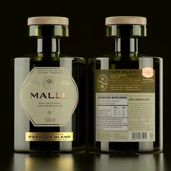
Emotional attributes of colors: Understand the emotions and associations conveyed by different colors and choose suitable colors according to the characteristics of the products and the target audience. For example, green is usually associated with environmental protection and nature, so it’s suitable for the labels of organic food or environmental protection products. Gold and silver are often used for the labels of high-end products, conveying a sense of luxury and nobility.
According to the attributes of the products, use different colored labels. For example, the labels on the exterior design of general medical supplies are usually white. White represents purity, healing and health. Another example is that when buying vegetables in the market, the labels on the vegetables are usually green. Green represents health, pollution-free and nature, etc. These are the meanings of green.

Graphic Design
Unique patterns: Designing unique and creative patterns can make the labels more recognizable. The patterns can be concrete, such as the real images of objects related to the products, animals, plants, etc. They can also be abstract combinations of geometric figures and lines, giving people a simple and modern feeling.
Through unique pattern designs and creative patterns, consumers will feel fresh and their attention will be attracted.
Use of illustrations: Exquisite illustrations can add an artistic sense and interest to the labels, attract consumers’ attention and arouse emotional resonance. The styles of illustrations can be diversified, such as cartoon style, realistic style, ancient style, etc. Choose according to the positioning and target audience of the products.
Illustrations, combined with the cultural heritage of the country, are designed to use patterns that fit the country’s culture and cater to consumers’ preferences, so that they can win consumers’ favor.
Simplicity of graphics: Avoid piling up too many complex graphics on the labels and keep the design simple and clear so that consumers can quickly understand and recognize them. Simple graphics are easier to be remembered and have a stronger visual impact.
Font Design
Choose appropriate fonts: Choose fonts that match the style and positioning of the products. For example, formal products like high-end wines and jewelry can use elegant and solemn fonts. While children’s products or fashionable items can choose lively, cute or personalized fonts.
Size and thickness of fonts: Adjust the size and thickness of fonts to highlight key information. For example, the brand name, product name, key selling points, etc. can use larger and thicker fonts to make them more conspicuous. While secondary information can use smaller and thinner fonts to maintain the overall balance and coordination.
Text layout: Reasonable text layout can improve the readability and visual effect of the labels. We can use alignment, indentation, line spacing and other ways to make the text arranged neatly and clearly. We can also use some creative layout methods, such as tilting, rotating and arranging the text in a scattered but orderly manner to add dynamism and interest to the labels.
Materials and Techniques
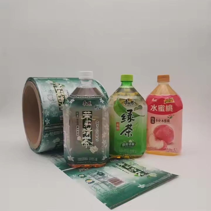
Special materials: Choosing unique label materials can improve the texture and touch of the labels, thus enhancing the visual attraction. For example, using shiny metal foils, rich-textured leather, environmentally friendly wooden materials or three-dimensional grating materials, etc., which can leave a deep impression on people both visually and tactilely.
Printing techniques: Using advanced printing techniques can bring rich visual effects to the labels. Such as gold stamping, silver stamping, UV printing, embossed printing, three-dimensional printing, etc. These techniques can make the text and patterns on the labels more prominent, creating a shiny, bumpy or three-dimensional effect and increasing the delicacy and high-end feeling of the labels.
Innovative techniques: Besides traditional printing techniques, we can also try some innovative techniques, such as laser cutting, laser carving, 3D printing, etc., to create unique shapes, textures or three-dimensional effects for the labels, making the labels more technological and innovative.
Information Layout
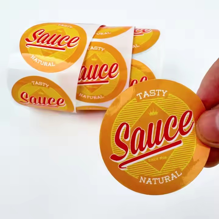
Highlight the key points: Put the important core selling points of the products in the front, emphasize the importance of the core selling points, enlarge the font size and highlight the key points. See which font is more in line with the tone of the product and then use this font.
Keep it simple and clear: Avoid piling up too many words and information on the labels and keep the layout simple and clear. Only show the most critical and valuable information so that consumers can quickly get the content they need and avoid visual fatigue caused by information overload.
