I. The Relationship Between Shape Psychology and Brand Perception
- Psychological Implications of Basic Geometric Shapes
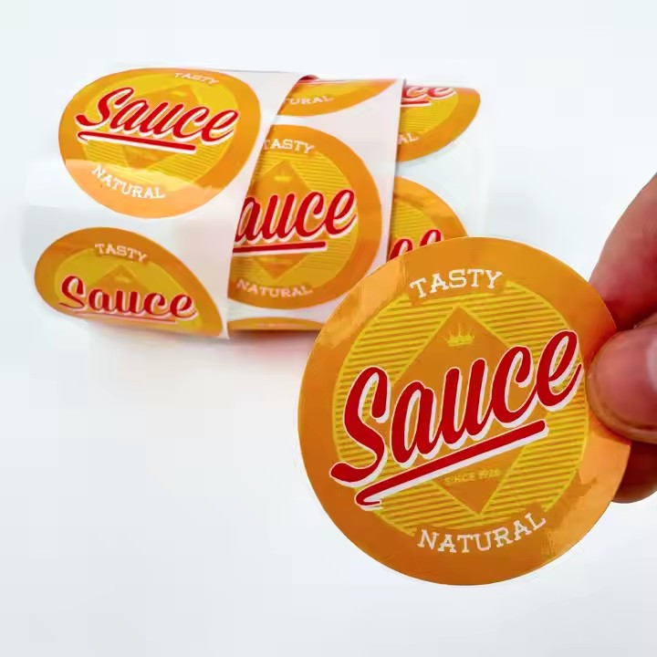
Round / Oval: These shapes convey a sense of softness and inclusiveness, making them suitable for products that emphasize “smooth flavor” and “low irritation.” For example, the Japanese brand Ploom Tech uses rounded-rectangle labels with a matte finish to enhance a sense of “approachability,” aligning with its positioning as a “replacement for traditional cigarettes.” Psychological studies show that rounded shapes lower consumers’ psychological defense mechanisms, subconsciously categorizing the product as “low risk.”
Square / Rectangular: These shapes symbolize order and professionalism, often used to highlight a product’s technological sophistication. The early label design of American brand Juul featured a minimalist white rectangle with black borders and sharp-edged fonts, emphasizing its identity as a product of “medical-grade vaporization technology.” The vertical and horizontal lines of rectangles evoke feelings of “stability” and “reliability,” reinforcing consumer trust in electronic devices.

Triangle / Polygonal: These shapes contain dynamic tension and are ideal for youth-oriented products promoting “trendy flavors.” The UK brand Vype used triangular segments with fluorescent gradient coloring in its limited edition label designs to create visual impact on shelves. Such irregular shapes stimulate curiosity and resonate with Gen Z’s pursuit of “uniqueness.”
- Emotional Value of Custom-Shaped Designs
E-cigarette silhouette imitation: Designing the label as a miniaturized silhouette of the device enhances product association. For example, Chinese brand RELX used streamlined label cuts mimicking its device shape, with matte-finished edges to match the device’s texture, forming a complete sensory recognition loop through sight and touch.
Nature-inspired abstract shapes: Shapes like leaves or water droplets are used to emphasize “natural ingredients.” The U.S. brand Naked 100 used a droplet-shaped cut-out for its fruit-flavored series, embedding fruit imagery inside. The symbolic shape more intuitively conveys “natural extraction” than textual descriptions.
II. Functional Requirements and Shape Adaptation Principles
- Information Density and Readability
Advantages of Rectangles / Trapezoids: Regular shapes are ideal for organizing dense content like warning labels and ingredient lists. According to EU TPD regulations, warning text must occupy no less than 30% of the total label area. Rectangular designs allow for grid-based layouts that improve information hierarchy. For instance, one brand divided a rectangular label into three sections: product image (left), ingredients (center), and warning (right), using the golden ratio (1:1.618) to allocate space—boosting reading efficiency by 40%.
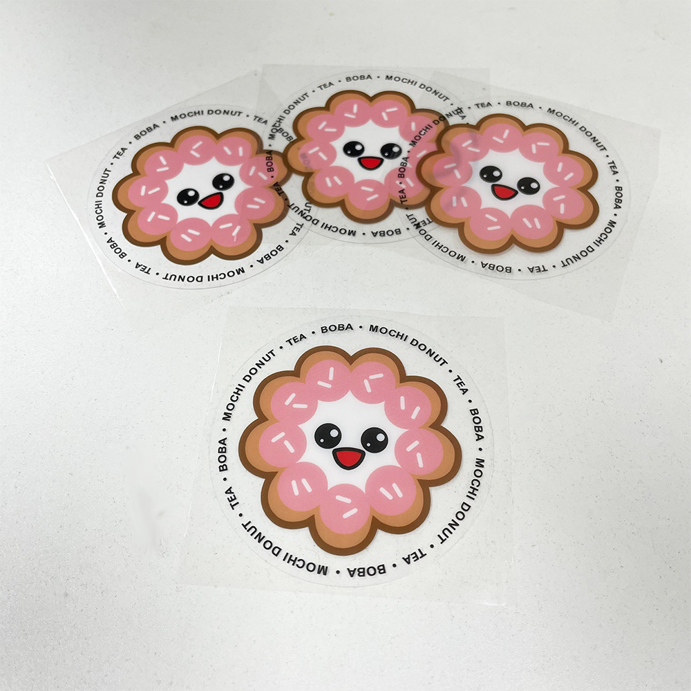
Challenges with Round Labels & Solutions: Curved edges can distort text, which may require bold fonts or segmented layouts to compensate. South Korean brand LIL uses circular labels with radial text layouts—warnings circle the edge while core information is centered. Sans-serif fonts like Helvetica help maintain visual clarity and readability.
- Manufacturing Feasibility and Cost Control
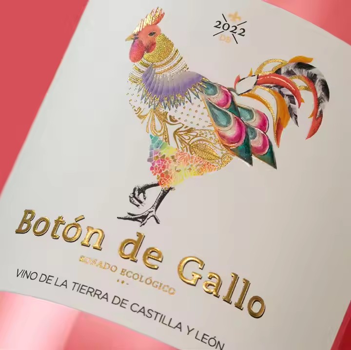
Cost threshold of custom-cut shapes: Laser-cut irregular shapes (e.g., cut-outs, polygons) cost 20–30% more than rectangles, making them suitable for premium lines. Italian brand Vapium used a diamond-shaped label with silver plating. Although production costs increased, the differentiated design allowed a 40% higher price point and a 15% boost in profit margin.
Cost-effectiveness of standardized production: Rectangular labels are compatible with standard printing equipment, ideal for mass production. A domestic OEM found that rectangular labels are 50% more efficient to produce and have less than 1% defect rate. A budget brand used rectangular labels with hot-stamping to elevate perceived quality while controlling costs—reaching monthly sales of over 100,000 units.
III. Balancing Regulatory Constraints and Market Trends
- Trends from 2023 to 2025
Minimalism returns: Influenced by Nordic design, Swedish brand Frii launched fully transparent rectangular labels, using only hot-stamped brand names with micro-printed info on the back. This “blank space” approach boosted shelf recognition by 27%, contributing to a 12% increase in European market share in 2024.
Interactive shapes: Canadian brand VapeX introduced a triangular label that unfolds into a user manual. This foldable design transforms the label into a functional guide, reducing product return rates by 18% and improving user retention by 8% compared to standard labels.

IV. Shape Strategies Based on User Scenarios
- Optimized Shapes for Portability
Ultra-thin rectangular labels: With thickness under 0.3mm, these labels conform to the device’s curves. Japanese brand iQOS used flexible PVC with rounded corners for its third-gen label. User research showed that pocket abrasion was reduced by 73%, and 91% of users reported high satisfaction with portability.
Round magnetic labels: U.S. brand Smok designed a round magnetic label that attaches inside the case and reveals a QR code when removed. This design combines functionality and aesthetics, increasing anti-counterfeit scan rates by 35%.
- Shape-Driven Value in Gift Scenarios
3D foldable shapes: Taiwanese brand Vaporesso created a hexagonal 3D label for its gift box edition, which unfolds into an illustrated brand story. Combined with hot-stamping, the gift-like presentation allows a 50–80% price premium, with holiday season sales accounting for 32% of annual volume.
Jewelry box-inspired shapes: UK brand Aspire used velvet-covered oval labels with metal nameplates, mimicking luxury jewelry packaging. Targeting the high-end gift market, this design achieved a 15% higher repurchase rate and raised average order value to over 800 RMB. Mimicking high-end jewelry box forms can significantly enhance perceived value and justify premium pricing.


