- Core Design Logic
German consumers value authenticity and quality, so label designs need to convey a dual sense of “reliability” and “refinement.” The overall style should lean towards minimalism, avoiding excessive decoration. Simple lines and patterns help consumers remember the product more easily.
The combination of colors and materials should evoke a sense of sophistication. German consumers pay close attention to design quality. Pattern elements should reflect the candle’s usage context—for example, natural imagery for home décor candles and traditional symbols for holiday editions.
Design must strictly comply with Germany’s Product Labeling Law, ensuring that information such as ingredients, origin, and burn time is clear and readable. Sans-serif fonts like Helvetica are recommended, with a minimum font size of 4 pt. Color is crucial—only vivid colors can make patterns lively and align with the product’s character.
Color schemes generally use low saturation tones such as cream, dark green, and navy blue, which match mainstream German aesthetics. Patterns should maintain visual coherence and avoid clutter—for instance, using repeated single laurel leaves instead of complex floral clusters preserves simplicity and conveys a natural vibe.

- Scene-Based Design Proposals
Everyday Home Use:
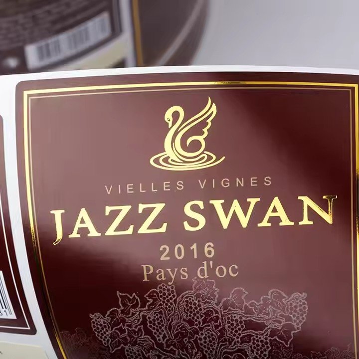
Labels should emphasize “comfort.” Use geometric plant silhouettes like olive branches or oak leaves with regional recognition. Lines should be precise and smooth. Gold foil outlining against matte label paper creates a tactile contrast. Background colors like creamy white or light gray are recommended. Information is well-sectioned, with key selling points such as “natural beeswax” and “cotton wick” placed at the visual center. Small corner motifs, such as a simple candle flame halo depicted with dotted lines, subtly evoke life and warmth.
Holiday Limited Editions:
Christmas labels should incorporate traditional symbols without cliché. Abstract fir tree outlines as triangular geometric shapes paired with flat red ribbon designs, and use whitespace to enhance breathability. Patterns should occupy no more than 30% of the label area to avoid overpowering the design.
For Christmas Eve specials, starry sky elements are suitable—e.g., a simplified Orion constellation rendered with gradient silver ink against black labels. Add fine stripes at the bottom simulating traditional German fabric textures, conveying a handcrafted, ceremonial feel.
Aromatherapy and Healing:
For consumers seeking relaxation, labels should emphasize “natural healing.” Watercolor-style botanical illustrations—such as chamomile or lavender—can be used, with controlled color bleed and sharp edges.
Use Morandi tones like grayish purple and light amber, combined with matte UV finishing to highlight petal textures. Layout employs asymmetrical balance, placing the main illustration on the left and vertically aligned fragrance notes on the right (e.g., “Top: Bergamot, Middle: Cedar”), visually reflecting the scent’s layering.

- Compliance and Detail Control
Material choices should balance environmental friendliness and texture. Recommended materials include 100% recycled kraft paper or linen fiber paper, aligning with German consumers’ emphasis on sustainability. If candles contain essential oils, add a plant icon (e.g., a lavender sprig) in the label corner at a minimum size of 1 cm × 1 cm.
Strictly review pattern copyrights to avoid protected traditional motifs. Original simplified versions of local elements—like Alpine mountain silhouettes or hop cones—can reflect German identity while minimizing legal risks. For imported candles, label the country of origin in German at the bottom, ensuring a contrast ratio of at least 3:1 between text and background for legibility by elderly consumers.
Special-use candles, such as outdoor windproof types, should incorporate functional icons (e.g., a shield symbol for protection rating) along with bold “Windproof” text. Keep the pattern-to-text ratio around 1:2 to prioritize clear information delivery. - Classic Case Studies
Germany’s local brand Erdbeerkerze is exemplary. Its Christmas series uses single-line reindeer silhouettes on matte copper-red backgrounds, with text limited to brand name and burn time—relying on material contrast rather than complex patterns.
Another notable example is Diptyque’s limited edition in Germany, which simplifies iris flower patterns into three oval color blocks framed with black and gold foil. This minimalist yet recognizable style fits local tastes and maintains brand identity. The “less is more” design philosophy is central to German candle label design.
Final designs should pass the test of “recognizable from afar, detailed up close”—being identifiable from 3 meters away on shelves while revealing usage context and all compliance info clearly upon closer inspection. This balance is the essence of German candle label design.


