

- Define the Design Positioning: Match Scenarios and Audience Needs
The design of eggshell stickers must first pinpoint the “application scenario” and “target audience.” Different scenarios and audiences have distinct requirements that directly determine the design direction. Blindly pursuing creativity can easily lead to a mismatch between the product and user needs.
(1) Scenario Adaptation: Align with Space and Usage Logic
Different applications demand varying sticker sizes, styles, and durability levels. Designers should match these attributes precisely to each scenario:
Home use:
Children’s rooms: Emphasize scratch resistance and easy cleaning. Choose fun patterns such as cartoons, starry skies, or animals. Recommended in modular combinations (each element 10–20 cm, 10–15 designs per set) to allow parents to arrange freely.
Kitchen and refrigerator stickers: Focus on waterproof and oil-resistant properties. Designs can include simple ingredients, slogans, or geometric patterns, typically 5–15 cm in size to avoid blocking functional zones.

Bedroom or wardrobe stickers: Favor low-saturation Morandi tones and line art to create a calm, cozy atmosphere while reducing visual overstimulation.
Cultural and creative products:
Notebooks or phone cases: Highlight small and delicate aesthetics. Size range 3–8 cm. Designs can feature IP characters, short quotes, or vintage illustrations, with rounded corners for safety.
Holiday decorations (Christmas, Lunar New Year): Emphasize theme colors (e.g., red & green for Christmas, red & gold for the New Year), and consider foil stamping (gold/silver) to enhance texture. Incorporate foldable or 3D elements (like snowflakes or lanterns) to increase interactivity.
Commercial use:
Storefront windows: Prioritize long-distance visibility—use bold lines, high color contrast, and avoid overly complex details that blur from afar.
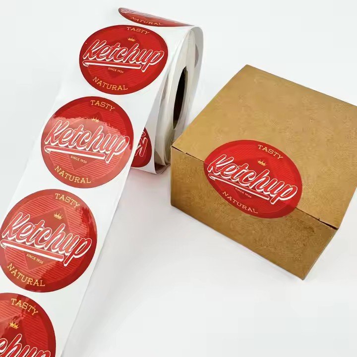
Product packaging: Include brand logo and product information, ensuring visual consistency with the packaging. The sticker’s dimensions should precisely fit reserved spaces (tolerance ≤ 2 mm).
(2) Audience Adaptation: Balance Aesthetics and Safety
Different age groups have distinct priorities when it comes to stickers. Design optimization should be audience-specific:
Children (ages 3–12):
Safety comes first—avoid sharp shapes or aggressive imagery.
Use bright, soft pastel or candy tones (avoid neon colors that strain the eyes).
Add educational elements, such as letters, numbers, or animal names, to combine decoration with learning.
Choose washable, eco-friendly materials to prevent harm from accidental contact or ingestion.
Adults (ages 18–35):
Focus on aesthetics and individuality. Styles can include minimalist, vintage, “ins,” or Chinese trendy designs.
Patterns may feature abstract lines, florals, niche illustrations, or motivational text (e.g., “Live Well”, “Have a Nice Day”).
Offer multiple size options—single small stickers or large panels—to fit various decoration needs.
For a premium tactile feel, use matte lamination or textured finishes (like woodgrain or linen).
- Material and Process Adaptation: Ensure Design Feasibility
The visual outcome of eggshell stickers depends heavily on material properties (such as thickness, adhesion, transparency) and production constraints (such as printing precision or lamination). Ignoring these may cause a design that looks great on screen but fails in production.
(1) Substrate Adaptation: Choose Material by Application Scenario
Common eggshell sticker substrates include transparent PET, white PVC, matte paper, and kraft paper—each with distinct design implications:
Transparent PET:
Ideal for “invisible” decoration (e.g., glass windows, phone screens). Designers must consider background color compatibility—dark designs show better on light surfaces, while light colors work best on dark ones.
Use high-adhesion inks to prevent peeling, and avoid large solid color blocks to reduce uneven printing or bubbling.
White PVC:
Suitable for opaque surfaces (walls, wardrobes, notebooks). The material provides excellent coverage, allowing for complex designs.
For thicker bases (≥0.1 mm), include a 0.5 mm bleed margin to prevent exposed edges after die-cutting.
PVC can be waterproofed, making it ideal for kitchens and bathrooms—designs can include a “washable” symbol or label.
Matte paper:
Perfect for vintage or artistic aesthetics (journals, gift boxes). Soft to the touch but non-waterproof and wear-prone, so avoid large light-colored areas that soil easily.
Suitable for retro illustrations or typography, with usage instructions like “Avoid contact with water or oil.”
(2) Process Adaptation: Stay Within Manufacturing Limits
Common production techniques include digital printing, screen printing, foil stamping (gold/silver), lamination, and die-cutting. Understanding their limitations ensures the design can be physically produced:
Printing precision:
Digital printing offers high accuracy—ideal for detailed linework or gradient effects.
Screen printing suits bold, flat-color graphics; however, it struggles with soft gradients (e.g., pink-to-white).
Maintain minimum line width ≥ 0.3 mm (thinner lines may blur) and minimum font size ≥ 8 pt (smaller text may be unreadable).