

- Visual Focus: Capturing Attention at First Glance
A consumer’s first impression of a perfume often comes from its label. Strong visual identifiers help products stand out on shelves or screens and leave a lasting memory.
Color coordination should align with the fragrance’s character and target audience.
Fresh floral or fruity scents suit bright, light tones such as blush pink, pale blue, or mint green—conveying liveliness and freshness.
Woody or oriental fragrances work well with deep brown, jet black, or burgundy, evoking sophistication and mystery.
Unisex fragrances favor minimalist palettes such as black, white, gray, or nude, creating a calm and modern look.
To maintain visual harmony, limit the palette to one main color and one or two accents. For example, Jo Malone’s classic white label with black lettering is simple yet highly distinctive.

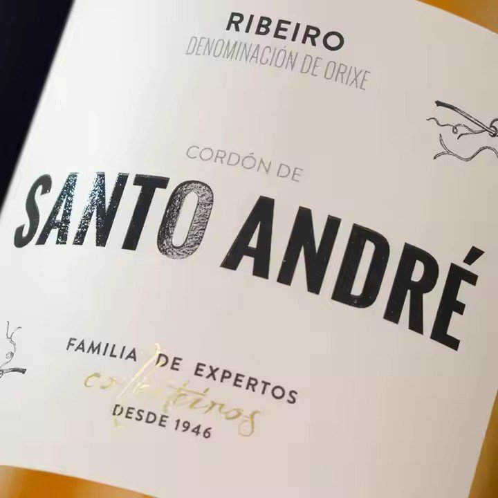
Graphic elements should express the perfume’s essence precisely. Literal symbols—like roses for floral notes or waves for aquatic scents—help convey the fragrance type, while abstract graphics such as lines or geometric forms can express mood and tone. Chanel N°5’s geometric typography and minimal framing embody timeless elegance, while Diptyque’s handwritten logo paired with fine line art reflects a literary, vintage aesthetic.
Typography should balance beauty and legibility.
Serif fonts work best for luxury fragrances, adding refinement.
Handwritten or artistic fonts suit youthful, trendy perfumes, emphasizing individuality.
Sans-serif fonts complement neutral or minimalist designs.
Font sizes should create clear hierarchy: highlight the brand and fragrance name, while details like scent type and volume remain readable but understated. Avoid overly decorative typefaces that compromise clarity.
- Emotional Resonance: Conveying Story and Atmosphere Through Design
Perfume embodies emotion and memory—its label should visually communicate the story or mood behind the scent, evoking a consumer’s emotional response.
Incorporate storytelling and atmosphere.
Simple illustrations or text can hint at the fragrance narrative—for example, Hermès Terre d’Hermès uses earthy tones and bold fonts to reflect its “earth and travel” theme, stirring feelings of freedom and exploration.
Design can also create specific moods: romantic perfumes might use soft curves and gradient tones for a dreamy aura, while office-ready fragrances adopt clean lines and muted hues to convey confidence and professionalism.
Design for the target audience’s emotions.
For young women, include delicate touches such as bows or subtle glitter to satisfy a playful, feminine sensibility.
For mature men, emphasize metallic textures and sharp lines to express strength and sophistication.
For niche or artistic consumers, favor minimalist designs and handcrafted details like embossing or foil stamping to highlight individuality.
Color psychology can also enhance emotional appeal—warm hues evoke joy and passion, while cool tones convey calmness and restraint.
- Clear Information: Balancing Beauty with Practical Communication
A perfume label isn’t just decorative—it’s a communication tool. Clear, well-structured information builds trust and helps consumers make confident decisions.
Establish a clear information hierarchy.
Primary information (brand and fragrance name) should occupy the visual center in bold, prominent fonts.
Secondary details (scent type, volume, concentration) follow in moderate size for easy readability.
Supporting information (manufacturing location, shelf life) can be discreetly placed along the edges in smaller text to maintain aesthetic balance. Avoid overcrowding—retain only essential details for a clean, readable layout.
Ensure logical, visually balanced layout.
Horizontal alignment suits standard bottles for a straightforward, elegant appearance, while vertical designs complement tall, slender bottles for added uniqueness.
Maintain proportion between text, graphics, and whitespace—ample whitespace elevates the sense of luxury. For instance, Dior J’adore centers its brand and fragrance names prominently, with secondary text neatly aligned below, creating a balanced and comfortable layout.
- Tactile Quality: Using Materials and Craftsmanship to Elevate Luxury
The material and craftsmanship of a label profoundly influence how consumers perceive the perfume’s quality. A refined tactile experience enhances the sense of luxury and aligns with the high-end nature of perfume products.
Choose materials that match the perfume’s positioning.
Premium fragrances often use coated paper or specialty paper paired with gold or silver foil stamping for a metallic sheen and smooth texture.
Niche or artisanal perfumes may use kraft paper or rice paper to convey natural simplicity and individuality.
Youthful, fashion-forward lines can adopt transparent PVC or fluorescent paper for a bold, modern personality.
The label should also suit the bottle’s material—for example, paper labels on glass bottles can include lamination to prevent moisture damage and wear.
Craftsmanship details enhance perceived value.
Beyond hot stamping, techniques like embossing, UV varnish, or holographic printing can add dimensionality and refinement.
For instance, Gucci Guilty uses gold foil lettering and embossed floral patterns for both tactile and visual richness. Some high-end brands even embed rhinestones or metal nameplates to heighten the sense of opulence. The key is consistency—craft techniques should complement the perfume’s personality, avoiding excessive ornamentation that may feel gaudy.