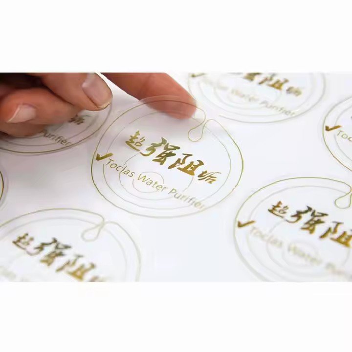
Health supplement labels are not merely information carriers—they are bridges of trust between the product and the consumer. In a market where ingredient-conscious consumers are rising and health demands are upgrading, the persuasiveness of a label directly influences purchase decisions. To make a label stand out in a crowded market, it should follow the principles of “compliance as foundation, trust as core, needs as guide”, transforming professional information into clear, credible visual language that converts a product from being merely “seen” to being trusted.
- Compliance First: Establish Trust Through Authority
The unique nature of health supplements makes compliance the foremost factor for persuasiveness. Consumer trust begins with legitimacy and safety, and labels must translate regulatory compliance into visible trust signals.
Highlight Core Certifications:
Essential credentials such as the Blue Hat logo, approval number, and production license number, as required by the Health Food Labeling Management Regulations, must be prominently displayed. A recommended layout is Blue Hat + approval number, with the logo no smaller than 10mm. Next to it, clearly display “National Health Food G + 4-digit year + 4-digit sequence number” for instant recognition of legitimacy.
Clear Production Information:
Include manufacturer name, address, contact information, production date, and expiration date. Use readable fonts like SimSun or Heiti, with font sizes no smaller than 4pt, to avoid ambiguity that could erode trust.

Transparent and Specific Ingredients:
Consumers care about what’s in the product and what it delivers. Ingredients should be listed from highest to lowest concentration. Key active ingredients should be highlighted using bold fonts or subtle background blocks, e.g., “Per 100g: Collagen peptides 12g, Vitamin C 500mg,” rather than vague terms like “rich in” or “high content.” For ingredients sourced from natural materials, simple icons can help convey origin—for example, labeling fish oil as “Deep-sea salmon extract” with a small fish icon for easy recognition.
- Precise Targeting: Communicate Core Value Based on Consumer Needs
The essence of persuasiveness is addressing consumer concerns. Labels must be designed to match the target audience’s needs, linking product value directly to their pain points while avoiding information overload.
Audience-Specific Design:
Middle-aged and elderly consumers: Simplify design, prioritize readability, use calm tones (black or dark brown), font size no smaller than 3pt, and emphasize direct benefits like “Supports healthy blood pressure” or “Improves sleep,” paired with comforting copy such as “Protecting your parents’ health.”
Young women (beauty supplements): Use soft tones like pink or lavender, highlight key benefits like “Collagen” or “Antioxidant,” and incorporate minimalistic line or floral elements to balance aesthetics and functionality.
Scientific yet Accessible Claims:
Avoid prohibited terms like “cures” or “treats.” Use compliant language such as “helps improve” or “supports,” and enhance relatability through scenario-based language. For example:
A liver supplement for night-owls: “Post-night repair,” paired with a liver icon.
An immunity support product: “Daily immune boost,” paired with a shield icon.
Authority Endorsements:
Include credible certifications such as “National High-Tech Enterprise” or “ISO9001 Quality Certification” to reinforce efficacy through third-party endorsement.
- Visual Optimization: Strengthen Emotional Connection Through Detail
Visual experience directly influences consumer perception. Professional, human-centered details elevate trust from rational judgment to emotional identification.
Color Palette:
Use colors that match the product type and convey reassurance. Avoid highly saturated, harsh colors.
Green: natural, healthy—ideal for herbal products.
Blue: professional, reliable—suitable for fish oil or protein powders.
Gold: premium, nourishing—appropriate for bird’s nest, ginseng, or other tonic products.

Limit main colors to 2–3, paired with white or light gray backgrounds to maintain clarity.
Layout Logic:
Follow a top-to-bottom, left-to-right visual flow.
Top: brand logo and Blue Hat certification.
Middle: key benefits and ingredient information.
Bottom: usage instructions and precautions.
Usage Instructions:
Keep instructions concise, e.g., “Take 2 capsules once daily with warm water,” with optional warm tips like “Best taken after breakfast.”
Precautions:
Use warning colors (e.g., red) for critical information like “Not suitable for specific groups” or “Cannot replace medicine,” ensuring compliance while demonstrating responsibility.
In summary, a persuasive health supplement label combines regulatory credibility, clear value communication, audience-centered design, and professional tactile quality. When done right, it converts mere visibility into consumer trust and ultimately drives purchase decisions.


