
- Start with Compliance: Clarity Comes Before Aesthetics
Australia has strict regulatory requirements for supplement labels. The Therapeutic Goods Act 1989 and TGO 92 set mandatory rules for information display, and non-compliant designs can lead to product removal from shelves.
Therefore, “looking good” must be built on the foundation of compliance. Label design should first establish an information hierarchy that keeps all regulatory details clear and easy to read.
Mandatory Information Must Be Displayed Properly
Key information that must be included comprises:
- ARTG number (AUST L or AUST R; AUST L for low-risk products, AUST R for high-risk medicines)
- “Not a medicine” statement
- Ingredient list
- Dosage instructions
- Manufacture date and expiry date
These details must appear in easily readable areas. Sans-serif fonts (e.g., Arial) should be used, with a minimum size of 6pt. The color contrast between text and background should be ≥ 4:1 — for example, dark grey or black on light backgrounds, or white text on dark backgrounds. Avoid gradients or decorative fonts that reduce legibility.

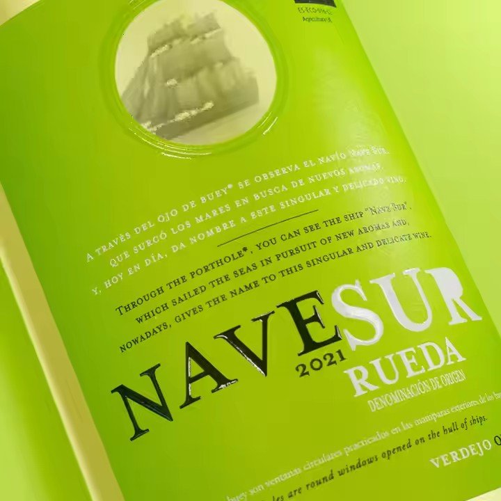
Blackmores’ new packaging is a good example: key information is placed central-left with clear bullet formatting that complies with TGO 92 and supports fast consumer recognition.
Clear Information Hierarchy
Divide the label into three visual zones:
Brand Identification Zone (top 1/5): logo, “Australian Made”, heritage info such as “Since 1932”.
Core Information Zone (middle 2/5): product name, ARTG number, hero ingredients, “Not a medicine” statement.
Supplementary Information Zone (bottom 2/5): ingredient list, dosage instructions, batch/expiry details.
This structure aligns with consumer reading patterns: identify the brand first → evaluate product benefits → check details last.
Build Visual Appeal: Communicate Trust and Quality Through Local Aesthetics
Australian consumers value natural sourcing and scientific validation. Your label should reflect these cues through colors, graphics, and material choices—while aligning with mainstream Australian aesthetics.
Color Palette: Match Product Category & Natural Imagery
Choose colors that reflect both product category and Australian preferences:
- Vitamins: mint green, lemon yellow → “fresh nutrition”
- Herbal formulas: olive green, earth brown → natural botanical extraction
- Collagen or women’s wellness: soft rose pink, pearl white → gentle & nourishing
Avoid high-saturation or clashing colors. Australians generally prefer low-saturation “Morandi tones”.
For example, Swisse often uses pale grey paired with soft blue lines to convey professionalism and calmness.
You may also establish a fixed color system by category (e.g., blue for fish oil, white for calcium), similar to Blackmores, making products easier to identify on shelves.
- Graphics: Minimalist but Meaningful — “Natural + Scientific”
Use simple, purposeful icons to reinforce brand identity:
- Minimal botanical line drawings (leaves, flowers) to reflect naturopathic heritage — as seen in Blackmores’ updated labels.
- For marine-sourced products like fish oil, use simple wave motifs rather than detailed illustrations for a modern, premium look.
- Add subtle scientific cues — small molecule sketches next to key ingredients or shield icons representing safety.
Graphic lines should be smooth and rounded to match Australia’s relaxed, friendly design culture.
- Materials & Finishes: Enhance Tactile and Visual Premium Feel
Material choice significantly impacts perceived quality:
- Entry-level: matte coated paper — durable, clean, non-reflective.
- Premium lines: soft-touch films — fine texture, better hand feel.
- Use selective foil stamping (gold or silver) for logo, ARTG number, or “Australian Made” icon to emphasize key information and add premium flair.
- For transparent bottles, use die-cut labels that show part of the product contents — such as yellow fish oil paired with pale blue lines for visual depth.
Design for Multiple Sales Channels: Retail & E-Commerce Ready
Australia’s supplement industry spans pharmacies, supermarkets, and online platforms. Label designs must work both on shelves and on digital screens.
Offline Retail: Strong Shelf Impact & Easy Readability
Pharmacy shelves are crowded, so labels must be visually identifiable from 3 meters away:
- Logo should occupy at least half of the brand header space with high-contrast colors (e.g., black on white).
- Product name should be the largest text element, using bold or underlined type when needed.
- Add a vertical category tag on the right side (e.g., “VITAMIN D”, “OMEGA-3”) so shoppers can quickly identify the type even from the side.
For smaller bottles, simplify the lower information area to avoid crowding—focus on brand, benefits, and ARTG details.