

I. Physical Fit: Shaping the Foundation through Structural Compatibility
A physical fit is the prerequisite of effective label design. At its core lies the challenge of achieving “morphological symbiosis” between the label and the jar body — the label must be adapted to the material, curvature, size, and use scenario of the jar to determine its form boundaries and method of application.
The jar material determines the label carrier — the first rule of physical fit.
Glass jars, with their smooth surface and transparent texture, pair well with transparent PET labels or foil stamping. Gradual-fade edges help maintain the glass’s clarity.
Metal jars convey a cool, industrial aesthetic. Matte coated paper or kraft paper labels provide contrast and soften the harshness. Rough-cut edges can enhance a natural vibe.
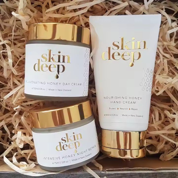
Plastic jars, being cost-effective and highly moldable, work best with film labels or shrink sleeves. Shrink sleeves conform tightly to the curved surface, even wrapping around the bottom for a seamless visual.
For example, a serum in a metal jar might use a silver matte label aligned precisely with the jar’s embossed line, avoiding fingerprints while visually reinforcing the product’s precision.
Curvature coordination between jar and label requires precise proportioning.
For cylindrical jars, consider the “visual golden ratio”: a label height of 1/3 of the jar height emphasizes slenderness, while 2/3 coverage enhances fullness. Leave 1–2 mm buffer in label width to avoid distortion on curved surfaces.
For square jars, edge handling is key: straight-corner jars match straight-edge labels to emphasize sharpness, while rounded jars should use matching rounded corners (e.g., a 5mm corner radius on both jar and label).
A square face cream jar may align its label edges with the jar’s edges, and match corner radius precisely, giving a one-piece appearance when viewed from the side.
Use-context-driven label placement is the invisible logic behind physical fit.
Pump-style jars (e.g., sprays) should avoid the pressing area, placing core information on the lower mid-section to reduce wear and prevent detachment.
Wide-mouth jars (e.g., creams) may extend the label across the lid-body junction for a more cohesive look.
Portable cosmetics (e.g., lipstick tubes, small serum bottles) should feature compact label designs with reduced info density.
If a label covers more than half the jar, it may feel cramped; keeping it within one-third balances functionality and aesthetics.
II. Visual Fit: Using Design Logic to Strengthen Unity
The essence of visual fit is to create a “visual community” between label and jar — through coordinated colors, patterns, and light effects that minimize the “stuck-on” feel and maximize the “native” integration. Designers must break free from thinking of the label as a mere attachment, and instead treat the jar as a background canvas — and vice versa.
Color system harmony forms the foundation of visual integration.
Two approaches: monochromatic extension and contrasting balance.
In monochromatic schemes, the label should be 1–2 shades darker than the jar (e.g., light beige jar with light brown label), adding depth while preserving harmony.
In contrast schemes, color ratio control is key — for instance, a black jar can pair with a gold label (complementary), but gold should cover no more than 30% of the label to avoid clashing.
A rose essential oil in a light pink glass jar may use a deep rose-red label with a transparent fade at the edges, creating the illusion that the label color “grows” from the jar — visually connecting product identity with continuity.
Visual pattern alignment enhances narrative unity.
Round jars work well with circular motifs or radial layouts — e.g., a circular logo echoing a round pump head, or ring patterns wrapping down to the bottom for a closed visual loop.
Square jars can emphasize angles with linear graphics — e.g., vertical stripes aligned with jar edges, or geometric motifs that mirror jar surface embossing for a “solid-hollow” relationship.
A facial mask tin might use a label with semi-transparent petal graphics; matte treatment on exposed aluminum contrasts with the label’s glossy zone, blending reflections to make petals appear as if organically grown from the surface.
Light and shadow detail define refinement in visual cohesion.
Metal and glass jars are reflective — place text on the jar’s shadow-facing side or use matte inks to reduce glare.
Transparent jars offer opportunities for light-play — labels with die-cut shapes can project shadows when backlit, creating interactive light-label effects.
A perfume in a clear glass jar might feature a star-shaped cutout in the label. When light passes through, it casts star shadows on the surface, linking light and label in a poetic experience and turning the label into a “light director.”
