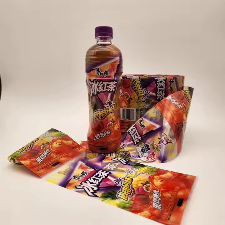
When using colors for label stickers, how can we mix colors in various ways to attract attention to the greatest extent? Because only when the label or external packaging is eye-catching and beautiful enough can it attract consumers.
Create a Retro Atmosphere
Use classic retro tones: The colors of the retro style usually have low saturation and brightness, giving people a sense of stability and nostalgia. For example, colors like dark green, burgundy, turmeric, and dark brown. Combining these colors can create a retro and charming atmosphere. You can refer to the color combinations in retro posters and old photos and apply these classic retro tones to the design of colorful stickers to give the stickers a unique charm. It is very important to use some classic retro color combinations because the retro color schemes are classic enough and have withstood the test of time. Therefore, classic color combinations are more deeply rooted in people’s hearts and can win the favor of more people.
Add an aged effect: To enhance the retro feeling, some aged effects can be added based on the mixed colors. For example, gently apply some brown or gray paint on the surface of the sticker to simulate the traces of time; or use sandpaper to gently polish the edges of the sticker to make it show a worn effect, making the sticker look more historical and vintage. Adding an aged effect gives the sticker a sense of history and can also give people a sense of reliability that has withstood the test of time.
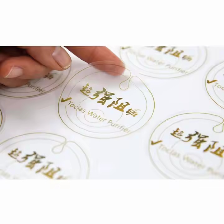
Draw Inspiration from Natural Colors
Imitate the tones of natural landscapes: Nature is the greatest master of colors. Drawing color inspiration from beautiful natural landscapes is a good way to create eye-catching colorful stickers. For example, the blues and greens of the ocean, the light blues and whites of the sky, the dark and light greens of the forest, and the various bright colors of flowers. Combining and mixing these natural colors can create fresh, comfortable, and attractive sticker colors. For example, for a sticker themed around a beach, light blue and light yellow can be used to represent the sky and the beach, and green and blue can be used to represent the waves, making the sticker full of a natural atmosphere. Drawing inspiration from nature and imitating the tones of nature is appealing because humans naturally have the characteristic of being close to nature. So, choosing comfortable color schemes that are close to nature is more attractive.
Extract the color characteristics of animals: The colors on animals are also very rich, diverse, and unique. For example, the feathers of a peacock have gorgeous colors such as blue, green, and purple; the wings of butterflies show various colorful patterns and colors. The typical colors of these animals can be extracted and mixed, and then applied to the design of stickers to give the stickers unique visual appeal. For example, when designing a sticker themed around a butterfly, the bright colors on the butterfly’s wings, such as orange, black, and white, can be used for color matching to show the beauty and agility of the butterfly.
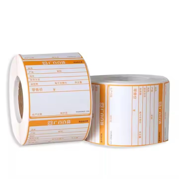
Create a Dreamy Effect
Use fantastic color combinations: The colors of the dreamy style usually have the characteristics of being soft and bright, and some color combinations that are not commonly seen in reality are often used to create a fantastic atmosphere. For example, combinations like light purple and light blue, pink and mint green, light yellow and light pink, etc. These color combinations can give people a dreamy and ethereal feeling, as if they are in a fairy tale world. These colors can be applied to the design of colorful stickers with themes such as magic, fairies, and starry skies to make the stickers full of fantasy colors. Create different color combination schemes and use bold color clashes. For example, the combination of red and green, because red flowers match with green leaves, which is a very impactful color combination, and the two colors have a strong visual impact.
Add fluorescent or luminous elements: To make the stickers more dreamy, some fluorescent or luminous materials can be added during the color mixing process. During the day, fluorescent colors can make the stickers more vivid and eye-catching, attracting people’s attention; at night, the luminous elements will emit a soft light, creating a mysterious and dreamy effect. For example, for a sticker themed around the starry sky, fluorescent blue and purple can be used to represent the starry sky, and then luminous materials can be added to the star patterns to make the sticker show the effect of twinkling stars at night. Adding fluorescent effects and luminous elements can make the stickers stand out relying on these unique luminous elements, attract the public’s attention, and win the attention of more consumers.
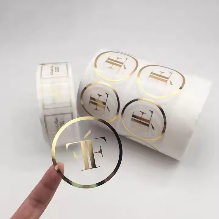
Play with Color Layers
Create rich effects through layering: By layering different colors, rich color layers and unique visual effects can be created. For example, first apply a base color on the sticker, such as yellow, and then gently apply a layer of transparent red paint on it, which will produce an orange overlay effect. Due to the different transparency of the paint, a color change with a sense of hierarchy will be formed. You can try layering multiple colors and adjust the order and thickness of the layering according to your needs to obtain unique and eye-catching color effects.
Express a three-dimensional effect using light and shadow: Use the lightness and darkness of colors to express the light and shadow effects, making the sticker have a three-dimensional sense. For example, when drawing a circular object, use a darker color to represent the shadow part and a lighter color to represent the illuminated part, and express the three-dimensional sense of the object through the transition of colors. For some complex patterns, according to the direction of the light source and the structure of the object, the changes in the lightness and darkness of the colors can be reasonably used to create a realistic light and shadow effect, making the sticker more vivid and attracting the audience’s attention.
