Color Matching
Fit the Perfume Theme: Select the main color tone according to the fragrance type and positioning of the perfume. For example, for fresh floral – scented perfumes, soft colors like pink, light blue, or light yellow can be used, giving people a warm and romantic feeling. For woody – scented perfumes, brown, dark green, etc. can be adopted to convey a sense of stability and nature. And for fruity – scented perfumes, bright colors such as orange and red are suitable to reflect vitality and passion. Since the creation of perfume also has a theme, a corresponding theme should be set for the label.
Create a Visual Impact: After determining the main color tone, match one or two auxiliary colors to enhance the visual effect. The auxiliary colors can be complementary or similar to the main color tone to form a sharp contrast or a harmonious transition. For instance, for a perfume with blue as the main color tone, gold can be used as an embellishment to add a sense of luxury; or light purple can be paired to create an elegant and dreamy atmosphere. At the same time, pay attention to the saturation and brightness of the colors, and avoid using overly dull or dazzling colors to ensure the overall color comfort of the label. Once the main color tone is determined, try to choose colors related to the theme. For example, if the theme is romance and it is mainly intended as a Valentine’s Day gift, then colors like purple or pink should be used.

Graphic Design
Reflect the Characteristics of the Perfume: Use elements related to the perfume for graphic design. For example, flowers, fruits, and leaves can represent floral or fruity scents; trees and wood textures can reflect woody scents. Some abstract lines or shapes can also be used to express the unique temperament of the perfume. For example, elegant curves may imply the softness and delicacy of the perfume. To reflect the characteristics of the perfume, make good use of some scents. For example, for a perfume that can calm people down, the scent of tea or the fresh aroma of some herbal plants, such as the fragrance of citrus peel and ginger, which are all plant scents that can effectively soothe the mind.
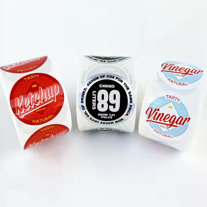
Adopt a Unique Style: According to the brand positioning and target audience of the perfume, choose an appropriate graphic style. For example, for high – end luxury brands, a refined hand – drawn illustration style or a simple combination of geometric shapes can be used to show the brand’s elegance and quality. For young and fashionable brands, popular flat design, cartoon images, or creative collage art can be applied to attract the attention of young consumers. In addition, through special processes such as hot stamping, silver stamping, and embossing, the graphics can be made more three – dimensional and vivid, increasing the texture and attractiveness of the label.
Text Arrangement
Highlight Key Information: Key information such as the brand name, fragrance type, and capacity of the perfume should be placed in prominent positions and use larger fonts to ensure that consumers can clearly identify them from a distance. The brand name can adopt a unique font design to reflect the brand’s personality and style, but readability must be guaranteed. Information such as the fragrance type and capacity should use simple and clear fonts for consumers to quickly obtain the information.
Pay Attention to Text Hierarchy: In addition to the key information, there may be other information on the label, such as the ingredients of the perfume, usage instructions, place of origin, etc. Arrange these information in layers according to their importance. Secondary information can use a smaller font, but the overall readability should be ensured. At the same time, by adjusting the line spacing, letter spacing, and color of the text, there should be a clear distinction between the texts to avoid the information being too crowded or chaotic.
Add Artistic Elements: Without affecting readability, some artistic treatments can be carried out on the text. For example, design some parts of the text to be combined with the graphics, or use some special font effects such as shadows and gradients to increase the interest and attractiveness of the text. However, be careful not to overuse these effects to avoid affecting the recognition of the text and the overall simplicity of the label.
Material Selection
Consider Texture and Durability: Select label materials with good texture, such as high – quality paper, plastic film, or leather, which can enhance the overall quality of the perfume. For high – end perfumes, paper with texture or special coatings, such as pearlescent paper and art paper, can be selected to add a sense of luxury to the label. For some sporty or outdoor perfumes, waterproof and wear – resistant plastic film materials can be used to reflect the durability of the product.

Combine Special Processes: According to the design requirements, combine some special processes to enhance the attractiveness of the label. For example, the hot stamping process can present patterns or texts with a metallic luster on the label, adding a sense of splendor. The embossing process can make the surface of the label have uneven textures, such as leather texture and wood texture, improving the tactile and visual effects. There is also the local UV varnishing process, which can form a shiny effect in specific areas of the label, highlighting key elements and attracting consumers’ attention.
Overall Layout
Maintain Simplicity and Balance: The overall layout of the label should be simple and clear, avoiding piling up too many elements together to prevent visual confusion. Reasonably distribute elements such as graphics and texts on the label to maintain an overall sense of balance. A symmetrical layout or an asymmetrical but rhythmic layout can be adopted to make the label look comfortable and harmonious.
Create a Unique Focus: Set a unique focal element on the label, such as a striking graphic, a special advertising slogan, or a unique logo, to attract consumers’ attention and guide their eyes to browse other information on the label. This focal element should be in line with the brand image and product characteristics of the perfume, and be able to convey the core value of the product instantly.


