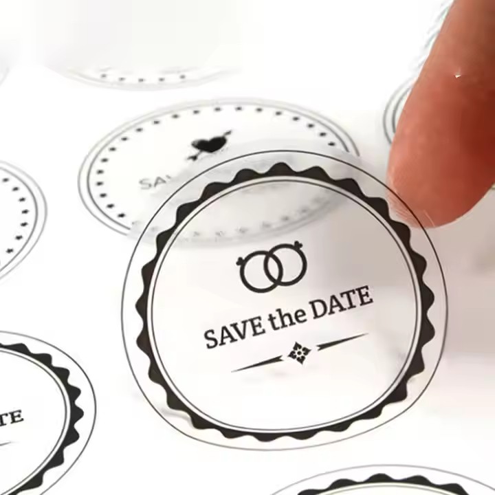
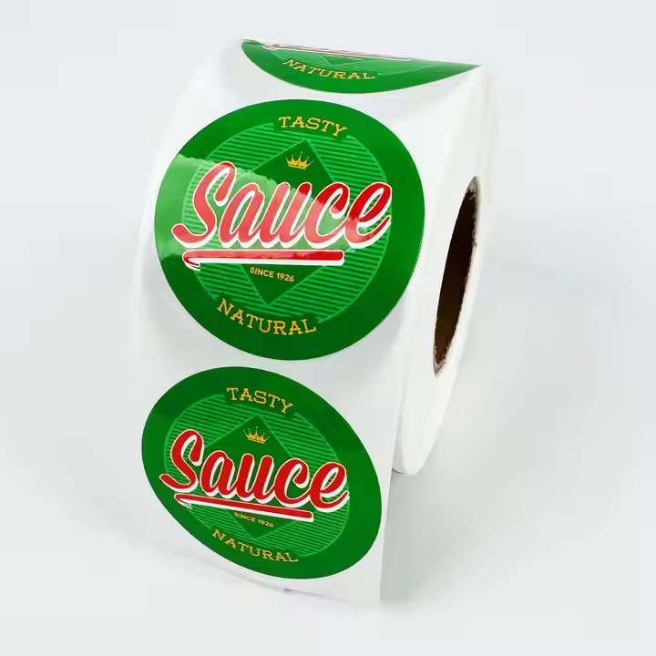
In the market, porcelain items and some cookware are all affixed with labels, because the labels are relied on to showcase the functions of the containers, the production dates, the usage methods, and so on, all of which will be presented on the labels as much as possible.
Highlight Brand Characteristics
Use Brand Colors: Apply the brand’s main color tone or representative colors to the label. For example, the red color of Coca-Cola and the blue color of Tiffany make users associate the brand as soon as they see the label color. By using the brand color on the label, it will form a good memory point. A good memory point can help consumers remember the product brand.
Incorporate the Brand Logo: Place the brand logo on the label in a prominent but not obtrusive way. For example, the labels of Apple products all have the Apple logo, which strengthens the brand’s impression in users’ minds. Incorporating the product logo well into the label allows consumers to remember the product in many situations.
Utilize Unique Graphics and Shapes
Unique Graphic Elements: Select unique graphics that are related to the product or have symbolic meanings. For example, the flower pattern on a cosmetics label represents the natural ingredients of the product. Creative and personalized graphics can also be used, such as the silhouettes of unusual animals, abstract artistic graphics, etc., to increase the fun and uniqueness of the label. Unique elements can effectively distinguish products from those in other industries, making it easier for consumers to remember the brand.
Innovative Shape Design: Break through the traditional rectangular or circular label shapes and adopt irregular shapes, special three-dimensional shapes, or shapes that echo the shape of the container. For example, the label of a wine bottle can be designed to be similar to the outline of the wine bottle, or rare shapes such as triangles and diamonds can be used to make the label stand out among many similar products. Using innovative shape design and innovative pattern design, as long as they are innovative and different, they can make consumers feel novel and refreshing, and it is easier for consumers to remember the product.

Optimize Text Design
Concise and Clear Copy: The text on the label should be simple and easy to understand, avoiding complex words and sentences, so that users can quickly understand the key information of the product, such as the product name, main features, usage instructions, etc. For the text and copy designed on the label, they should be as concise as possible, because only simplicity can make consumers remember the product brand.
Unique Font Style: Choose fonts that match the product positioning and brand image, such as fashionable sans-serif fonts, retro serif fonts, cute handwritten fonts, etc. Some creative designs can also be made for the fonts, such as deformation, adding decorative elements, etc., but the readability of the text must be ensured.
Reasonably Use Colors
Sharp Color Contrast: Select label colors that form a sharp contrast with the color of the container, so that the label can stand out. For example, use a light-colored label on a dark container or a dark-colored label on a light-colored container. Contrasting colors can also be used in the design of the label itself, such as red and green, yellow and purple, etc., to attract users’ attention.
Emotional Color Selection: Different colors can evoke different emotional associations. Select appropriate colors according to the characteristics of the product and the target audience. For example, warm colors such as red and orange are often used for food and beverage products to convey a sense of enthusiasm, vitality, and deliciousness. Cool colors such as blue and green are often used for technology and health products, giving people an impression of calmness, professionalism, and safety. For emotional colors, for example, when designing products for children, some milder and lighter colors that are more approachable should be used to attract children’s attention.
Provide a Clear Information Hierarchy
Prioritize Important Information: Place the key information of the product, such as the brand name, product name, and core selling points, in a prominent position on the label, usually at the top or middle, so that users can see it at a glance. Regarding the information hierarchy, important information should be placed in the front and presented, because consumers’ attention is limited, and they will only see and remember the important information, while they will not pay attention to the unimportant information.

Differentiate Information Levels: Differentiate different types of information through font size, color shade, thickness, etc. For example, use a larger font and a more eye-catching color to represent the product name, while use a smaller font and a lighter color to present secondary information such as the ingredient list and usage instructions, making the label information clear and easy to understand, and facilitating users to quickly obtain the required information.
Add Interactive Elements
Scratchable or Peelable Parts: Set up scratchable areas on the label. For example, after scratching, you can see product discount information, redemption codes, hidden patterns or stories, etc. Or design peelable labels. After peeling them off, you can find interesting content, such as product usage tutorials, brand stories, etc., to increase user interaction and fun with the label.
AR or QR Code Technology: Utilize AR technology to allow users to see virtual product displays, brand promotion videos, or interactive games by scanning the label with their mobile phones. Or set up QR codes on the label. After scanning the QR code, users can obtain more product information, participate in online activities, receive benefits, etc., to improve user participation and memory of the label.


