

Clarify the Design Elements
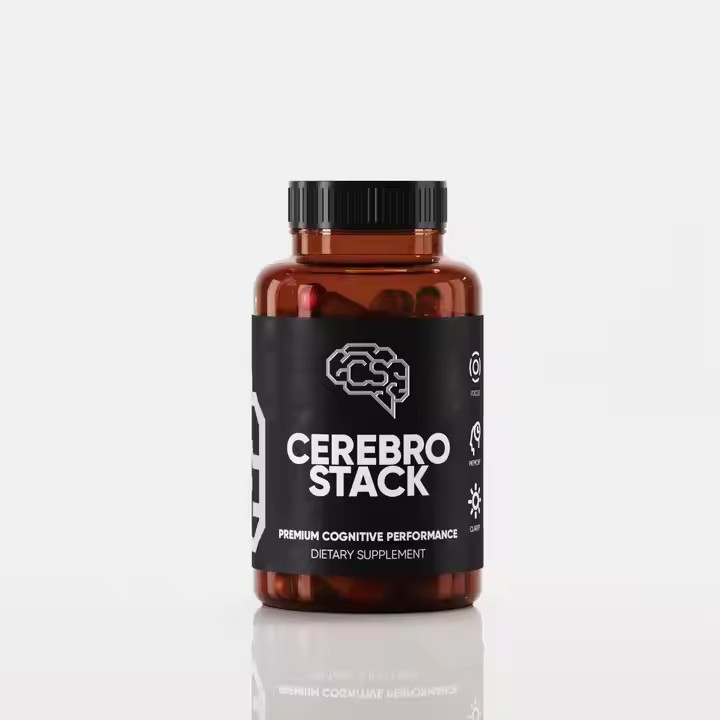
Highlight the Brand: Place the brand name or logo in a prominent position on the label, such as at the top or in the center. Choose appropriate fonts and colors according to the brand style. If the brand takes a high-end and luxurious route, you can select fonts with an artistic and delicate feel, and use colors mainly like gold, silver, etc. If it focuses on a natural and fresh style, choose simple and soft fonts, and the color combination should tend to natural color systems like light green and light blue.
Reflect Product Features: If the candle has a unique fragrance, such as rose or lavender, mark it with a larger font on the label and match it with corresponding floral patterns. For candles with special effects, such as sleep-aid candles, you can add some elements representing tranquility and relaxation, like patterns of the moon, stars, etc.
Determine the Style and Theme: Determine the overall style according to the usage scenario and target audience of the candle. For example, for candles used in weddings, the label style can be designed to be romantic and elegant, using soft tones like pink and white, and matching elements such as hearts and lace. For Christmas candles, use red and green as the main colors and add Christmas elements like Santa Claus, snowflakes, and bells.
Apply Design Techniques
Color Matching
Choose the Main Color: Select the main color inspired by the color or fragrance of the candle itself. For example, for a lemon-scented candle, you can use yellow as the main color, and for an ocean-scented candle, use blue as the main color. You can also determine it according to the preferences of the target audience. For female audiences, you can choose soft and sweet colors; for male audiences, choose more stable and low-key colors. When using colors, try to choose those that are more in line with the product itself. For example, if the candle is a high-end brand product, when using the outer sticker, try to use gold, white, or silver, which is more in line with the positioning of a high-end candle.
Match the Secondary Colors: Secondary colors are used to highlight important information or add visual layers. Generally, choose colors that are coordinated with the main color. For example, if the main color is blue, the secondary color can be white or light blue to create a fresh and comfortable visual effect. Use some secondary colors because they can well embellish the overall color tone and bring new visual experiences to consumers, attracting their attention and making them more likely to consume the candle product.
Patterns and Illustrations
Simple Patterns: For simple-style candle labels, you can use simple geometric patterns such as circles, squares, and lines for combination and arrangement to create a simple and modern visual effect.
Hand-drawn Illustrations: Hand-drawn illustrations can add an artistic and interesting touch to the candle label. You can draw scenes related to the candle’s fragrance or theme. For example, for a forest-themed candle, draw a vibrant forest scene with elements like trees and small animals, allowing consumers to more intuitively feel the product’s atmosphere.
Patterns such as the sun, moon, and stars are commonly used elements in candle labels, which can create a dreamy and romantic atmosphere. For example, a full moon with stars can be used for Mid-Autumn Festival-themed candles; the pattern of a shooting star across the starry sky is suitable for candles with themes of making wishes and blessings. In addition, meteorological elements such as clouds, raindrops, and snowflakes can also be designed according to different scenarios and themes. For example, snowflake patterns are used for winter or Christmas-themed candles, and raindrop patterns can be used for candles with a fresh and soothing atmosphere.

Insect patterns such as butterflies and bees can add a sense of liveliness and vitality to the candle label; while cute animal images such as cats, dogs, and rabbits are suitable for candles with children or pet themes, which can easily build a closer relationship with consumers and make them feel more attached. If you want to reflect the natural and environmentally friendly concept of the candle, you can also choose forest animal patterns such as elk and squirrels.
Text Layout
Clear Information Hierarchy: Place important information such as the brand name and product name in a larger font at the top or in the center, and arrange other information such as ingredients and usage methods in a smaller font at the bottom or in secondary positions.
Choose the Right Font: The style of the font should match the overall design style. Serif fonts can be used for formal and elegant occasions; sans-serif fonts are suitable for modern and simple styles; and for children or creative-themed candles, cartoon or artistic fonts can be used.
Materials and Processes
Select Textured Materials: Choose appropriate label materials according to the positioning of the candle. For high-end candles, you can use textured special paper, kraft paper, or paper with a texture to increase the product’s quality feel; for ordinary household candles, general coated paper or matte paper can be used. Choosing different textured label papers can create different impressions because different materials bring different visual effects. You should make different choices according to the company’s positioning and the product’s tone.
Add Special Processes: Improve the texture and visual effect of the label through special processes such as hot stamping (gold or silver), embossing, and UV varnishing. For example, hot stamping the brand name or pattern on the label can make the label more eye-catching and luxurious.
