
Modern Interpretation of Traditional Heritage: Translating Historical Symbols
Cigar culture is deeply rooted in colonial history and maritime trade. Therefore, label pattern design must balance the inheritance of traditional elements with modern reinterpretation. As the birthplace of cigars, Cuba’s cigar labels often feature shields, crests, and tobacco leaf motifs — essentially extensions of 16th-century Spanish heraldry, originally used as marks of authenticity and quality. Modern design should avoid direct imitation, instead abstracting and reconstructing these core symbols.
Take the tobacco leaf motif as an example. Traditionally rendered in a realistic, winding form, it can be modernized using geometric line art — continuous curves can simulate the natural arcs of growing leaves, with line weight variation creating a sense of light and shadow. This preserves recognizability while embracing contemporary minimalism. The shield symbol can be deconstructed into irregular polygons filled with simplified family emblems — for instance, abstracted animal crests formed from symbolic lines — retaining a sense of heritage while aligning with current visual preferences.
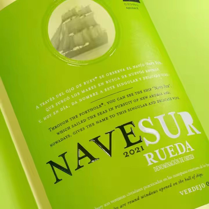
Date markings should convey both historical weight and legibility. Serif typefaces reminiscent of Gutenberg-style printing, paired with slight vintage effects like worn edges or faded textures, can reflect the time-honored value of cigars. Subtle modern touches — such as ultra-fine metallic lines embedded in leaf motifs that are only visible from certain angles — preserve the retro feel while adding refined detail and anti-counterfeiting functionality.
Visual Encoding of Regional Identity: Expressing Terroir Through Design
Cigar quality is inextricably linked to its origin, and label design should act as a visual passport of place. Distinct natural and cultural features from each producing region must be translated into unique symbolic languages, helping consumers intuitively associate pattern with provenance.
Cuban cigars can incorporate plantation elements. For instance, the limestone topography of Pinar del Río can inspire jagged border lines, while the colonial arch windows of Havana’s architecture can inform the label’s upper decorative elements. Dominican cigars may draw from Caribbean nature — stylized palm leaves or curving wave motifs, rendered in lively lines to evoke tropical vibrancy. Nicaraguan labels could adopt Mayan geometries — pyramidal silhouettes or sun calendar symbols transformed into background textures that express cultural richness.
The use of regional elements should avoid clichés or visual clutter. Aim for impressionistic, not literal, representation. For example, rather than realistically depicting tobacco fields, use flowing parallel curves and a green gradient to hint at the landscape while maintaining abstraction and aesthetic imagination.
Constructing Visual Hierarchy: Organized Information Flow
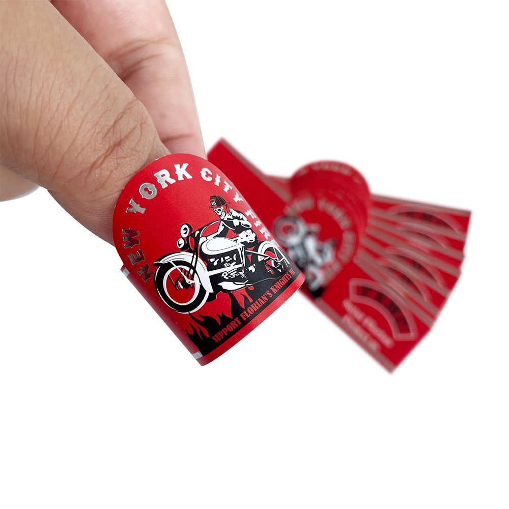
Despite their small size, cigar labels must carry brand name, origin, model, year, and more. Pattern design should establish a clear visual hierarchy to guide viewers through this information in order of importance. A three-tier structure is ideal: core identity layer, supporting information layer, and decorative layer — each distinct but interrelated.
The core identity layer lies at the visual center, typically containing the logo or key graphic, occupying 30–40% of the label. Examples include Cohiba’s “man-beast” symbol or Montecristo’s “three crowns” icon, both symmetrically composed for recognizability at small sizes. Serif fonts with historical character — like Didot or Bodoni — enhance visual impact with contrasting strokes.
The supporting information layer surrounds the core and includes text like origin and model. Font size should be 1/3 to 1/2 that of the brand name, using sans-serif type for readability. Fine lines or frames can divide this layer from the core, creating distinct zones without disrupting visual unity.
The decorative layer frames the label’s edges or background, adding atmosphere and balance. This includes scrollwork, geometric patterns, or anti-counterfeit watermarks. Complexity should contrast with the core — if the center is intricate, decoration should be restrained, and vice versa. For example, Romeo y Julieta labels pair a clean brand name with detailed floral scrollwork around it, creating rhythm through contrast.

Color Pairing and Depth
Color is critical to visual hierarchy. The core layer should use high-contrast combinations — like deep red and gold, or black and silver — for visibility. Supporting and decorative layers can use lower-contrast tones such as light gold, ivory, or taupe to avoid overpowering the main visuals. Limit the palette to 3–4 colors to maintain an elegant and dignified style aligned with cigars’ luxury positioning.
Material-Craft Synergy: A Dual Sensory Experience
Cigar label pattern design is not solely visual — it must also align with material selection and printing techniques to deliver a tactile and visual experience that enhances perceived quality. The same pattern can convey vastly different impressions depending on material and finish, so combinations should be chosen based on brand positioning and product tier.
