
I. Start with the Core Function of the Label: Avoid Design for Design’s Sake
At its core, a perfume label is a communication tool. Every design decision should serve two primary goals:
Reduce cognitive load: Enable consumers to understand within 3 seconds what the product is (category), who it’s for (target audience), and what level it is (price positioning);
Reinforce brand recall: Use distinctive elements (graphics, materials, layout) to help the product stand out on shelves or screens and establish a strong link to the brand.
Examples: Luxury perfumes like Chanel No.5 never overload the label. Instead, they use minimalist typefaces and the iconic bottle silhouette to convey an effortless sense of prestige. In contrast, niche artisanal brands like Diptyque use hand-drawn illustrations and script fonts to evoke a sense of artistry and individuality. — First clarify the product’s core value, then amplify it through design.
II. Break Down the Label’s Key Elements: From Information to Visuals
- Information Hierarchy: Clear First, Then Beautiful
Label content must follow a clear hierarchy. Overloading with text leads to confusion. A typical priority structure is:
Primary (Must be prominent): Brand name + product name (e.g., “Tom Ford Oud Wood”). These should be in bold, clear fonts, typically centered or placed at the visual focal point.
Secondary (Aid identification): Key selling points (e.g., “Limited Edition,” “Woody Scent”) or usage cues (e.g., “For Evening Wear”). Visual symbols like a moon icon can replace text.

Tertiary (Functional info): Volume (50ml), concentration (EDP/EDT), ingredients (for sensitive skin users), and production info (batch number, expiration). Fonts may be smaller but must remain legible, typically placed at the bottom or side.
Bad Example: A domestic perfume brand placed “Natural Plant Extracts” and “French Perfumer” alongside the brand name, making it unclear at a glance which was the actual brand—too much info equals poor communication.
- Visual Language: Convey “Scent Impressions” with Imagery and Color
Perfume is a sensory-driven product, and the label should help visually translate the olfactory experience so consumers can anticipate the scent through design.
Color:
Cool tones (blue, green, grey) suggest fresh scents (e.g., citrus, aquatic notes);
Warm tones (gold, brown, red) suit intense scents (e.g., amber, leather, oriental notes);
Muted “Morandi” tones fit soft floral fragrances (e.g., rose, lily of the valley).
Graphics: Abstract visuals allow for more imagination:
Geometric shapes (straight lines, triangles) work well for modern fragrances (e.g., CK ONE’s minimalist lines signal gender-neutral youth);
Organic curves (flowing water, intertwining vines) suit romantic floral scents (e.g., Jo Malone’s lily of the valley sketch reflects softness and nature);
Vintage motifs (Baroque flourishes, gold borders) suit classic rich scents (e.g., Guerlain’s “Shalimar” uses gold accents to imply luxury and heritage).
Typography: Font style should align with scent tone:
Serif fonts (decorative ends) for classic, elegant fragrances;
Sans-serif fonts for modern, gender-neutral scents;
Script fonts for niche, artistic perfumes — but always ensure legibility.
Core Principle: Ensure visual elements match the scent experience — e.g., a “marine scent” with gradient blues and wave-like lines is more evocative than simply writing “ocean fresh.”
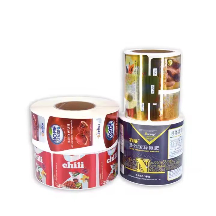
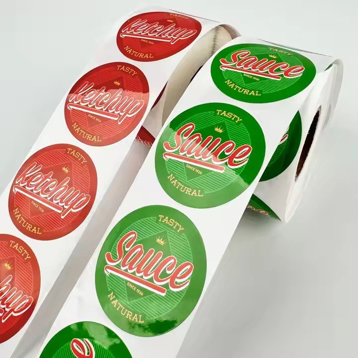
- Material and Finish: Use Tactile Cues to Elevate Perceived Value
Material and printing technique convey invisible luxury — especially for mid-to-high-end perfumes, texture matters more than visuals alone.
Base Materials:
Coated paper + matte lamination: Suitable for mass-market products. Low-cost, easy to print, gives a clean look.
Specialty paper (e.g., cotton, vellum): Suited for natural or niche brands; adds texture and a handmade feel.
Metal foils (gold/silver): For premium or limited editions. Reflective materials boost a sense of opulence. (e.g., Penhaligon’s animal-head collection uses metal labels that echo the sculpted bottle caps for a “collectible” vibe.)
Finishing Techniques:
Hot stamping (gold/silver): Adds metallic detail to text or icons. Use sparingly to avoid looking flashy.
Embossing/Debossing: Creates a tactile effect, often used on the brand logo to add texture perception.
Spot UV: Applies gloss coating on key text like “Limited Edition” to create a contrast with matte areas and enhance layering.
Tip: Match material to use case —
Spray bottles need waterproof labels (to avoid smudging);
Portable roll-on perfumes (e.g., 10ml) require abrasion-resistant labels (PVC recommended).
III. Design for Positioning: Different Brands Require Different Label Logic
- Mass-Market Perfumes: Clarity Beats Subtlety
Target audience: General consumers (not fragrance enthusiasts); value clarity and shareability.
Design focus:
Vivid color schemes (e.g., pink = floral, blue = fresh);
Literal graphics (e.g., a rose image = rose scent);
Straightforward messaging (e.g., “Lasts 72 Hours” in bold);
Clean layout, no complex patterns — ensure key info is legible even from a distance on shelves.
