
I. Design Logic: Based on “Transparency Characteristics”, Clarify Core Objectives and Information Hierarchy
The design logic of transparent box seal stickers differs from that of ordinary opaque stickers. It is necessary to prioritize the “superimposed effect of the transparent background and the products inside the box” to avoid visual conflicts between information and products. At the same time, clear goal positioning and information hierarchy ensure the design does not deviate from its core functions.
First, the core objective of the design must be clarified, as different objectives determine the focus of the design. If the goal is “brand recognition”, brand logos and slogans should be used as core elements to ensure consumers capture brand information the moment they come into contact with the transparent box. If the goal is “product description”, key content such as product names, core selling points (e.g., “food-grade material”, “handmade”), and usage scenarios should be prioritized to help consumers quickly understand the product’s value. If the goal is “promotion guidance”, promotional information such as “limited-time discount” and “buy one get one free” should be highlighted, using strong visual symbols to attract attention. For example, for the seal sticker of a transparent bakery box, if the core goal is brand recognition, the logo can be placed at the visual center, paired with simple lines in the brand’s main color. If the core goal is product description, information such as “shelf life”, “storage method”, and “ingredient list” should be clearly marked to prevent information from being overlooked due to the transparent background.
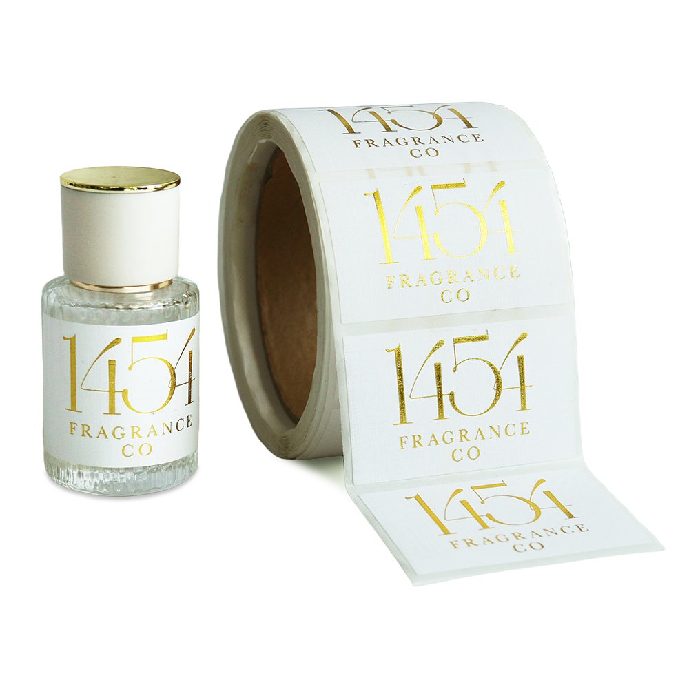
Second, a reasonable information hierarchy must be established to avoid visual confusion caused by information overload. The information on transparent box seal stickers should be divided into three levels: “core information, auxiliary information, and decorative elements”. Core information (e.g., logos, product names, key selling points) should occupy the visual focus, accounting for no less than 30% of the total sticker area to ensure visibility from a distance. Auxiliary information (e.g., specifications, usage tips, QR codes) should be placed around the core information, with a font size 1-2 sizes smaller than the core information. It should also be designed with light colors or thin lines to avoid overshadowing the core content. Decorative elements (e.g., lines, patterns, textures) should be extremely simple and only serve as an aid for information partitioning, accounting for no more than 10% of the area to prevent covering the products inside the box or interfering with information reading. For example, on the seal sticker of a transparent cosmetic sample box, the core information includes the brand logo and product name (e.g., “Hyaluronic Acid Serum”), the auxiliary information includes capacity (“5ml”) and usage tips (“once a day”), and the only decorative element is a thin line separating the information areas. This design is clear and does not affect the display of products inside the box.
II. Visual Presentation: Adapt to Transparent Carriers, Enhance the Dual Effects of “Setting Off and Highlighting”
The visual design of transparent box seal stickers should focus on “how to highlight information against a transparent background while setting off the products inside the box”. Through the scientific matching of colors, fonts, and graphics, the dual effects of “clear information and eye-catching products” can be achieved.
Color selection must balance “information highlighting” and “product coordination”. Over-reliance on high-saturation colors should be avoided, as should overly pale colors that blur information. First, the background color can be either a “contrast color” or a “same-color system” based on the color of the products inside the box. If the products inside are light-colored (e.g., white towels, light-colored pastries), the sticker’s background can use low-saturation colors such as light blue or light pink. This highlights the sticker’s outline without causing visual conflicts with the products. If the products inside are dark-colored (e.g., dark chocolate, black jewelry), the sticker’s background can use light colors such as white or off-white to make information easier to identify through light-dark contrast. Second, the color of text and graphics must form a strong contrast with the background color. For example, light blue backgrounds can be paired with dark blue text, and white backgrounds with black or dark gray text to ensure text clarity. For core information (e.g., promotional slogans), the brand’s main color or eye-catching colors such as orange and red can be used, but the area of these colors must be controlled to prevent overly bright colors from overshadowing the texture of the products inside the box. In addition, large areas of dark backgrounds should be avoided. Dark colors tend to create a “depressive feeling” on transparent carriers and may reflect light, making information unreadable. They are especially unsuitable for displaying products such as fresh food and baked goods that need to highlight “freshness”.

Font selection must follow the principles of “readability first and style matching” to avoid using complex fonts that hinder information transmission. For body text, sans-serif fonts (e.g., Microsoft YaHei, Source Han Sans) are preferred. These fonts have clear strokes and simple structures, which do not cause visual fatigue against a transparent background and are suitable for stickers of different sizes. For core information (e.g., brand logos, product names), slightly more designed fonts (e.g., bold black fonts, rounded fonts) can be used, but font recognition must be ensured. Art fonts, handwritten fonts, or overly thin fonts should be avoided—art fonts easily distort text, handwritten fonts are hard to recognize on small-sized stickers, and overly thin fonts may have broken strokes due to printing accuracy issues. At the same time, font size should be adjusted according to the sticker size and the importance of information. For small-sized stickers (e.g., within 5cm×5cm), the body text font size should not be less than 8pt, and the core information font size should not be less than 12pt. For large-sized stickers (e.g., over 10cm×10cm), the font size can be appropriately increased, but text should not cover the entire sticker. Sufficient blank space should be reserved to integrate with the transparent background. For example, on the seal sticker of a transparent stationery box, the product name can use 14pt bold black font, and the specification information can use 10pt regular black font. This design is clear and conforms to the simple style of stationery products.
