
- Natural Symbols: Using “Subtractive Aesthetics” to Reflect Local Ecology
Australia’s vast landscapes and unique flora and fauna are the most central sources of inspiration for local aesthetics. When designing lighter stickers, the selection of natural elements should follow the principle of “highlight the iconic, remove the redundant,” using minimalist symbols to convey ecological texture while avoiding cluttered realism.
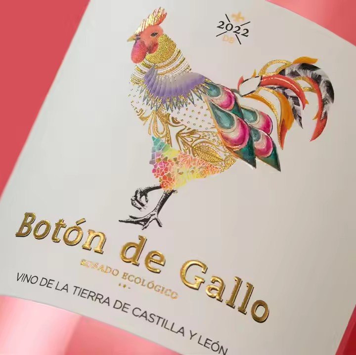
Element selection: Focus on highly recognizable native species and landscapes. Animals could include kangaroos (side-view jumping pose for dynamism), koalas (hugging eucalyptus branches in a relaxed posture), and emus (elongated silhouette in simplified form). Plants may include golden wattle (yellow flower clusters reduced to dot symbols), jacaranda (purple petals simplified as curved lines), and eucalyptus (leaf outlines abstracted as geometric shapes). Landscapes could include Uluru (red rock mass paired with ground-shadow color contrast), the Great Barrier Reef (light blue–green gradient), and lone savanna trees (deep green trunk with a circular crown). These elements carry an “Australian imprint,” instantly evoking emotional resonance without extra explanation.

Visual style: Abandon intricate textures and excessive details, instead adopting a minimalist “line + color block” approach. For example, a kangaroo could be drawn with a single smooth dark-brown line outlining the body, left unfilled, with a light-brown shadow only at the tail for depth—two colors sufficient for a lively, dynamic effect. Uluru could be simplified into a 2/3 red color block on the left, a light-brown gradient for ground on the right, and a faint orange wash in the background—capturing the landscape essence without overwhelming small sticker sizes. This “subtractive” approach aligns with Australians’ pursuit of authenticity in nature while ensuring clarity and instant recognition in compact formats.
- Cultural Elements: “Restrained Expression” to Integrate Diverse Meanings
As a multicultural nation, Australia’s aesthetics blend Indigenous heritage with the casual lifestyle of immigrant communities. Designers should respect boundaries, avoiding overuse, and allow cultural elements to flow subtly into designs.
Indigenous culture: Avoid directly replicating sacred or historically significant totems (to prevent cultural appropriation). Instead, use universal and non-restricted motifs such as dot painting, circular patterns (symbolizing waterholes or campsites), and straight lines (representing roads and rivers). For instance, with a beige background, the left side could feature three uneven brown dots suggesting rocky clusters, and the right side a curved white line symbolizing a river—ample negative space retains rhythm and connection to the land while staying light and approachable.
Leisure culture: Focus on outdoor activities Australians love—surfing, barbecues, camping—again in minimalist form. A surfing scene could be a light-blue curve (wave) with a black silhouette figure (simply a body holding a board, no facial details) above it, with a blank background—pure visual shorthand for beach energy. A barbecue scene could use an orange circle (grill) plus two light-brown short lines (sausages)—no need for charcoal or furniture, yet it evokes the relaxed vibe of outdoor gatherings. This “unpolished, effortless” expression perfectly matches Australians’ casual lifestyle, turning cultural motifs into emotional touchpoints.
- Color System: “Native Tones” that Fit Local Preferences
Color is a key carrier of aesthetic identity. Australians generally prefer soft, low-saturation, nature-oriented tones that reflect land and environment—avoiding harsh saturation and strong contrasts. For lighter sticker design, the palette should center on “earth tones + natural tones,” with main colors such as off-white, light brown, tan, pale blue, deep green, and light yellow—shades inspired by desert, grassland, ocean, and vegetation.
Application examples: A koala could be rendered in light gray with a muted green trunk, a gentle combination that avoids sharpness. A jacaranda theme sticker could use soft purple curves for petals against an off-white background, creating a romantic “purple bloom” feeling without heaviness.
Color logic: Follow the “three-color rule” to avoid clutter. Classic approaches include:
Earth-tone dominance: light brown (kangaroo outline) + muted green (eucalyptus leaves) + white space for balance.
Natural gradient: pale blue (sky) fading into soft purple (sunset) with a white line splitting the horizon—color progression conveys ambiance without complexity.
