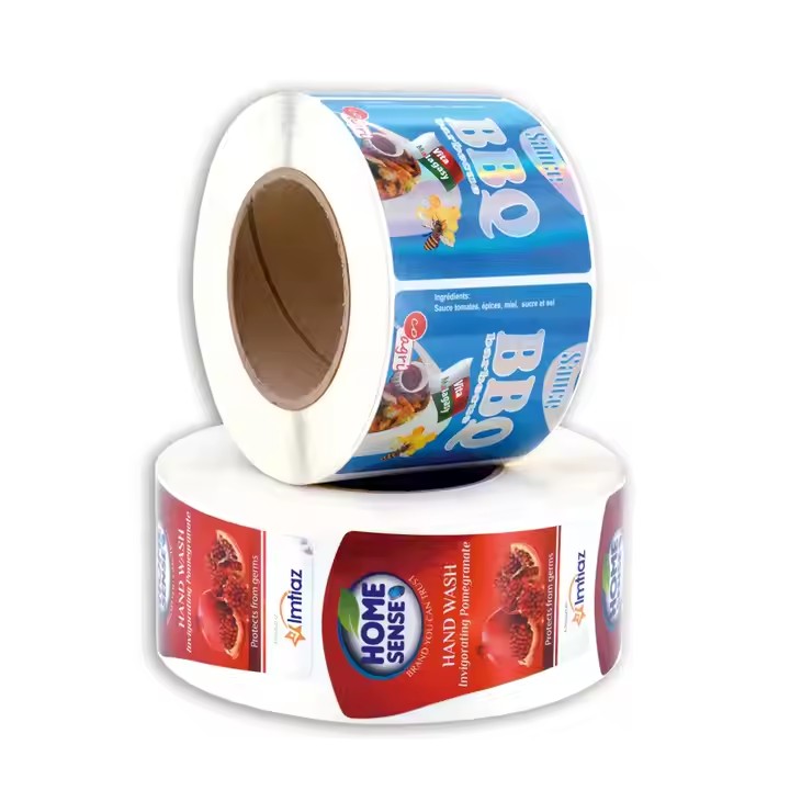
- Use of Color: Create Strong Visual Impact
Color is the first thing people notice. The right colors help catch attention quickly. For example, orange reminds people of Hermès because it’s used consistently in their packaging—this shows how powerful color association can be.
(1) Choose Basic Safety Colors
Use standard safety colors:
Red = danger or stop (e.g. “No Fire”, “High Voltage”)
Yellow with black = caution (e.g. “Watch Your Step”)
Blue = instructions (e.g. “Wear Safety Helmet”)
These colors match what people already know—like traffic lights. Using these familiar colors helps people understand the warning faster.

(2) Use High Color Contrast
High-contrast colors make stickers easier to see. For example:
White text on a red background
Black text on yellow
Blue background with orange elements
Warm vs. cool color combinations (like red vs. green or black vs. yellow) also grab attention and make the message stand out.
- Use Symbols: Communicate Clearly Without Words
Symbols are easy to understand and don’t need translation. A good symbol can make your brand or warning more memorable.
(1) Use Standard Warning Symbols
Use symbols that are globally recognized:
Skull = toxic
Exclamation mark = general warning
Lightning bolt = electric danger
These symbols help people quickly understand the warning, even without reading the text.
(2) Customize Symbols for Specific Situations
You can adjust standard symbols to fit the situation. For example:
In a lab, combine a spilled chemical bottle with a skull icon to show chemical danger.
On a construction site, show a person falling with a “Do Not Enter” sign to warn about open shafts.
Keep symbols simple and clear so they can be seen from far away or in poor lighting.
- Text Design: Make Information Easy to Read
Text gives detailed warning information. Good layout helps people understand it quickly.
(1) Choose Clear Fonts

Use clean, easy-to-read fonts like Arial or bold Chinese Heiti .
Make key words like “DANGER” or “DO NOT TOUCH” larger and bold (1.5–2 times bigger than normal text).
(2) Organize Text and Use White Space
Start with the most important message: e.g., “HIGH VOLTAGE – DO NOT TOUCH”
Add more details in smaller text: e.g., “Voltage: 10KV”
Leave enough space between lines so it’s not crowded. Also make sure the text color contrasts well with the background to stay readable in different lighting.
- Size and Shape: Fit the Usage Environment
Sticker size and shape should match where and how they are used.
(1) Choose the Right Size
For large places like factories or construction sites, use big stickers (A3 or A2) so they can be seen from far away.


