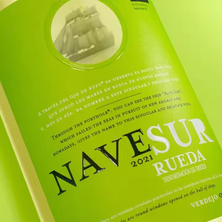
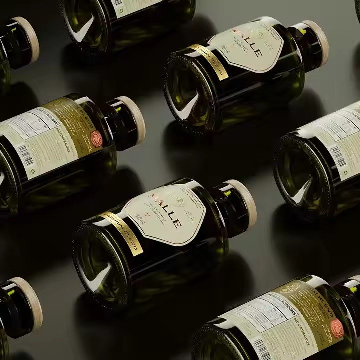
As the first visual touchpoint between a bottle of wine and the consumer, the wine label serves not only as an information carrier but also as a direct expression of brand sophistication and product quality.
A premium wine label must go beyond simple information layout — it should be built around the core concept of “culture as the soul, texture as the foundation, and detail as the charm.”
By harmoniously combining color, typography, graphics, and finishing techniques, designers can create a refined visual atmosphere that matches the rituals of wine appreciation, making the label itself an extension of the product’s high-end identity.
- Color Palette — Conveying Elegance Through Restraint
Color is the foundation of a refined wine label and should follow the principle of “less is more.” Using low-saturation, high-texture tones helps communicate elegance and class.
Traditional labels often appear gaudy due to excessive use of bright reds and golds. In contrast, premium labels favor a “monochrome base with subtle accent colors” approach.

Primary colors should reflect the wine’s character or origin.
To highlight richness and tradition, choose deep tones such as Burgundy red or dark wine red — low in saturation, dark in value, and naturally evoking a sense of depth and heritage that echoes the wine’s hue.
To emphasize freshness and purity (as in dry whites or dessert wines), select off-white, pale gold, or soft gray — light tones paired with fine textures that create a clean, sophisticated impression suitable for upscale dining or private tastings.
Accent colors should be limited to one or two, forming a low-contrast pairing with the main tone — for instance, matte gold with Burgundy red or dark brown with cream white. Avoid sharp contrasts that disrupt visual harmony.
Additionally, color zoning can help structure information hierarchy — the main tone can carry the logo and key visuals, while accent colors highlight vintage, alcohol content, or region, ensuring clarity within an elegant, cohesive presentation.
- Typography — Elevating Refinement Through Simplicity
Typography defines the craftsmanship of a label. The key is to avoid ornate or decorative fonts and instead focus on “simplicity, elegance, and legibility.”
Title fonts (brand name, wine name) should favor serif or custom-designed typefaces.
Serif fonts such as Didot or Bodoni exude a vintage elegance and strong contrast between strokes, perfect for classic red wines, symbolizing tradition and prestige.
Custom typefaces can integrate brand DNA — for example, incorporating a vine or wine glass motif into the initial letter — enhancing recognition and exclusivity, a hallmark of luxury labels.
Body fonts (origin, year, tasting notes) should use sans-serif or fine serif fonts to maintain readability at small sizes, such as Helvetica Light or Georgia Light, ensuring a clear, airy layout.
In terms of layout, follow the principle of “space is luxury.” Avoid overcrowding; let key information breathe.
The brand and wine name can occupy the upper two-thirds of the label, centered and enlarged for prominence, while product details can be neatly aligned on the lower third in smaller 6–8pt text. The resulting contrast between large titles and fine text creates a refined and balanced composition.
- Graphics and Visual Elements — Expressing Culture Through Symbolism
Graphic design should align with the cultural and geographic identity of the wine, focusing on minimal, symbolic imagery rather than cluttered realism.
Mass-printed motifs like grape clusters, wine glasses, or châteaux often look dated; luxury design favors abstraction and reduction — conveying meaning through elegant restraint.
To emphasize terroir, simplify the region’s map into a fine-line contour, using soft metallic hues (like pale gold) to outline the shape — elegant and informative without excess.
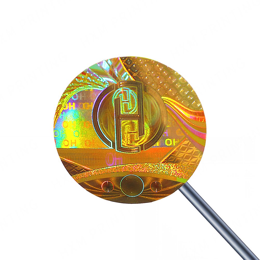
To emphasize heritage, integrate the founding year or emblem into a seal-like design, using hot-stamping (gold/silver foil) to give a “mark of craftsmanship” feel.
Another advanced approach is using texture instead of imagery — embossing patterns of vines or wine ripples onto a plain label.
These subtle relief textures reveal delicate depth under light, enhancing the tactile and visual luxury without visual clutter — a signature detail in premium red wine labels.

Designers should also limit themselves to no more than one or two graphic elements to preserve cohesion. For example, a vintage-inspired label can pair minimalist château lines, while a contemporary label can feature abstract wave motifs — ensuring stylistic unity and avoiding aesthetic dissonance.
- Finishing Techniques — The Final Touch of Luxury
Material and finishing choices are what transform visual beauty into tactile refinement. Avoid standard coated papers and choose premium specialty papers:
For a vintage look, select leather-textured or linen papers with natural grain. When combined with foil stamping, they evoke a sense of handcrafted luxury — ideal for classic red wines.
For a modern minimalist style, choose matte PET paper or translucent vellum. Matte PET offers a non-reflective surface and soft color presentation, perfect for contemporary premium wines.
Through the interplay of paper texture, color restraint, typographic precision, and artisanal finishing, a wine label can transcend mere decoration — becoming a tangible expression of heritage, elegance, and prestige.


