
- Material Adaptation: Seamless Integration with Glass
The smooth surface, transparency, and usage environment of glass tubes (such as high temperatures or humidity) make material selection the foundation of standout sticker design.
Transparent Base: Enhancing Clarity and Depth
For decorative glass tubes (e.g., reed diffusers, specimen vials), high-transparency PET material (light transmittance ≥95%) can be used along with UV spot foiling or laser printing techniques to create subtle layering effects under light.
Example: On a sticker for a diffuser bottle, print gradient botanical silhouettes on a transparent base, leaving some areas blank to let the liquid inside remain visible—emphasizing the natural theme and fluid beauty.
For lab glass tubes, corrosion resistance is crucial. Use polyimide (PI) material with high-temperature-resistant inks (withstand ≥200°C), ensuring durability during alcohol sterilization or heat exposure. A matte coating reduces glare, keeping measurement markings and data clearly readable.
Textured Contrast: Creating Tactile Memory Points
For decorative uses (e.g., handmade candle jars, cultural merchandise), add a frosted coating along the edges to contrast the smooth glass texture, or use localized embossing (e.g., raised letters or geometric patterns) for tactile interaction.
Example: For a vintage-inspired sticker, replicate the texture of old typewriter fonts with embossing and a semi-transparent kraft-tone base to evoke nostalgia.
- Graphic Design: “Flowing Aesthetics” for Curved Surfaces
The cylindrical or curved surfaces of glass tubes require designs that go beyond flat layouts. Embrace extension, wrapping, and dynamic balance for 360° visual appeal.
Wrap-Around Composition: Narrative Along the Curve
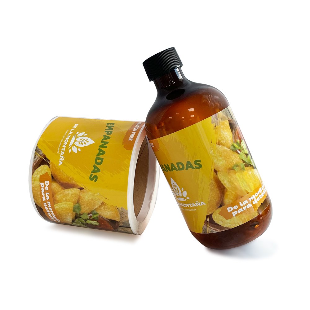
For longer glass tubes (e.g., test tubes or message bottles), use continuous wrap-around graphics. Break illustrations into visual units that seamlessly connect around the tube.
Example: For an ocean-themed design, depict waves on the left, marine life like shells and starfish in the center, and beach silhouettes on the right. When the tube rotates, it reveals a scene of “waves flowing onto the shore.”
If the tube displays inner content (e.g., specimens, dried flowers), use a “half-wrap” concept—design enlarged botanical cells on one side, leaving the opposite side clear. This asymmetric layout highlights the specimen while avoiding visual clutter.
Negative Space: Making Glass Part of the Design
Use the glass’s transparency creatively, integrating the sticker with its contents and surroundings.
Example: On a starry night theme, print constellation outlines as hollowed designs on a black sticker. Light passing through the tube casts shadow constellations, combining the sticker and light into a complete picture. Alternatively, use gradient-transparent “glow” effects on the edges to softly blend the design with the clear glass, minimizing visual boundaries.
- Color Strategy: Balancing Transparency with Impact
Glass’s light-transmitting nature complicates color design—light refraction alters saturation, and liquids inside may affect sticker appearance. Color choices must account for both lighting and the contents.
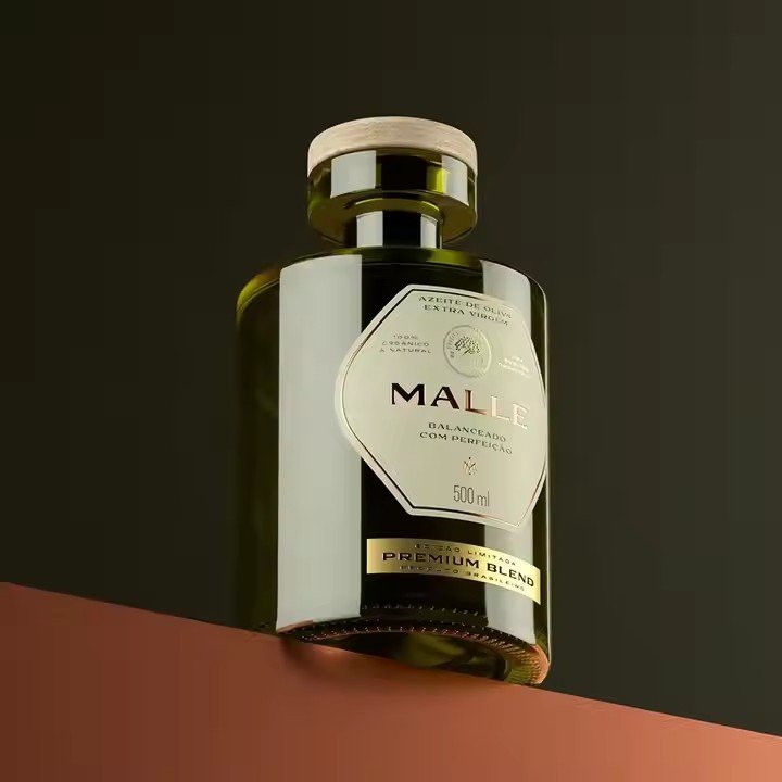
Low Saturation Tones: Sophistication Meets Clarity
For luxury cosmetic tubes (e.g., serums, essential oils), use Morandi tones (e.g., dusty pink, misty blue, ivory) with semi-transparent inks to blend harmoniously with clear glass.
Example: On a rose essential oil tube, apply a 50% transparent dusty pink base and overlay golden line art of a rose—highlighting the natural aesthetic while maintaining visual elegance.
Color Contrast: Enhancing Functional Clarity
For lab or industrial tubes, color helps differentiate functions quickly. Use high-saturation main colors with contrasting accents—e.g., red for acid containers (warning) with white measurement lines for clarity; blue for neutral solutions with yellow batch marks.
Avoid colors that may blend with internal liquids (e.g., no green stickers on green solutions).
- Functional Integration: From Visual to Practical
A standout sticker isn’t just about looks—it should also serve the usage scenario by improving information delivery, grip, and protection.
Information Hierarchy: Making Key Details Instantly Visible
For labeled tubes (e.g., reagent vials, vape liquid containers), structure information by priority:
Top: large fonts for key data (e.g., concentration, volume)
Side: smaller text for ingredients, expiration date
Bottom: QR code for product traceability
Use reversed text (white text on dark backgrounds) or fluorescent inks for night-lab environments to ensure readability in all conditions.
