
Kiss-cut stickers may look small and simple, but creating a design that’s eye-catching and practical involves thoughtful planning. From brand recall to appealing visuals and production feasibility, every detail counts.
- Align with the Brand and Define the Style
Start by identifying the purpose of the sticker and its target audience. If it’s for a children’s toy brand, go with playful, cute designs—think cartoon animals and magical elements. For a high-end beauty brand, opt for an elegant, minimalist aesthetic with soft tones and clean lines.
Color choice is key—make sure it matches the brand identity. Since people have limited attention and memory, aligning the sticker’s design with the product’s style and tone helps reinforce brand recognition.
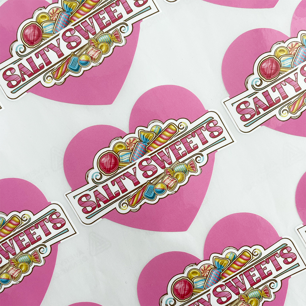
For example, a bubble tea shop targeting a youthful crowd might turn signature drinks into adorable cartoon characters with playful slogans like “Slurp Your Happiness!” If the brand leans more artistic, watercolor designs and poetic quotes can give it a tasteful touch. Stickers that reflect the brand’s personality become miniature ambassadors that leave a lasting impression.
- Attractive and Clear Visual Design
Stickers have limited space, so focus on highlighting the most important elements. If you’re promoting a new cake, place it at the center with minimal decorative elements like whipped cream swirls or cherries. Avoid clutter—too many elements can distract from the message.
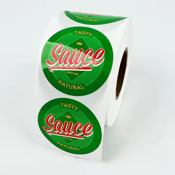
Use white space wisely; a balanced composition makes the design feel more open and pleasant. Color also sets the tone: reds and oranges convey energy, while greens and blues feel calm and natural. Stick to 3–4 coordinated colors to avoid visual chaos.
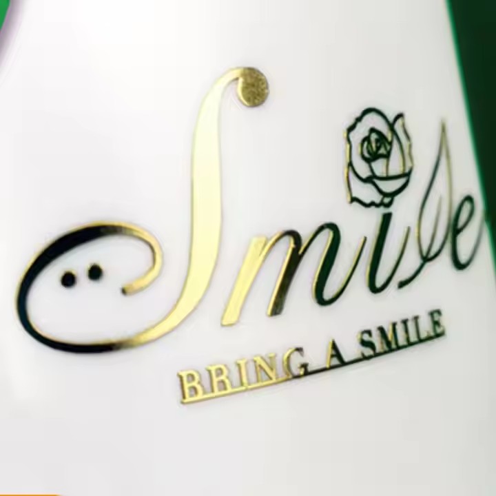
Typography matters. Make the main headline bold and readable at a glance. Descriptive text should be legible and well-spaced. Font style should align with the overall tone—use rounded, handwritten fonts for cute themes, and clean, sans-serif fonts for tech or modern aesthetics. Typography and tone must consistently reflect the brand identity.
- Production Feasibility
Even the most beautiful design won’t work if it’s hard to produce. Kiss-cut stickers are known for their custom edges, but avoid overly complex shapes like fine zigzags or tiny cutouts—they are hard to cut precisely and increase production costs. Keep a buffer between the design and the edge to prevent cutting errors or unsightly white margins.
Material choice affects appearance and use. Glossy paper stickers offer vibrant colors but aren’t waterproof—good for notebooks or cards. PET materials are shiny, durable, and water-resistant, great for water bottles or phone cases. Transparent PVC blends well with surfaces like glass or plastic. Always choose materials based on the intended use.
If you want premium finishes like gold foil or UV coating, plan those areas in the design stage. Clearly mark foil regions or textured areas to avoid mistakes during printing.
- Focus on User Experience
Stickers are meant to be used, so the user experience matters. If they’re hard to peel or tear easily, users won’t enjoy them. Add a small notch or perforated line to make peeling easier.
If the sticker conveys instructions or safety info, keep the text concise and well-structured with bullet points. For more engagement, consider interactive designs—like scratch-off elements revealing surprise messages or a collectible puzzle that forms a complete image when assembled. These playful touches boost user interest and brand visibility.
Designing kiss-cut stickers is like crafting a miniature piece of art. When you take the time to consider brand identity, visuals, materials, and user experience, you create stickers that are not only beautiful and functional but also memorable—maximizing their role in brand promotion and emotional connection.
