
- Regulatory Compliance: The Rigid Baseline for Information Transmission
The primary requirement for cosmetic stickers is compliance with the laws and regulations of the country of manufacture and sale—this is a non-negotiable baseline. Although mandatory regulations on cosmetic labeling vary across countries, their core revolves around the principles of “truthful, complete, and identifiable information.”
In China, the Regulations on Cosmetics Supervision and Administration and the Measures for Cosmetics Labeling explicitly specify the mandatory information on stickers: product name; name and address of the registrant/record holder; manufacturer’s name and address; cosmetic license number; ingredient list (labeled according to INCI international nomenclature); net content; shelf life (either production date or expiration date); usage instructions; and safety warnings (e.g., “avoid eye contact,” “pregnant women use with caution”). This information must be clearly legible, with no blurry fonts or concealed layouts—for example, font height must be at least 1.8 mm and must not be obscured by packaging folds or seals.
Exported products must meet the target market’s regulatory requirements. For the EU market, labeling must include Cosmetic Product Notification Portal (CPNP) information, and the ingredient list must highlight 26 allergens; the US FDA requires warning statements and distributor information; Japan’s Cosmetics Law mandates ingredient labeling in Japanese and country of origin indication. Non-compliance risks product seizure, recall, or sales bans.
Moreover, regulations strictly control the authenticity of information: medical claims such as “whitening” or “anti-wrinkle” are prohibited unless special cosmetic status is granted, and ingredient origins cannot be fabricated (e.g., claims of “natural extraction” must have solid evidence). Therefore, before producing customized stickers, legal or compliance departments must review the content to ensure text and data are free of compliance risks.
- Material Adaptation: Deep Matching with Product Characteristics
The choice of sticker material must comprehensively consider product properties, packaging materials, and storage environments. The core goal is to “maintain information integrity and avoid material conflicts.”
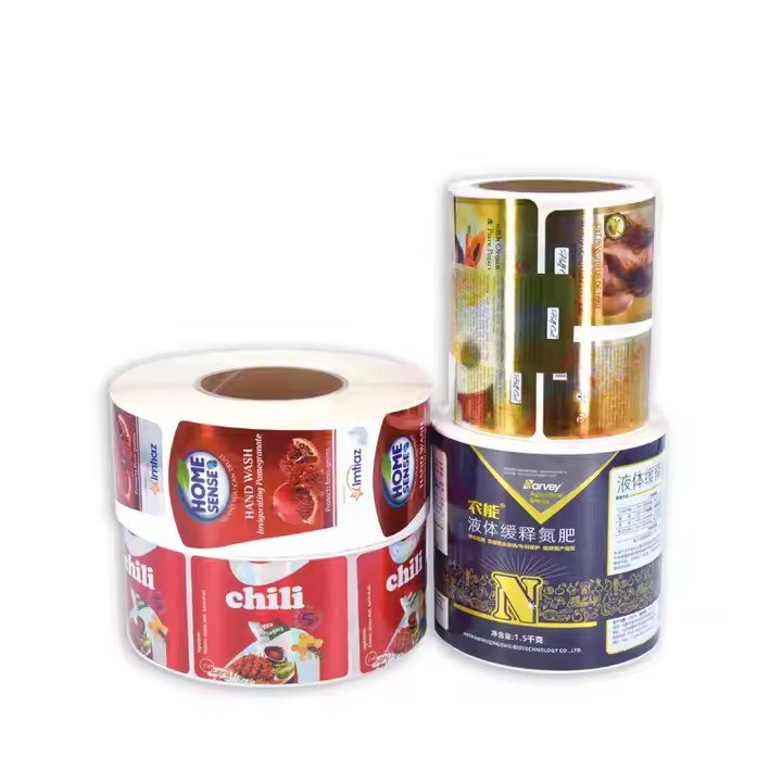
For product form: liquid cosmetics (e.g., toners, serums) require stickers with anti-penetration properties. Ordinary coated paper may cause ink bleeding due to liquid leakage; hence, coated paper with lamination or BOPP film materials with waterproof coatings are preferred to resist liquid corrosion. Cream products (e.g., face creams, eye creams) often contact oils, so stickers need oil resistance; PET material is recommended for its strong chemical resistance and low solubility in oils. Spray products have pressurized packaging, requiring tight-fitting stickers to avoid lifting due to pressure; synthetic paper with strong adhesive backing is commonly used.
Regarding packaging materials: glass bottles have smooth surfaces, so stickers need high-viscosity adhesives (e.g., acrylic glue) to prevent peeling; plastic bottles (e.g., PET, PE) may have mold release agents on the surface, requiring adhesives specialized for plastics; metal cans (e.g., ointment tins) require consideration of sticker adhesion and avoidance of chemical reactions between glue layers and metal that cause rust.
Storage environment is also critical. Cosmetics requiring refrigeration (e.g., some active ingredient serums) need stickers that tolerate low temperatures (-10℃ to 0℃); ordinary adhesives may harden and peel at low temperatures, so special low-temperature adhesives are necessary. Sunscreens used outdoors need stickers with UV resistance; materials with UV coatings can prevent fading caused by prolonged sun exposure.
- Visual Design: Precisely Connecting Brand Tone and Consumer Psychology
As cosmetics are emotional consumption products, sticker visual design directly impacts consumer purchase decisions but must balance aesthetics and functionality.
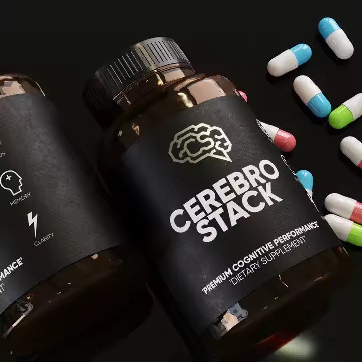
First, design must align with the brand tone. High-end skincare brands usually adopt minimalist styles, using low-saturation colors like matte gold, pearl white, and deep brown, combined with hot stamping or embossing to highlight texture (e.g., La Mer’s gold fonts on white matte stickers). Youth-oriented makeup brands may use high saturation, gradients, and illustration elements to create visual impact (e.g., Perfect Diary’s cartoon character stickers). However, designs must not obscure mandatory labeling, such as covering the ingredient list with patterns or distorting key information (e.g., making “shelf life” text unreadable with artistic fonts).
Second, design must consider shelf visual competition. On retail shelves, cosmetic stickers need to quickly convey core information within 0.5 meters—brand name, product type (e.g., “moisturizing cream”), and key selling points (e.g., “hyaluronic acid”). The main visual area should focus on these three types of information, using contrasting colors (e.g., white text on a dark background) and avoiding clutter. For example, serum stickers can enlarge the “hyaluronic acid” text accompanied by a water droplet graphic, allowing consumers to immediately grasp product features.
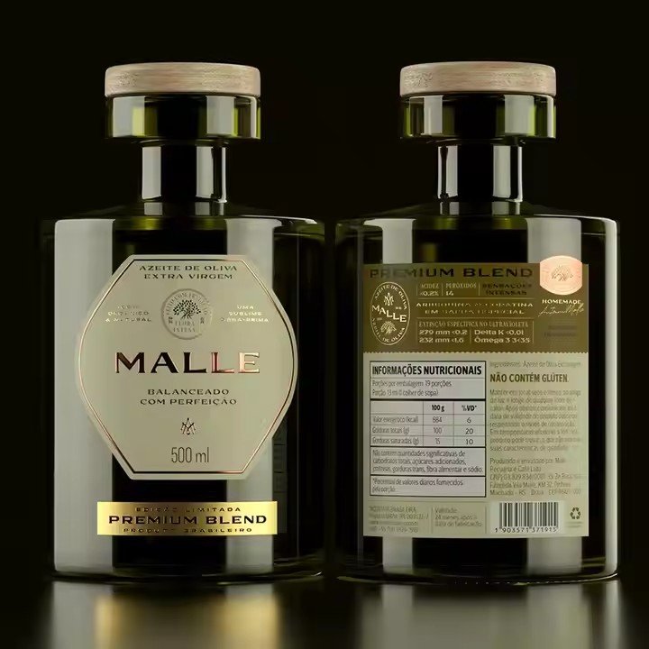
Finally, design must adapt to packaging form. Stickers for curved packaging (e.g., round bottles) should avoid horizontal layouts to prevent text distortion after application; flat square boxes can use full-bleed designs but must reserve folding areas; for pump bottles, stickers should avoid pressing zones to prevent wear from frequent contact. Transparent packaging (e.g., glass bottles) may use “cut-out” designs, revealing the product’s color (e.g., pink serum shown through clear stickers), enhancing product appeal.
