I. Purpose and Function
Identifying products: The most basic function of a label is to help identify products, so the design of the label plays an extremely important role in the product’s identity. For example, in an electronics factory, there are numerous product models. Clear information such as the product name and model on the label enables workers, quality inspectors, and consumers to quickly distinguish different products. For instance, on the label of a mobile phone, key identifying information such as the phone model and color will be clearly marked. Another example is electronic products like computers, which are relatively expensive. If you want to showcase your product positioning and introduce this electronic product in detail, you need to make corresponding designs on the label packaging.
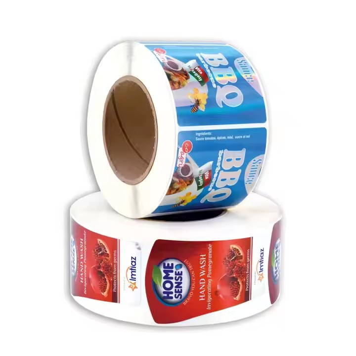
Providing instructions: Many products require labels to provide usage instructions, safety warnings, and ingredient information, etc. Taking a food factory as an example, food labels must include contents such as the ingredient list, shelf life, and storage conditions. For example, on the label of a jar of jam, it will state what fruit ingredients it contains, whether it contains allergens (such as peanuts), the range of the best consumption date, and important information such as the need to store it in a cool and dry place. For any product, the usage instructions are very important because some consumers may be allergic to the product or cannot consume it due to their own health conditions. Therefore, potential problems should be anticipated in the early stage of label design to avoid unnecessary issues.
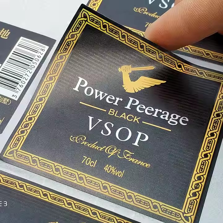
Brand promotion: Labels are an important platform for brand display. Factory-customized labels should highlight elements such as the brand logo, brand colors, and brand slogan. For example, the product labels of sports brands usually prominently display the brand logo (such as Nike’s swoosh logo) and adopt the brand’s characteristic colors (such as Nike’s black and white color combination) to reinforce the brand’s impression in consumers’ minds. The promotion of a brand should be combined with the current fashion trends and fashionable elements. If your product combines with the current fashion elements on the outer packaging and labels, then your product is likely to sell well in the market.
II. Target Audience
Consumers: If the main audience of the label is consumers, then the label design should focus on attractiveness and readability. For example, for the labels of children’s toys, bright colors, cute patterns, and simple and easy-to-understand words will be used to attract children and their parents. Meanwhile, the size and layout of the text on the label should be convenient for consumers to read, especially for some products where consumers need to quickly understand product information when purchasing, such as daily necessities. For different product users, the design should be targeted at specific subgroups of people because people of different age groups are different, and their cognitive and intellectual levels are also different. Therefore, different label packagings should be designed for different age groups to facilitate sales.
Internal personnel: When the label is mainly for internal use in the factory, the focus is on clarity and accuracy. For example, in an automobile manufacturing factory, the labels of parts used on the production line are mainly for enabling workers to quickly confirm the specifications and batches of the parts. At this time, the label may not require too many decorative elements but mainly consist of simple and clear text and codes. The business areas that workers are responsible for should be clearly defined, and their work responsibilities should be clearly understood to effectively improve the production work efficiency.
III. Regulatory and Standard Requirements
Industry-specific regulations: Different industries have different label regulations. In the pharmaceutical industry, drug labels must include strictly regulated contents such as the drug name, ingredients, dosage and usage, and adverse reactions. For example, on the label of a cold medicine, the content of each active ingredient, the number of times to take it daily, the dose limit, and possible side effects must be listed in detail to ensure the safety of patients’ medication. For different industries, the corresponding regulations should be complied with because different industries have different rules to follow. The above-mentioned drugs have more rules to comply with, so they need to be stated on the label to avoid misleading consumers.
Quality and safety standards: Product labels need to meet quality and safety standards. For example, in the textile industry, the label should indicate information such as the fabric composition and washing instructions that meet the relevant quality standards. For example, on the label of a wool sweater, the proportion of wool content will be indicated, and appropriate washing temperatures and methods will be provided to prevent consumers from damaging the clothes due to incorrect washing.
IV. Design Elements
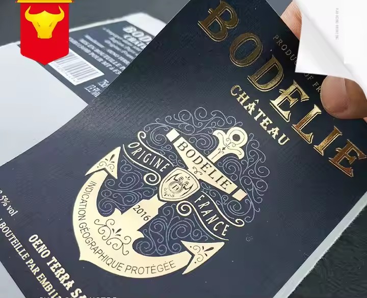
Colors: Color selection should consider various factors. On the one hand, the color should conform to the brand image. For example, high-end cosmetic brands may adopt colors such as gold and silver that represent luxury. On the other hand, the color contrast should be sufficient to ensure that the text and patterns are clearly readable. For example, black text on a white background is usually clear. The use of colors for different products should be cautious. For example, you should make choices and judgments based on the grade and tone of the product brand when using colors. Be cautious with color use because improper color use may cause the product to lose its market competitiveness.
Text layout: The text layout should be simple and clear. The font should be appropriate, avoiding being too fancy to affect reading. Important information (such as the product name, warning words, etc.) should be highlighted, for example, by increasing the font size, bolding the font, or changing the font color. Meanwhile, the direction and layout of the text should conform to the shape and use scenario of the label. The text layout should pay attention to the size because some product descriptions or descriptions of product features are needed. Therefore, distinctions should be made for the key points, and the advantages of the product should be placed in the key parts of the label to attract the attention of the audience.
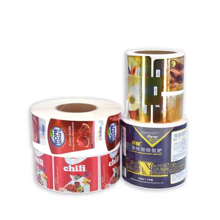
Patterns and graphics: Patterns and graphics can enhance the attractiveness of the label and its ability to convey information. For example, on the label of organic foods, natural scenery and crop patterns can be used to convey the natural and healthy attributes of the product. However, the patterns should not be too complex to avoid covering up the text information or causing misunderstandings.
V. Label Material and Size
Material: The label material should be selected according to the use environment and lifespan of the product. For products that need to be used outdoors for a long time (such as building materials), the label should adopt waterproof, sun-proof, and wear-resistant materials. For disposable products, a lower-cost paper label can be chosen.
Size: The label size should be adapted to the product packaging or the product itself. A too-small label may not be able to contain all the necessary information, while a too-large label will affect the overall aesthetics and practicality of the product. For example, the label size of a small electronic product (such as Bluetooth headphones) should be small and delicate, just able to be pasted on the surface of the product or its packaging, and not affect the portability of the product.
