
I. Regulatory Compliance: Non-Negotiable Under Global Regulatory Frameworks
E-cigarette label design must begin with strict adherence to relevant legal standards in target markets. Regulatory variations across countries directly shape label structure and content:
- Key Regulatory Elements
Mandatory Warning Content
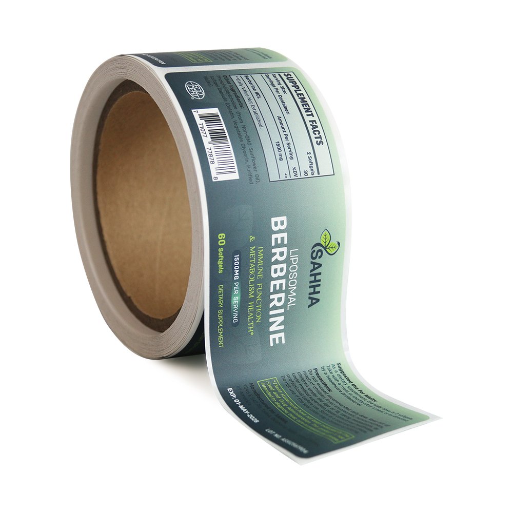
In China, standard GB 41700-2022 mandates that warning text occupy at least 30% of the total label area, with bold black font stating phrases like “Smoking is harmful to health” and “Minors are prohibited,” in font size ≥2mm.
The EU’s TPD requires warning images to cover at least 50% of the packaging, including visual depictions of lung disease or fetal harm, which must be reviewed and registered with the European Commission.

Transparency of Ingredients and Safety Info
The U.S. FDA requires nicotine concentration (e.g., “5% nicotine by weight”), e-liquid volume (to 0.1ml accuracy), manufacturer address, and contact info.
Canada requires bilingual warnings (English + French) such as “This product contains nicotine. Nicotine is an addictive substance,” with red-framed highlighting if nicotine exceeds 20mg/ml.
Prohibited Claims
China bans misleading claims like “low harm” or “quit-smoking tool.”
The EU prohibits enticing flavor descriptions such as “fruit flavor” or “vanilla”—only neutral terms like “tobacco flavor” are allowed.
Australia bans all colorful graphics; labels must use grayscale tones only.
- Compliance in Special Scenarios
Child-Resistant Packaging (CRP)
U.S. CPSC requires labels to display CRP certification logos (e.g., “Child-Resistant Packaging” icon), including illustrated instructions. The icon must be at least 15mm × 15mm with ISO 3864-compliant color contrast.
Cross-Border Trade Adaptation
For Southeast Asia, labels must be localized in languages like Indonesian and display Halal certification if required.
For Middle Eastern markets, avoid alcohol- or pork-related imagery; label text should be formatted right-to-left.
II. Materials & Processes: Balancing Function and Durability
E-cigarette usage involves high temperatures, humidity, and friction, which place unique demands on label materials:
- Technical Specs for Base Materials
Oil-Resistant Labels
E-liquid components like propylene glycol (PG) and vegetable glycerin (VG) can penetrate ordinary labels. PET or PVC synthetic paper with ≥3μm oil-resistant coatings is required. For example, Japan’s Oji PET-G labels offer a friction coefficient >0.8 (ASTM D2497).
Heat-Resistant Labels
E-cigarette surfaces can reach 50–70°C. Polyimide (PI) films tolerate -70°C to 260°C and, when paired with silicone-based inks, show color deviation ΔE < 1.5 even after 1,000 hours at 80°C (ISO 105-B02 standard).
Waterproof Labels
Outdoor usage demands IPX4-level water resistance. PE-laminated paper with UV-curable ink can withstand 30 minutes of water immersion with no wrinkling and achieves ≥ISO 4B ink adhesion (cross-hatch test).
- Specialized Finishing Techniques
Embedded Anti-Counterfeiting
Thermochromic ink (changes color above 35°C) or UV-sensitive ink can be used. BAT’s (British American Tobacco) labels incorporate microtext (font width <0.1mm) and QR-based traceability systems showing batch and region data.
Enhanced Tactile Features
Spot hot-stamping (5–8μm thick) or embossed logos (depth 0.2mm) increase brand tactile identity. Matte coatings (Ra = 1.5–2.0μm) reduce fingerprints and maintain a clean look.
III. Visual Design: Balancing Risk Warnings with Brand Identity
E-cigarette labels must harmonize mandatory warnings with brand expression:
- Visual Optimization of Warnings
Layered Layout Strategy
Separate areas for:
“Primary Warning Zone” (30%, red background + white bold text)
“Supporting Info” (ingredients, usage) with gray grid backgrounds
Ensure legibility via ISO 3864 contrast ratios (foreground/background luminance ≥ 4.5:1).
Dynamic Warning Indicators
Some labels use color-changing edges (e.g., red at >5% nicotine) via thermochromic ink.
The EU requires warning graphics (e.g., “decaying teeth,” “lung cancer cells”) at ≥300 dpi to maintain impact.
- Brand Identity Within Compliance
Neutral Visual Language
Ban flame/acceleration symbols. Use geometric shapes (e.g., rounded rectangles) and cool tones (dark blue, gray) for a tech-savvy aesthetic.
Japanese brand Logic uses minimal lines and matte silver foil to outline device silhouettes within regulatory bounds.
Stealth Branding
Insert micro-sized logos (<1mm × 1mm) on label edges or use spot gloss contrast to subtly render brand marks, complying with “no excessive marketing” rules while preserving identity.
IV. User Experience Design: Efficient Communication of Functional Information
Labels must address both first-time and experienced users:
- Information Architecture
Primary Info: Nicotine level, warnings, CRP icon—use bold black text + 2mm red border
Secondary Info: Charging instructions, e-liquid refill guide—use icons (e.g., battery + lightning symbol), icon size ≥8mm × 8mm
Tertiary Info: License number, lab report ID—use font ≤1.5mm at the bottom with line spacing ≥1.5× font height
