
Fit the Brand Image
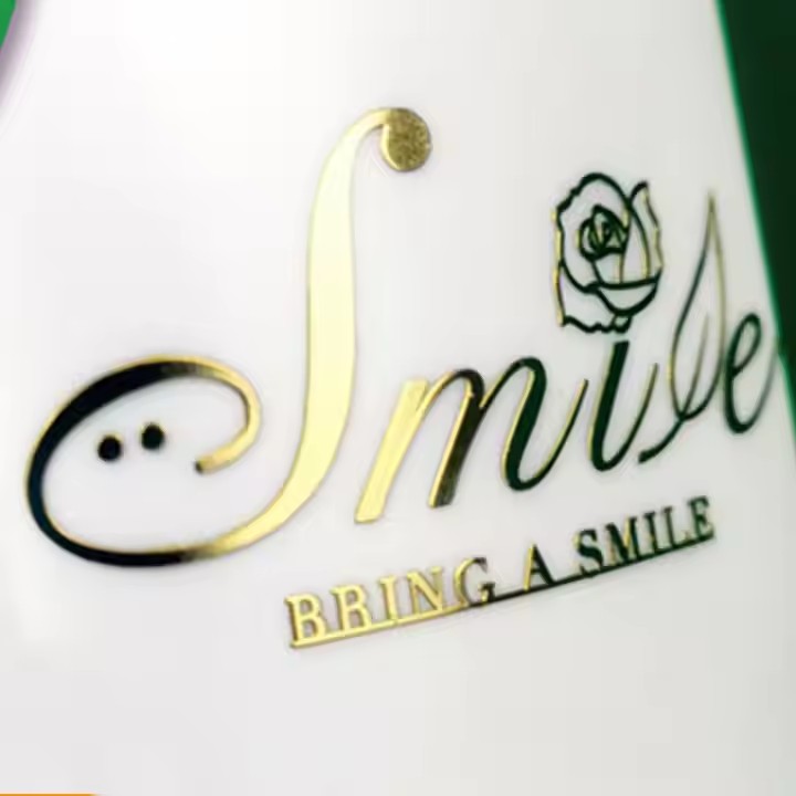
Brand Positioning: High-end luxury brands usually use classic colors such as gold, silver and black to reflect their quality and dignity. For example, Dior often uses black and gold as its main colors to show elegance and luxury. Mass-friendly brands may adopt more lively and bright colors, such as pink, light blue, etc., giving a friendly and approachable feeling. Some product labels of Maybelline use pink tones to convey a young and fashionable brand image. For cosmetics, the color should be selected according to the brand positioning and the product’s tone. Generally, the consumers of cosmetics are young women, so the external design of cosmetics should preferably use light colors, such as white, light green, sky blue, etc., which are very suitable colors for cosmetics.
Brand Culture: If a brand emphasizes the concept of nature and environmental protection, then natural colors such as green and brown will be good choices. For example, the labels of L’Occitane are often mainly green, highlighting its natural ingredients and environmental protection concept. Brands that focus on technology and innovation may use technological colors such as blue and gray. For example, some high-tech skin care product labels of Estée Lauder use blue tones.
Match the Product Characteristics
Product Efficacy: The label stickers of whitening products often use colors such as white and light blue, giving a pure and transparent feeling, implying the whitening effect of the product. Anti-aging products may adopt noble and mature colors such as purple and gold to convey their high-end and effective product positioning. Develop more attractive product efficacy according to the product efficacy.
Product Ingredients: Cosmetics containing plant ingredients may use green, brown and other colors that reflect nature on their labels, making people think of plant raw materials. If the product contains marine ingredients, marine colors such as blue and light blue will be more suitable. For example, some product labels of Biotherm are mainly blue, emphasizing its marine skin care characteristics.
Product Texture: Products with a light and refreshing texture, such as toners and light lotions, are suitable for using light colors, such as light blue and light pink, giving a light and comfortable feeling. Products with a thick and moisturizing texture, such as creams and lip balms, can use dark colors, such as dark pink and brown, to convey a moisturizing and rich texture.
Consider the Target Audience
Age Level: For young consumers, such as teenage girls, bright and lively colors, such as bright pink, bright yellow, tender green, etc. will be more attractive and can reflect youth and vitality. Some product labels of Innisfree use fresh green, pink, etc., which are very popular among young consumers. Cosmetics for mature women should have more stable and elegant colors, such as purple, dark red, dark brown, etc. Some high-end color cosmetics product labels of Lancôme use dark red and other colors to attract mature and tasteful consumers.
Gender Differences: The color choices for women’s cosmetics are more diverse, and soft colors such as pink, purple and red are more common. Men’s cosmetics usually adopt simple and tough colors, such as black, gray, dark blue, etc., reflecting men’s masculinity. For example, the label of Nivea’s men’s skin care product series are mostly blue and black.
Follow Industry Standards and Trends
Regulatory Requirements: The color of cosmetic labels should not be too bright or misleading to prevent consumers from misidentifying the product’s ingredients or efficacy. At the same time, some special-purpose cosmetics, such as sunscreen products, may need to use specific colors to mark key information such as sun protection index according to regulatory requirements.
Popular Trends: It is also important to pay attention to the color trends in the fashion and beauty industries. Every year, major color institutions will release popular colors, such as Pantone’s Color of the Year. Cosmetics brands can choose the color of label stickers according to the popular colors of the year to make their products more fashionable and trendy.
The Principle of Contrast and Coordination
Contrast with the Bottle Color: The color of the label sticker should form a good contrast with the bottle color to highlight the information on the label. If the bottle is dark, the label can be light-colored, such as a white label with a black bottle; if the bottle is light-colored, the label can be dark to increase the visual impact, such as a black or colored label with a white bottle. According to the design of the bottle, choose a suitable color for the label, because different color combinations will produce different effects. Also, when choosing colors, it is advisable to choose those that are similar, for example, red and pink are similar colors, which are easier for people to remember.
Color Coordination: If there are multiple colors on the label, make sure that these colors coordinate with each other and follow the principles of color matching, such as using complementary colors, adjacent colors and other matching methods. For example, blue and yellow are complementary colors and will produce a strong visual effect when matched together; while blue and green are adjacent colors and will give a harmonious and comfortable feeling when matched. Use coordinated colors and match the colors as much as possible according to scientific color matching rules. What kind of color matching is eye-catching, what kind of color matching is suitable for this season, what kind of color matching is suitable for this theme, etc., are all things that need to be considered.