
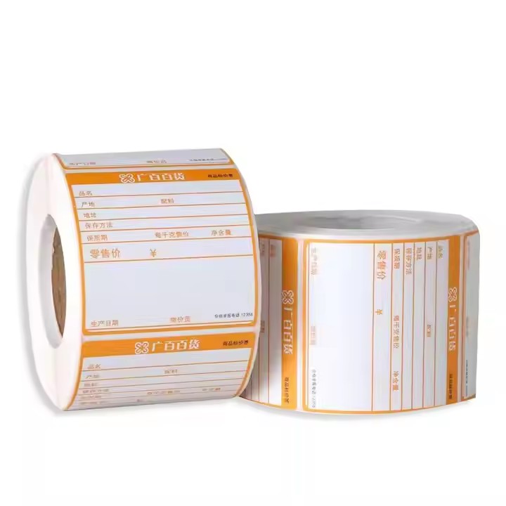
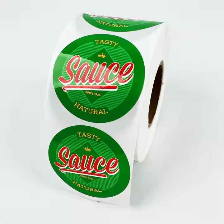
Cosmetic bottle labels generally inform consumers of the product name, usage functions (e.g., how to use a facial cream, the recommended time of day to use it), ingredients, and precautions. To design labels that are more memorable, start with elements that most strongly impact visual perception, such as color. Using bold, solid colors like red, green, yellow, or purple makes products more recognizable. For example, Hermès effectively uses a rich orange color, making it synonymous with the brand in consumers’ minds.
Visual Memory: Create a ‘Retinal Effect’ with Strong Symbols
Principle: Humans remember visuals 6x faster than text. Vivid symbols trigger emotional memory in the brain.
Super Symbol Design
Brand-exclusive graphics: Repeat logos or unique icons (e.g., Lancôme’s rose, Kiehl’s Mr. Bones) at the top or corner of labels to reinforce brand recognition. Use hot stamping or embossing to highlight symbols, like Estée Lauder’s metallic logo on premium lines.
Color memory points: Establish a brand color system (e.g., Shiseido’s “Proud Red,” La Mer’s “Mysterious Blue”) with color purity 30% higher than the background. Use contrasting colors (e.g., white bottles with high-saturation pink labels) to link to product benefits via color psychology.
Dynamic visual guidance
Golden triangle composition: Place core information (brand name, product name, key selling points) in the top 1/3 of the label (the first visual focal area). For example, SK-II’s “PITERA” is at the apex of the triangle, with water texture guiding the eye downward.
Fluid/light effects: Use gradients, refractions, or laser processes to mimic product textures (e.g., flowing light patterns for serums, matte embossing for creams) to enhance memory through synesthesia.
Information Memory: Deliver ‘3-Second Key Messages’ Precisely
Principle: Consumers scan labels for only 2.8 seconds on average—prioritize information hierarchically.
Memory anchor design
Numerical memorization: Use specific numbers to reinforce selling points (e.g., “28-day skin renewal,” “72-hour hydration”) for 45% higher retention than vague claims (Harvard Business School data).
Sensory translation: Convert technical terms into experiential descriptions. For example, “contains hyaluronic acid” becomes “bursting hydration blue bottle, melts into millions of hydrating micro-capsules.”
Memory hooks: Design shareable symbols, like Helena Rubinstein’s “30% 玻色因 (pro-Xylane)” in red circles, creating a conditioned response: “Black Bandage = 30% pro-Xylane.”
Emotional Memory: Build ‘Psychological Connection’
Principle: Emotionally resonant designs boost memory retention by 70% (Nature Neuroscience).
Storytelling scenarios
Usage scene illustrations: Draw mini-scenes on label edges (e.g., Kiehl’s calendula water label showing gardeners picking flowers) to convey “natural” concepts.
User testimony visualization: Highlight real reviews (e.g., “100,000+ oily skin repurchases”) with icons like seals or dialog boxes to enhance credibility.
Interactive memory design
Peelable/reversible labels: Fresh’s lip balm labels have a second layer with ingredient stories or tips, adding discovery fun.
AR interactive labels: Scanning triggers virtual try-ons or 3D ingredient analyses (e.g., Sephora brands), deepening memory through technology.
Emotional material selection
Tactile memory: Use linen-textured labels for natural products or cashmere-touch coatings for luxury lines to reinforce category associations.
Sustainability appeal: Use recyclable paper + soy ink, and label corners with “biodegradable” to attract eco-conscious consumers.
Pitfalls to Avoid
Information overload: Limit labels to ≤4 colors and ≤3 fonts; avoid dense layouts.
Lack of differentiation: Avoid copying trends blindly—align with brand DNA (e.g., “laboratory feel” for cosmeceuticals).
Mismatched craftsmanship: Hot stamping suits premium lines, while neon colors fit youthful brands; ensure consistency with product positioning.
Case Study: Elizabeth Arden Gold Capsule Label
Visual memory: Gold capsule graphics + green logo with hot stamping reinforce the “小金胶 (Golden Capsule)” symbol.
Information memory: Tier 1: “Time Rewind Capsule”; Tier 2: “90% pure retinol”; Tier 3: “night repair” scenario words.
Emotional memory: Micro-printed “28-day wrinkle reduction” testimonials on the back, paired with a 磨砂 (matte) texture to convey “professional reliability.”
By integrating visual symbols, information hierarchy, emotional materials, and interactive design, cosmetic labels can become memorable “triggers” in consumers’ minds, driving brand recall and purchase.