
Creative Conception
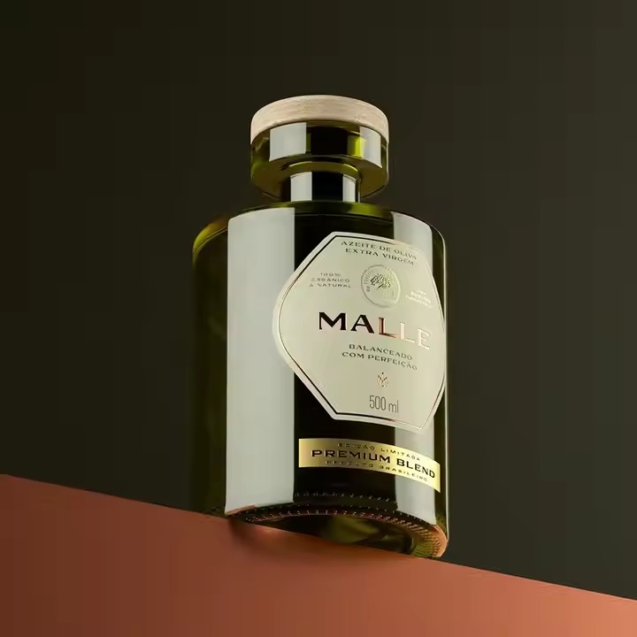
Integration with the Product: Design according to the characteristics of the product. When designing a transparent label for cosmetics, for example, the shape of the label can be designed to echo the curve of the cosmetic bottle. Or, use the main ingredients and functions of the product as elements for creative design, so that the label blends with the product, enhancing the overall aesthetic appeal and attractiveness. It is essential to think carefully before designing about how to make it look better and conform to the tonality of the product itself. What suits the product is usually more aesthetically pleasing.
Storytelling and Emotional Resonance: Endow the label with a story or an emotional theme. For instance, when designing a transparent label for a handmade jam, you can tell the story of how the jam is made, the local customs and culture of the production area, etc., triggering emotional resonance among consumers and increasing the cultural connotation and brand charm of the product. Label design should also emphasize storytelling and emotional resonance. Only with a good story can it be effectively spread. In marketing, elements such as the label’s slogan, tagline, and pattern design are all important factors affecting its spreadability. For example, the Nike sports shoes have a simple checkmark label, which is easy to remember.
Festival and Theme Customization: Launch customized transparent labels according to different festivals or events. For example, design transparent labels with elements like hearts and roses for chocolates on Valentine’s Day, creating a strong festive atmosphere and attracting consumers to make purchases. Customize some themes according to festivals, such as Christmas, Easter, National Day, Spring Festival, and other holidays, and create patterns and labels suitable for these festivals.
Color Application
Combination of Transparency and Solid Colors: Utilize the contrast between the transparent part and the solid color part to create a unique visual effect. For example, with a transparent background as the main part, match it with a small amount of solid color patterns or texts with high saturation, making the important information more prominent while maintaining the overall lightness and transparency. Since the color saturation of transparency is relatively low, bright and highly saturated colors should be used. Use gradient colors to guide the audience’s gaze and focus it on the important content on the label, such as the product name, brand logo, and key selling points. For example, on a cosmetics label, use a gradient color from light to dark to highlight the product name, allowing consumers to quickly identify it from a distance.
Application of Gradient Colors: By using gradient colors, the label can produce a soft and dreamy visual effect. For example, a gradient from light blue to dark blue can simulate the feeling of the sky or the ocean, which is suitable for transparent labels of products such as beverages and skin care products, giving people a fresh and comfortable visual experience. Through unique combinations and transition effects of gradient colors, the label can stand out among many similar products and attract consumers’ attention. For example, using bright and lively gradient colors, such as a gradient from orange to yellow, on a beverage label can give people a refreshing and energetic feeling, stimulating consumers’ desire to buy.
Color Coordination with the Product: Select colors that are coordinated or complementary to the color of the product itself. For example, when designing a transparent label for a green bottled shampoo, you can use light green or yellow that echoes the green as an auxiliary color, making the label and the product complement each other and enhancing the overall visual quality. Different gradient colors can create different atmospheres and emotions. For example, using a gradient from blue to purple can create a mysterious and high-end atmosphere, which is suitable for labels of high-end electronic products; while a gradient from pink to red can convey a romantic and warm emotion, which is suitable for labels of Valentine’s Day gifts.
Graphics and Texts
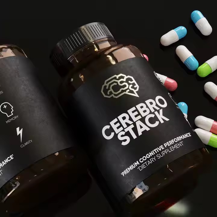
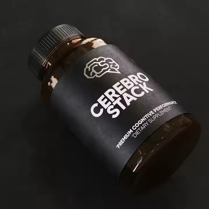
Simple Graphics: Adopt simple and clear graphic elements, avoiding overly complex designs to ensure that they can still be clearly identified against a transparent background. For example, use simple lines to outline the contour of the product or the brand’s iconic pattern, giving the label a modern and minimalist aesthetic.
Three-dimensional and Light and Shadow Effects: Use three-dimensional graphics or light and shadow effects to add a sense of hierarchy and three-dimensionality to the transparent label. For example, by drawing a three-dimensional fruit pattern with light and shadow effects, the fruit can look more realistic and appealing, which is suitable for labels of food products.
Text Layout: Select appropriate fonts and font sizes to ensure that the text is clear and readable. At the same time, pay attention to the contrast between the color of the text and the background. For example, use dark text on a light transparent background to highlight the information. In addition, creative text layout can be carried out, such as arranging the text around the graphic or bending the text according to the shape of the label to increase the fun of the design.
Process Selection
Local UV: Through the local UV process, create locally glossy patterns or texts on the transparent label, making them more prominent against the transparent background and increasing the texture and three-dimensionality of the label.
Hot Stamping: Use the hot stamping process of gold or silver to add metallic patterns or texts to the label, enhancing the grade and gorgeousness of the label, which is suitable for transparent labels of high-end products, such as luxury goods and high-grade gifts.
Die-cutting Process: Use the die-cutting process to cut the label into unique shapes, such as circles, hearts, animal shapes, etc., making the label more eye-catching on the shelf, attracting consumers’ attention, and also being able to better match the product packaging.
