
The design of food labels is very important because the colors and icons used in the design play a crucial role. They are the key for consumers to remember food brands.
Color Matching
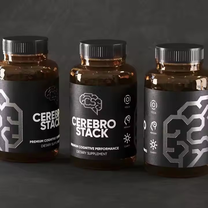
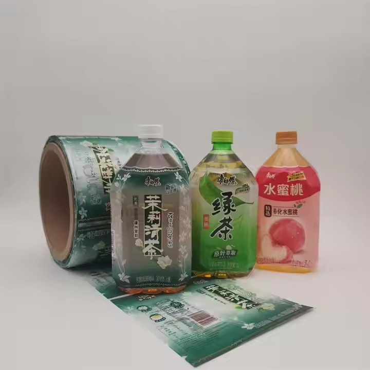
Choose vivid colors that match the product’s characteristics: Vivid colors can quickly catch consumers’ attention. For example, red is usually associated with vitality and enthusiasm, and it is often used for spicy foods or energy foods. Green is often used for natural and healthy foods, such as vegetable products and organic foods. Yellow gives people a warm and cheerful feeling and is suitable for baked goods or children’s foods. Color matching is extremely important because only beautiful colors can enable consumers to remember the product in a short time. Also, when choosing colors, we should select those that are consistent with the brand. For instance, when designing the packaging for potato chips, we should choose colors with high saturation, such as red, green, yellow, etc. Because only high – saturation colors can set off the delicious appearance of the food. Moreover, the external food label is related to the internal quality of the food, which can trigger consumers’ associations, making them feel that the product is delicious and thus prompting them to make a purchase.
Use contrasting colors: By matching contrasting colors, the information on the label can be made more prominent. For example, use light – colored text on a dark background, or vice versa. Common contrasting color combinations include red and green, blue and yellow, black and white, etc. However, attention should be paid to the proportion of contrasting colors to avoid being too dazzling or uncoordinated.
Maintain color consistency: If a brand has its own exclusive color, it should be kept consistent on food labels to enhance brand recognition. At the same time, the label colors of a series of products should also have a certain degree of consistency to form a unified visual style.

Graphic Design
Use images related to the food: It can be the image of the food itself, such as fresh fruits, vegetables, and meats, so that consumers can intuitively understand the product content. It can also be an image related to the characteristics of the food. For example, use a bee to represent honey products and a cow to represent dairy products. These images can help consumers quickly identify the attributes of the product. In addition, we also need to design product logos related to the food. For example, if it is a plum product, which is a processed fruit, then we should design a food label that is similar to or matches a plum. This allows customers to directly see what the product is like when they see the brand logo, arousing their desire to buy.
Create a unique brand image: Design a unique brand logo or brand ambassador to make it a symbol of the brand. For example, Mr. Bibendum of Michelin tires and Colonel Sanders of KFC. These unique images can leave a deep impression on consumers, and when consumers see the label, they can quickly associate it with the brand.
Adopt interesting illustration styles: Illustration is a very expressive graphic form. Different illustration styles can be selected according to the positioning of the food and the target audience. For children’s foods, cartoon – style illustrations with bright colors and cute images can be used. For high – end foods, realistic or minimalist style illustrations can be used to reflect the quality and delicacy of the product.
Text Layout
Highlight key information: Key information such as the product name, brand name, main ingredients, and flavor should be placed in a prominent position, using larger fonts and eye – catching colors so that consumers can obtain important information in a short time.
Choose fonts with strong readability: Avoid using overly fancy or difficult – to – read fonts to ensure that consumers can easily read the text on the label. Generally speaking, simple sans – serif fonts (such as Arial and Helvetica) have better readability in small sizes, while serif fonts (such as Times New Roman) are more suitable for headings or places where style needs to be emphasized.
Segment and leave white space reasonably: Reasonably segment the text content on the label and use white space to separate different pieces of information to avoid overcrowding of the text. This can make the label look neater and clearer, and improve the efficiency of information transmission.
Add Unique Elements
Incorporate story elements: Telling the brand’s story, the origin of the food, or the unique aspects of the production process can make consumers have an emotional resonance and increase the memorability of the product. This information can be conveyed by adding short text descriptions, pictures, or icons on the label.
Set up interactive elements: For example, set a QR code on the label. After consumers scan it, they can obtain more information about the product, recipes, promotional activities, etc. Or design some interesting interactive games, such as puzzles and lucky draws, to increase the interaction and fun between consumers and the product.
Use special printing techniques: Adopt some special printing techniques, such as hot stamping, silver stamping, embossing, UV printing, etc., which can give the label a unique texture and visual effect, enhancing the grade and attractiveness of the product. For example, using the hot stamping process on the label of high – end chocolate can highlight the luxury of the product.
