
- Precise Positioning: Align with Design Goals and Usage Scenarios
The first step in designing colored label stickers is to clarify their core purpose and application scenario. This directly determines the design direction. Different contexts have distinct functional requirements for stickers, which should be addressed accordingly:
Product Packaging Scenarios: The main goal is to strengthen brand memory and convey key information.
For food packaging (e.g., bread bags, jam jars), emphasize freshness and “organic” attributes. Warm tones (orange, yellow, light brown) can stimulate appetite, while production and expiration dates should be clearly marked.
For cosmetics and skincare packaging, highlight “safety” and “premium” qualities. Cool tones (light blue, lavender, off-white) with minimalist lines work well to showcase ingredients and usage instructions.
Example: An organic yogurt brand uses light green as the dominant color, paired with a milk-textured white background. The center features bold text reading “No Added Sugar,” with the expiration date in small print at the bottom—both reinforcing product positioning and delivering core information at a glance.
Decorative Scenarios: Focus on “personal expression,” commonly seen in journals, luggage, and children’s room décor.
Journal stickers should balance small, refined details with thematic consistency, often featuring cartoon motifs (stars, flowers, animals) or short phrases (“Happy Today,” “Keep Going”). Pastel shades or high-saturation contrasts work well, with sizes controlled at 2–5 cm for easy mix-and-match.
Luggage stickers need durability and water resistance, with larger, bold graphics (e.g., landscapes, fashion logos) in strong contrasts (black/white, red/yellow) to boost visibility. Scratch-resistant finishes are recommended for outdoor use.
Children’s room stickers should emphasize safety and fun. Use eco-friendly inks, feature cartoon or fairy-tale themes, bright colors (pink, blue, yellow), and rounded corners to avoid scratches.
Warning/Instructional Scenarios: Prioritize “visibility and quick recognition,” often used in logistics, laboratories, and public spaces.
Logistics warning stickers (e.g., “Fragile,” “Keep Dry,” “This Side Up”) should use high-contrast color schemes (red/white, yellow/black), paired with simple icons (broken glass, umbrella, upward arrow). Bold sans-serif fonts ensure legibility even from a distance.
Laboratory warning stickers (e.g., “Toxic,” “Flammable”) must follow strict industry conventions: red for prohibition, yellow for caution, blue for instruction. Graphics should be clear (skull, flame, safety gloves), with sizes adjusted to fit equipment and placed in highly visible spots.
- Color Matching: Convey Emotion Through Color, Avoid Clutter
Color is the soul of colored label stickers. A well-balanced palette instantly attracts attention and communicates emotions or information. Avoid random mixing and follow logical principles:
Define a Primary Color to Set the Tone:
The primary color should account for 60%–70% of the design, aligned with theme and context.
For baby products: soft pinks or blues for warmth and safety.
For sports: vibrant reds, oranges, or yellows for energy and passion.
For cultural/creative products: low-saturation Morandi shades (dusty pink, lavender, mint green) for a sophisticated, artistic feel.
Material also matters: transparent PVC suits bold, saturated colors (clear and vivid after printing); matte coated paper suits muted tones (delicate texture); kraft paper suits warm colors (brown, yellow, orange) for a vintage, natural look.
Use Secondary Colors to Add Depth:
Secondary colors (20%–30%) support the primary tone, either through analogous or contrasting schemes.
Analogous (e.g., blue with teal and light blue) is harmonious and soft, ideal for food or baby stickers.
Contrasting (e.g., orange with purple or blue) creates impact, suitable for decorative or warning stickers—but proportions must be controlled to avoid harshness.
Example: A beverage label uses orange as the primary color (65%), with light yellow (25%) and dark green (10%) as secondary accents. Light yellow complements orange for freshness, while dark green highlights the “Low Sugar” tag, enriching hierarchy and emphasizing key info.
Accentuate with Highlight Colors:
Accent colors (5%–10%) act as the “finishing touch,” drawing focus to vital details.
Business stickers with a gray-and-white palette can use the brand logo color (red, blue) for logos or data.
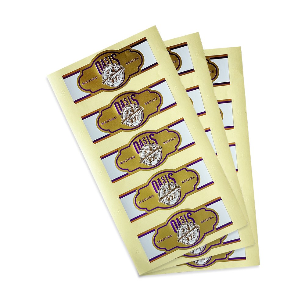
Decorative stickers can add metallic gold or silver through hot-stamping to elevate elegance—like gold edging around flower motifs or silver strokes in typography.

- Information & Graphics: Keep It Concise and Space-Friendly
Stickers are usually small (3–10 cm), so design must follow the principle of concise, clear, and adapted to scale to ensure efficient information delivery.
Information Hierarchy: Clear Priority, Easy Recognition
Core information (brand name, product name, key identifiers) should occupy the central or upper areas, with large, bold fonts in high-contrast colors for instant readability within 1 meter.
Secondary information (specifications, usage instructions, contact details) can go at the edges or bottom, in smaller, lighter text to avoid distracting from the main message.
