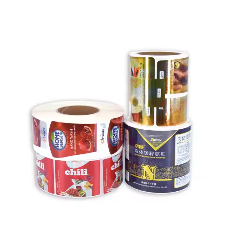
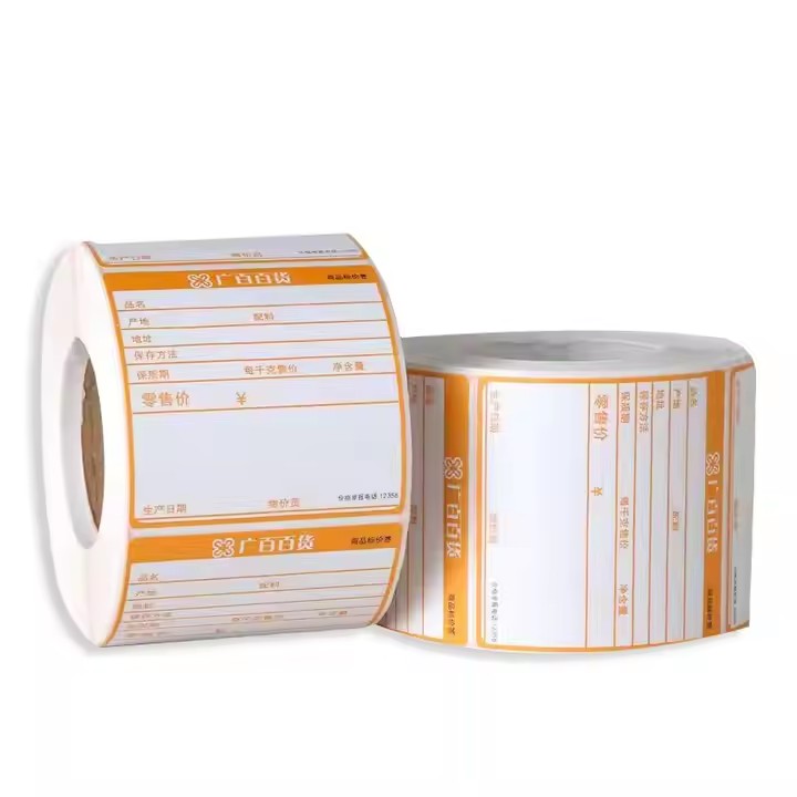
A label design draft is a template before label production. Production can only be carried out after the design is completed. The quality of the label is determined based on the design draft. Of course, the quality of the label is also related to the production process. Only when there are no problems with the production machines during the production process can the labels produced be of better quality.
Clarify Design Requirements
Communicate with the Client: Have a full – fledged communication with the client before the design to understand information such as the label’s usage scenarios, target audience, and main functions. For example, if it’s a food label, it’s necessary to clarify whether nutritional components, production dates, etc. need to be highlighted; if it’s a clothing label, it’s essential to determine whether to emphasize materials, washing instructions, etc. Before the label production, all aspects of the production should be well – communicated with the client, such as the quantity to be produced, the delivery date, and other details of the production and processing. These basic pieces of information must be clearly stated.
Collect Reference Materials: Gather label samples of similar products, industry standard specifications, and relevant materials provided by the client. Analyze their design styles, color combinations, information layouts, etc., to provide references and inspiration for the design. Collect some reference information, for example, information about top – notch companies in the label production industry, to learn their design ideas and business models.

Develop a Design Outline: Based on the communicated and collected information, sort out the elements, information hierarchy, color range, size specifications, etc. that the design draft needs to include, and form a detailed design outline as a guiding framework for the design. Developing a design outline means determining the style, pattern, theme, and direction of the label design. The design outline also plays a guiding role, giving the staff a design direction. Once the staff knows the direction, they will strictly follow it to carry out the design.
Pay Attention to the Design Process
Reasonable Information Layout: Sort and group the information on the label according to its importance and usage habits. Place important information such as brand names and product names in prominent positions, using larger fonts and eye – catching typefaces. At the same time, keep the information simple and clear to avoid visual confusion caused by excessive text and complex patterns. Use fonts and font sizes reasonably. The choice of font should match the image of the product brand. For example, if the food is spicy potato chips, it is advisable to use a more imposing and masculine font to highlight the brand image of the potato chips. Such a combination can achieve a good coordinated match. Because the taste of the potato chips is like this, it’s impossible to use a very soft – looking font, which can’t support the image and style of the spicy potato chips, and is not conducive to consumers remembering the brand image.
Harmonious Color Matching: Select an appropriate color scheme according to the product characteristics, brand image, and target audience. The number of colors should not be excessive, generally no more than three primary colors. Ensure that the colors are coordinated with each other and have a good visual contrast so that the information is clearly readable. Pay attention to the color matching of the product. The color matching should be appropriate. For example, according to the tonality of the enterprise’s products, choosing the right color for the enterprise can help consumers remember the brand as much as possible.

Choose the Right Font: The font style should be consistent with the product and brand image. For example, labels for children’s products can use lively and cute fonts, while high – end business products are suitable for simple and elegant fonts. At the same time, ensure that the font size is appropriate and can be clearly recognized under different devices and printing sizes. Choosing a suitable font according to the tonality of the enterprise. For an enterprise in the machinery industry, the designed font should be strong and tough. A suitable font helps consumers remember the brand more easily and establish the brand’s influence more easily.
Unique Creativity and Aesthetics: On the basis of meeting basic functions, make the label have a certain artistic beauty and creativity through unique graphic design, creative layout, etc., so that it can stand out among many products. However, also note that the creativity should not be too complex to affect the information transmission. Unique creativity can maximize consumers’ love and attract their attention during online and offline promotions.
Consider Printing Processes: Understand the characteristics and effects of different printing processes, such as hot stamping, UV printing, etc. Select an appropriate printing process according to the design requirements and budget to enhance the texture and visual effect of the label. At the same time, consider factors such as printing accuracy and color reproducibility during the design to ensure that the design draft can achieve the expected effect after printing.

Review and Optimize the Design Draft
Self – check and Proofreading: After the design is completed, the designer should carefully check the design draft. Check whether the information is accurate, such as whether there are typos and data errors in product names, specifications, ingredients, etc.; check whether elements such as colors, fonts, and patterns meet the design requirements and brand specifications.
Team Review: Submit the design draft to team members such as project managers, copywriters, and other designers for review from different professional perspectives, and ask for modification suggestions. For example, copywriters can review from the aspects of text expression and information integrity, and other designers can put forward their views on visual effects and design styles.


