
Customizing wine labels follows specific principles. For a label to go viral, it must integrate the company’s culture, philosophy, and current popular symbols.
- Regulatory Compliance: The Foundational Rule for Custom Wine Labels
Wine labels, as a critical part of food packaging, must first meet mandatory national laws and regulations — this is the premise of all design. Different countries and regions have varying standards. For the domestic market, labels must comply with standards such as GB 7718 (General Rules for the Labeling of Prepackaged Foods) and GB 2758 (Fermented and Blended Wines). For exports, products must meet the regulations of the destination market, such as CE certification in the EU or FDA standards in the US.
Mandatory label information includes the product name, ingredients, alcohol content, net volume, producer information, production date or shelf life, storage conditions, and execution standard number. Alcohol content must be accurate to 0.1% vol, ingredients should be listed in descending order of quantity, and imported wines must indicate the country of origin and domestic agent information. For special categories like organic wines, the label must include the organic certification mark and certifying body; medicinal wines must list their health functions and suitable consumer groups.
It’s crucial that labels avoid false or misleading claims, such as “best,” “premium,” or unverified health benefits, or fabricated origin and vintage information. For instance, a wine brand was penalized and recalled after labeling their product as “imported from France in original bottles” when it was actually bottled domestically — leading not only to financial loss but also severe brand reputation damage. Thus, compliance review should be integrated throughout the design process, with legal or quality inspection professionals involved when necessary.

- Brand Identity: The Narrative Expression of the Wine Label
A wine label visually conveys the brand story. Customized designs should deeply integrate the brand’s core identity, achieving “instant brand recognition”.
This can be implemented through three main pathways: symbolic elements, color systems, and typography styles.
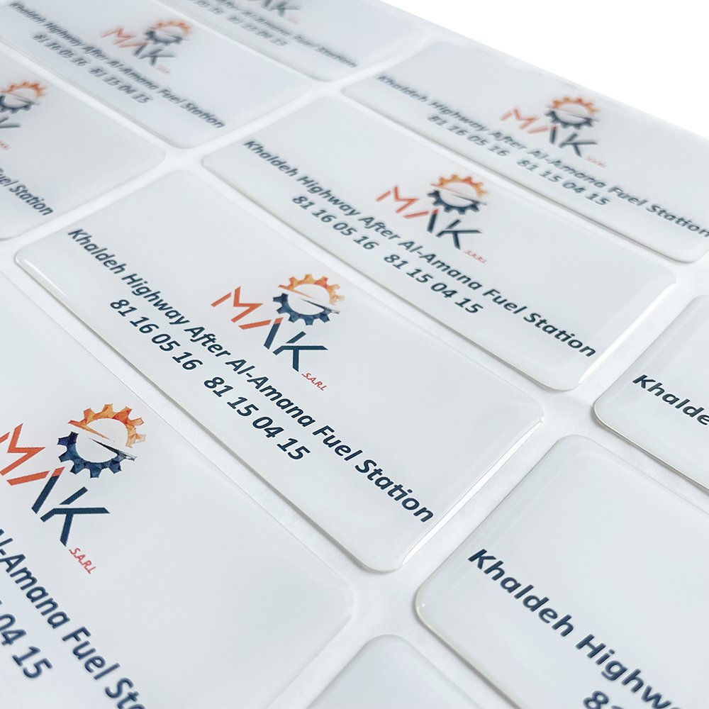
Symbolic Elements: These include the brand logo, exclusive graphics, or regional cultural symbols. For example, Moutai retains the “Flying Fairy” illustration on its label — a visual anchor for premium baijiu recognized over decades. Changyu Wines use grapevine motifs to emphasize their heritage as a century-old winemaker. Regional elements should be thoughtfully applied — e.g., yellow rice wine brands might incorporate images of Jiangnan’s bridges and boats, while sauce-flavored liquors could reference the Danxia landforms of the Chishui River Valley.
Color Systems: Colors should align with brand tone. Premium liquors often use gold and red to signal luxury; trendy fruit wine brands favor pastel colors to attract young consumers; organic wines typically use greens to highlight natural attributes. Consistency is key — for instance, a craft beer brand’s signature blue with white polka dots design stands out on shelves, boosting repeat purchases by over 30%.
Typography and Narrative: Beyond mandatory information, storytelling text should be concise and impactful — phrases like “Founded in 1892” suggest heritage, while “Hand-picked” highlights craftsmanship. Font choices must match the brand’s character: serif fonts convey tradition and depth, sans-serif fonts evoke modernity, and handwritten fonts add warmth and uniqueness.
- Visual Aesthetics: Balancing Appeal and Information Hierarchy
Visual design determines the label’s attraction power, on the foundation of compliance and brand expression. A great wine label should have “memorability from afar, and information up close”, achieved through a clear visual hierarchy and aesthetic balance.
Visual Focal Points: Typically, the brand logo or core graphic serves as the main visual, occupying 30%-40% of the label. Techniques like color contrast, strategic white space, or special finishes can make it stand out. For example, a whisky brand uses a distillation apparatus silhouette as the main graphic, enhanced with gold stamping against a dark background — making it easily recognizable even in dim bar settings.
Information Layout: Follow the natural reading path (top-left to bottom-right). Important information like the brand name and product series should be placed at the visual starting point, while mandatory details come second. Font size must ensure readability — critical data like net volume and alcohol content should not be smaller than 1.8mm to maintain legibility.
Color and Material Matching: Choices should reflect product attributes and consumption scenarios. Red wines often feature dark red labels with matte paper for a refined feel; beers favor bright colors with waterproof materials for refrigeration. A sparkling wine brand enhances its label with silver foil and transparent PVC, mimicking the shimmering effect of bubbles, making it stand out at events and parties.
- Materials and Craftsmanship: Elevating the Experience from Visual to Tactile
The texture and sensory experience of a wine label heavily depend on material selection and production techniques. Appropriate material and craftsmanship not only maximize design effectiveness but can also become a key differentiator for the brand.
