Select Colors According to Food Characteristics
Reflect the Taste and Texture of Food: Different flavored foods usually have corresponding color associations. For instance, the red color series is often linked to the flavors of fruits like strawberries and cherries, and it can convey a sweet and rich taste. The yellow color series can be applied to foods with flavors such as lemon and banana, expressing a fresh, sour and sweet feeling. For foods with a rich texture, such as chocolate and coffee, the brown color series can be used to show their richness and steadiness.
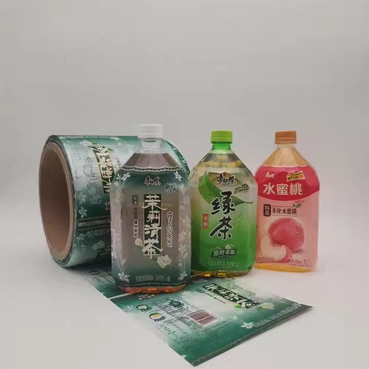
Mirror the Ingredients of the Food: If the main ingredients of a food have distinct color features, relevant colors can be used on the label to imply them. For example, for foods made from green tea as the raw material, green can be used on the label to emphasize its natural and fresh raw material characteristics. For foods with carrots as the main ingredient, appropriate orange elements can be added.
Match the Preferences of the Target Audience
For the Children’s Group: The colors on the labels of children’s foods should be bright, lively and vivid. Use highly saturated colors like red, yellow, blue and green to create a strong visual impact and attract children’s attention. Colorful illustrations or cartoon images can be adopted to create a cheerful and interesting atmosphere. Design colors that children like according to their age, and use some bright colors to cater to children’s psychology.
For Young Consumers: Young consumers generally prefer fashionable, personalized and creative color combinations. For the food labels targeting this group of consumers, popular color trends can be applied, such as the Morandi color series, fluorescent color series, etc., or techniques like color contrast and gradient colors can be used to show a unique style and vitality. Study the consumption psychology of young people. Since young people like trends, production can follow the trends.
For the Elderly Group: Elderly consumers tend to favor simple, stable and soft colors. For label design, light and elegant tones can be chosen, such as off-white, light blue, light gray, etc. Avoid using overly dazzling or complex color combinations to reflect the quality and reliability of the product.
Follow the Consistency of the Brand Image
Continue the Brand’s Main Color: The main color of a brand is one of the important symbols of the brand image. Food labels should try to continue the brand’s main color to maintain the consistency of the brand’s visual image. For example, the red color of Coca-Cola and the blue color of Pepsi-Cola are fully reflected on the labels of their various food products, allowing consumers to quickly identify and remember the brands. When designing labels, try to be close to well-known brands. By following the labels of well-known brands, consumers can remember the brand in a short time. Many unknown brands can imitate, learn from and draw on them, and through imitation, they can quickly gain the awareness of big brands.
Integrate the Brand’s Secondary Colors: In addition to the main color, brands usually have some secondary colors to enrich the brand’s visual system. In food label design, these secondary colors can be skillfully integrated and matched with the main color to form a coordinated and unified visual effect. For example, on a brand label with green as the main color, yellow can be used as a secondary color to highlight some important information or decorative elements, which can not only enhance the visual appeal but also maintain the overall style of the brand. Or some fashionable elements, that is, trendy elements, can be integrated, and it will be likely to become popular.
Use Color Contrast and Coordination
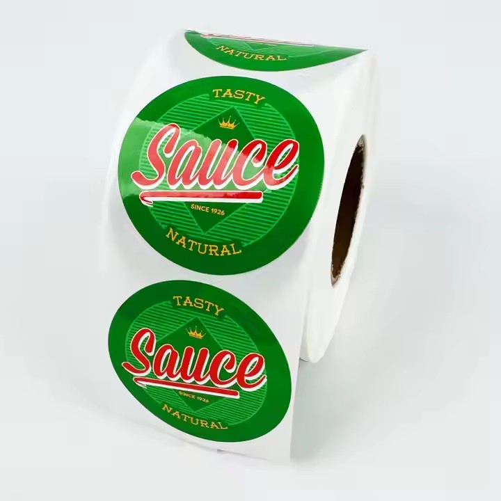
Emphasize Contrast: By using contrasting colors, the important information on the label can be made more prominent and attract consumers’ attention. For example, using dark text on a light background or vice versa creates a sharp visual contrast and improves the readability of the information. At the same time, contrasting colors can also be used to distinguish different information sections, making the content levels of the label clearer. For example, the contrasting colors of blue and yellow can be used to distinguish the nutritional composition table and the ingredient list of the food.
Pay Attention to Coordination: Choosing adjacent or similar colors for matching can create a harmonious and unified visual experience, making the label look more comfortable and beautiful. For example, using similar colors such as light green, dark green and yellowish green to design the labels of vegetable foods can reflect the natural, fresh and healthy characteristics of the products, and at the same time give people a fresh and soft visual experience.
Consider Special Effects and Materials
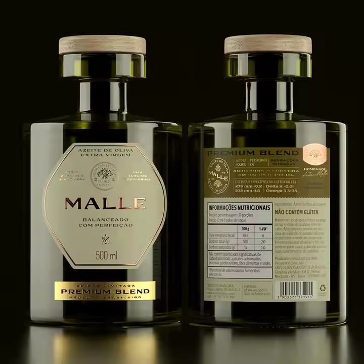
Special Printing Effects: Using special printing processes such as gold stamping, silver stamping, and UV varnishing can add luster and texture to the label and enhance the grade of the product. In terms of color matching, corresponding colors can be selected in combination with these special effects. For example, the stamping effects of gold and silver are suitable for matching with dark or bright colors, which can highlight the high-end quality of the product. For presenting printing effects, different processes should be utilized.
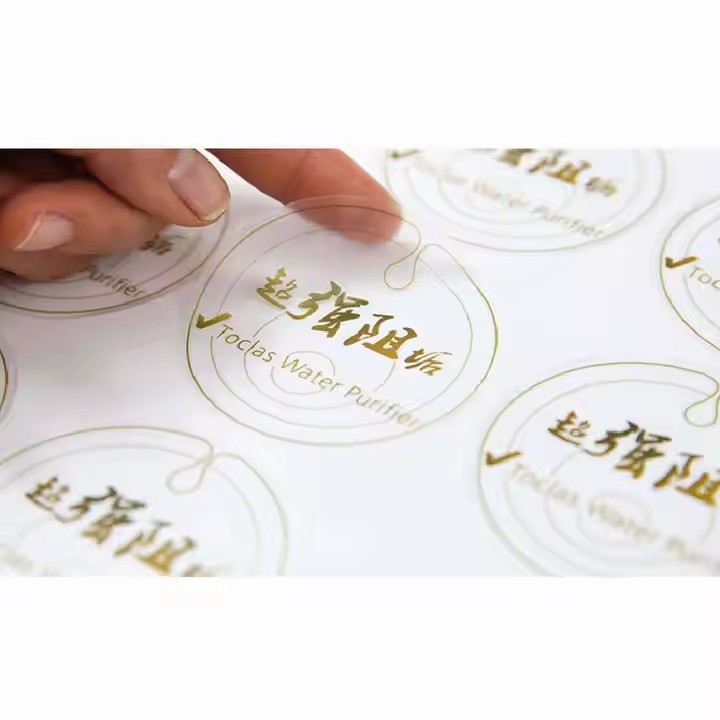
The Influence of Materials: Different label materials have different effects on colors, such as the texture and transparency of paper. When choosing colors, the characteristics of the materials should be considered to ensure that the final presented effect meets the design expectations. For example, on a transparent plastic label, the color saturation may decrease, so the selection and matching of colors need to be adjusted appropriately to ensure the visual effect of the label.
Create an Emotional Atmosphere
Convey Warmth and Intimacy: Using warm colors such as orange and pink can create a warm and intimate atmosphere, making consumers feel pleasant and close when they see the label. These colors are often used for the labels of baked goods, candies and other foods that can bring a sweet feeling. For example, a cake label with orange as the main color, paired with some soft light and shadow effects, can make people think of the sweetness of the cake and the warm baking scene.
Express Refreshingness and Tranquility: If you want to convey a refreshing and tranquil feeling, light blue and light green among the cool colors are good choices. They are often used for the labels of beverages, ice creams and other foods, giving people a cool and comfortable visual experience. For example, a mint-flavored beverage label uses light green as the main color, with white text and simple patterns, allowing consumers to feel the coolness and purity of the product.
