
- Material and Process Compatibility: The Foundation of Feasibility
Decal sticker design is fundamentally constrained by material properties and manufacturing capabilities—creative ideas that ignore this foundation are merely theoretical.
Substrate selection must match the application scenario:
For short-term indoor use (e.g., party wall decals), 80–120g coated paper is cost-effective and produces vivid prints but lacks water resistance—ideal for one-time use.
For outdoor applications (e.g., bicycles, skateboards), 0.15–0.3mm PVC film offers weather resistance for 3–5 years and strong UV protection. Studies show PVC decals fade 72% less than paper under the same conditions.
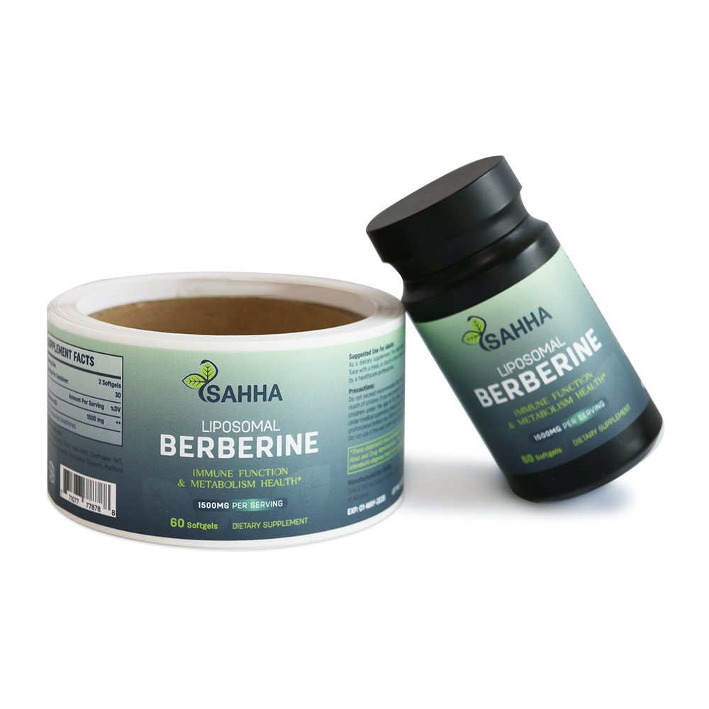
For premium decor (e.g., furniture, instruments), PET is commonly used for its high transparency (≥92%) and heat resistance (–40°C to 120°C), enabling an “invisible decal” effect and suitability for heat-prone environments.
Ink and coating choices directly affect visual quality and durability:
Solvent-based inks provide rich color saturation but contain VOCs—more suitable for industrial labels.
Water-based inks are non-toxic and eco-friendly, compliant with EU REACH standards, making them ideal for children’s decals—though water resistance must be enhanced with lamination (up to IP65 rating).
Metallic inks and laser coatings add a premium feel. For example, trend-focused skateboard decals use foil stamping for a shimmering gradient under light, increasing perceived value by 30%.
Process adaptability determines design execution:
Die-cutting precision must match design complexity: fine lines (e.g., hairlines, thin borders) must be ≥0.3mm wide to avoid breakage.
Hollow designs need ≥1mm connecting points to prevent distortion (e.g., star-shaped festival wristband decals use four 0.8mm links for both integrity and wearability).
Embossed designs should maintain a thickness of 0.1–0.5mm—anything thicker may peel at the edges. A brand’s embossed laptop decal with 0.8mm thickness saw a 45% increase in detachment complaints, later resolved by reducing it to 0.3mm.
- Building a Clear Visual Symbol System: From Attraction to Retention
The core value of decal stickers lies in “visual communication.” Effective design builds a logical symbol system to achieve “3-second attention, long-term memory.”
Color system encoding must balance impact and surface harmony:
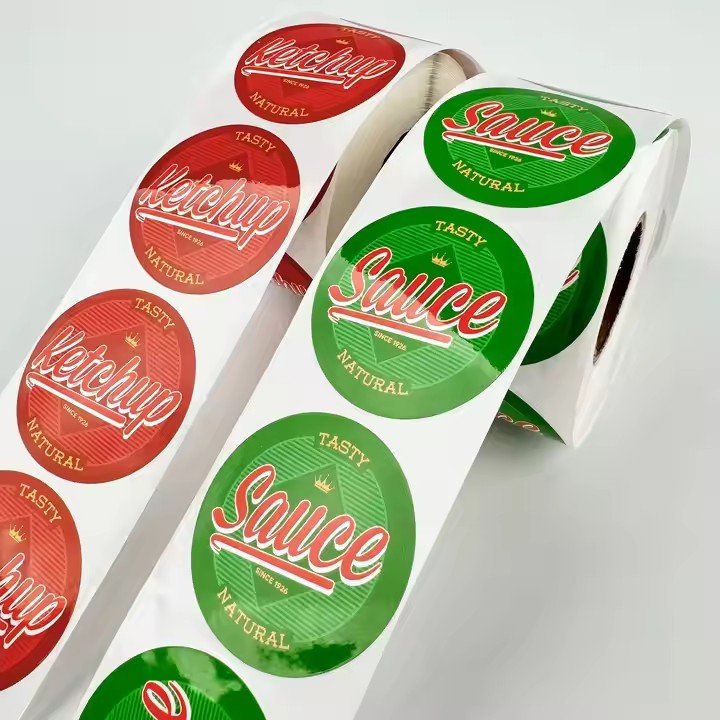
High-saturation colors (e.g., red, bright yellow) suit fast-moving consumer goods (FMCG) decals like beverage bottles or snack packs—studies show they receive 40% more visual attention than low-saturation colors.
Morandi tones (e.g., dusty pink, foggy blue) are ideal for home decor decals (e.g., fridge, wall), creating a soothing atmosphere.
Industrial decals should use warning colors (e.g., yellow-black stripes, red text on white) compliant with ISO 3864 standards for safety and recognition.
Material surface affects color performance: matte materials enhance low-saturation color texture, while gloss finishes amplify high-saturation visual tension through reflectivity.
Simplified graphic language retains core identifiers:
Figurative designs should focus on “feature extraction”—e.g., animal-themed decals might only include silhouettes and signature features (panda’s eye patches, giraffe’s long neck), minimizing detail for small-size printing.
Abstract graphics should evoke emotion: waves suggest flow (good for beauty decals), triangles suggest strength (ideal for sports equipment).
Graphic complexity should match decal size: decals under 5cm in diameter should include no more than 3 elements to avoid clutter; large decals (e.g., car wraps) can layer gradients and transparencies to create depth.
Functional hierarchy of text:
Brand names should use highly legible fonts (e.g., sans-serif), with font size accounting for at least 15% of the layout to ensure readability from a distance.
Supporting text (e.g., material info, usage tips) should be ≥2pt and placed at the edges to avoid interfering with the main visual.
For children’s decals, text should combine readability + fun, using rounded fonts and visual aids (e.g., pairing the Chinese character for “sweet” with a candy icon) to improve recognition.
- Carrier-Adapted Systematic Design: From 2D to Multidimensional
The final result of a decal sticker depends on how well it fits the physical characteristics of its application surface. Design must anticipate surface material, shape, and texture to avoid disconnection from reality.
Deformation compensation for curved surfaces:
For curved carriers (e.g., thermos bottles, helmets), graphics should be compressed by 10%–15% along the arc during printing, so they restore proportion upon application. Otherwise, distortion like bulging or shrinking may occur.
For cylindrical surfaces (e.g., pens, cans), a “tapered at both ends” design reduces seam visibility. One brand’s marker pen decal lacked this tapering and showed a 20% seam overlap rate—user complaints rose 25%.