professional in one-stop Packaging Labels solutions
e-mail:hxmdlz@hxmpackage.com
Shenzhen Huaxinmei Printing Co., Ltd.
Features
- Design
- why choose us
- Our Advantage
- How to use
- Our Services
FAQ
- Support
- certification
- payment
- customization
- Privacy Policy

The color choice of a champagne label directly affects how quickly and sharply consumers notice the bottle on a retail shelf. If the label color aligns with public aesthetics and matches the character of the champagne, a strong color block can stand out among competing products and attract more visual attention in a crowded marketplace.
The key to being eye-catching is not drifting away from the product’s premium identity. All color combinations should follow these three principles and avoid being “bright but cheap-looking.”
1. Tone Alignment: Anchor to Premium Light-Luxury Positioning
Champagne is mainly associated with fine dining, celebrations, gifting, and upscale social settings. Priority should be given to low-saturation elegant tones, metallic colors, and classic neutrals. Avoid high-saturation fluorescent colors (such as neon pink or bright green) and dull muddy tones. The label should attract attention while still matching champagne’s sense of quality and ceremony.
2. Visual Contrast: Strong Contrast for Attention, Soft Contrast for Atmosphere
Effective contrast between the label and the bottle — and within the label itself — is essential for visibility. Dark bottles (such as deep green champagne bottles) pair well with light or bright label colors. Light or frosted bottles work better with high-contrast label colors. Within the label, the main and secondary colors should be clearly differentiated to avoid flat, same-tone stacking without hierarchy.
3. Scenario Fit: Match Colors to Usage Occasions
Different champagne occasions call for different color logic. Festive scenes suit warm celebratory tones, business settings favor cool premium tones, and niche light-luxury products work well with distinctive low-saturation palettes. Color should act as a visual symbol of the occasion and resonate instantly with the target audience.
Consumers in different scenarios have different color sensitivities and preferences. Choosing the main label color by scenario helps products stand out quickly on retail shelves, gift displays, and banquet tables.
(1) Festive & Gift Occasions (New Year / Christmas / Weddings / Anniversaries)
Core needs: celebration, ceremony, premium gift feel
High-impact color families: gold (foil or matte), wine red / burgundy, deep purple, navy blue
Examples:
Matte gold base + burgundy foil patterns
Navy base + silver lines
Burgundy base + light gold accents
Attention logic: Gold is the classic champagne color and naturally conveys luxury. Burgundy and deep purple are festive warm tones that match celebration themes without looking vulgar due to their lower saturation.
(2) Business & Formal Occasions (Corporate events / Premium dinners / Custom gifts)
Core needs: premium feel, simplicity, formality
High-impact color families: black-gold, gold-gray, matte silver + ivory, navy + light gold
Examples:
Pure black base + bright gold foil logo
Light gray base + matte silver lines
Ivory base + navy typography + small gold stamp
Attention logic: Black, gray, and navy are classic business neutrals. Paired with metallic gold or silver, they maintain formality while using metallic shine to create visual focus in minimalist environments.

Single colors can feel dull, while too many colors feel messy. The following three formulas balance visibility, texture, and print feasibility. Recommended ratio: main color ≥ 70%, secondary color ≈ 20%, accent color ≤ 10%.
(1) Classic Formula: Metallic + Neutral (Fail-Safe Combination)
Core combos:
Gold + black/white/gray/navy
Silver + black/ivory/navy
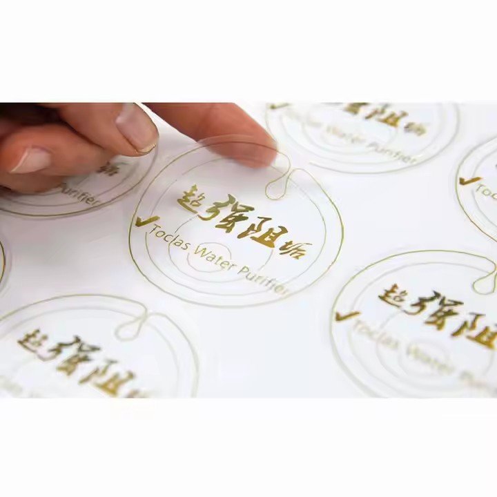
Key point: Neutrals create a clean base, while metallic foil or metallic ink becomes the focal point. The contrast between metallic gloss and matte backgrounds enhances refinement and visual impact — the “golden rule” of champagne label design.
(2) Light-Luxury Formula: Low-Saturation Soft Tone + Light Gold / Matte Silver
Core combos:
Dusty blue + light gold
Rose beige + matte silver
Cream white + champagne gold
Mint green + soft gold
Key point: Soft tones create a gentle premium atmosphere. Small areas of light gold or matte silver in logos and borders prevent the design from looking flat while preserving a light-luxury feel. Ideal for younger audiences and boutique champagne lines.
(3) Festive Formula: Deep Celebration Tone + Bright Gold
Core combos:
Burgundy + bright gold
Deep purple + bright gold
Navy + bright gold
Key point: Deep tones avoid the cheap look of high-saturation bright reds and purples. Bright gold highlights text and patterns, creating strong ceremony cues. Red-gold and purple-gold combinations are widely recognized as premium gift visuals and attract attention quickly in gift displays.

Champagne bottles are commonly deep green (classic), clear or frosted (fresh style), and dark brown (reserve style). Label colors must create sufficient contrast with the bottle so the label visually “pops” instead of blending in and getting visually lost.
Proper contrast ensures the label remains readable and striking from a distance, which is critical for shelf competition.
professional in one-stop Packaging Labels solutions
e-mail:hxmdlz@hxmpackage.com
Shenzhen Huaxinmei Printing Co., Ltd.
Fill in the form below to book a 30 min no-obligation consulting session.
I will reply within 24 hours.