professional in one-stop Packaging Labels solutions
e-mail:hxmdlz@hxmpackage.com
Shenzhen Huaxinmei Printing Co., Ltd.
Features
- Design
- why choose us
- Our Advantage
- How to use
- Our Services
FAQ
- Support
- certification
- payment
- customization
- Privacy Policy
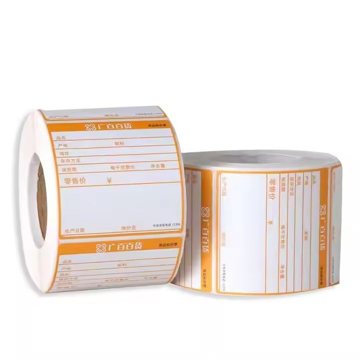
The core prerequisite of effective communication is “instant understanding.” Overly complex icons increase cognitive load for overseas audiences, so minimalist design is the foundational principle for cross-border communication. Icons should strip away redundant decoration and focus on the core attributes of paper sticker rolls—the roll form + adhesive function—using clean lines and geometric elements to build a clear visual symbol.
In terms of form, circular and curved shapes can summarize the roll structure, combined with rectangles and minimalist arrows to suggest the “peel-and-stick” action, forming a highly condensed visual language. For example, using smooth curves to wrap a rectangular sticker can intuitively express the roll format, while arrow direction implies usage, allowing the function to be understood without text.
Color usage should follow a principle of “restrained adaptability”: prioritize brand primary colors (such as industrial blue or metallic gray commonly used by door and window companies), paired with white or black to create strong contrast. This ensures clarity on both small labels (2 cm × 2 cm) and large exhibition posters, while aligning with the minimalist industrial aesthetic favored in European and Australian markets.
Line design should be in vector format to ensure distortion-free scaling. Line thickness should be consistent and no less than 0.3 mm to avoid blurring or breakage in small-size printing, complying with European ISO 12647 printing standards and enhancing the professionalism and quality of export materials.

Sticker roll icons should be closely tied to door and window application scenarios, establishing a strong association between icon–product–use, enabling audiences to quickly grasp product value. The key is to cleverly integrate the paper sticker roll form with door and window elements and functional selling points, avoiding isolated or abstract designs.
Minimalist door and window outlines can be incorporated—for example, shaping the curve of the paper roll to resemble a sliding window frame, with the sticker area embedding certification symbols such as CE or AS 2047. This directly conveys the core message of “certified sticker rolls for doors and windows,” making it ideal for export packaging and helping overseas customers quickly identify product usage.
For functional features, integrate internationally recognized symbols:
Salt-spray-resistant stickers can use a droplet + shield icon, suitable for coastal door and window labels in Australia.
Eco-friendly and recyclable versions can combine the Möbius loop (recycling symbol) with paper roll lines, aligning with Europe’s carbon-neutral trend.
High-temperature-resistant versions can use a sun + thermometer icon to meet the needs of high-temperature regions in Southern Europe.
At the same time, simulated usage dynamics can be shown through dashed lines or arrows depicting the moment when a sticker is peeled from the roll and applied to a door or window profile. This enhances contextual immersion, makes the icon more vivid, and strengthens audience memory.
Overseas markets value not only functionality but also visual design with warmth and attitude. Emotional elements can effectively soften the rigidity of industrial products, improving communication appeal and brand identification.
In terms of shape, rounded corners should be used for paper rolls and sticker edges to avoid the sense of distance created by sharp lines. This suits residential door and window consumption scenarios and conveys visual signals of “safety” and “friendliness,” which are particularly popular in European markets.
Natural symbols can also be incorporated—for example, adding minimalist leaf lines at the base of the paper roll to suggest the use of biodegradable paper materials. This responds to global green consumption trends and communicates environmental responsibility without text, enhancing brand favorability.
More importantly, brand DNA should be embedded. Integrate core elements of the brand logo (such as initials or signature graphics) into the icon—for example, transforming the curve of the paper roll into a stylized brand initial, or embedding the logo outline into the sticker area. This ensures that audiences associate the icon with the brand at a glance, creating a proprietary memory point and avoiding homogenized competition.

Most paper sticker roll icons on the market follow a basic “roll + sticker” format. Differentiated design is key to breaking communication bottlenecks and strengthening competitiveness. Unique symbols should be created based on brand positioning and product selling points.
From a functional differentiation perspective, exclusive symbols can be designed for the specific needs of door and window stickers:
Anti-counterfeiting versions can integrate a QR code + shield combination.
Weather-resistant versions can add a lightning bolt + shield symbol.
High-adhesion versions can use tightly aligned double-rectangle lines to imply strong bonding.
These visual cues quickly communicate core advantages and distinguish the product from ordinary sticker rolls.
Paper sticker roll icons need to be applied across multiple scenarios—product labels, packaging, websites, social media, and exhibition materials. Design must therefore account for different media characteristics to avoid scenario limitations that weaken communication effectiveness.
Size adaptability should achieve “small yet clear, large yet refined.” Core elements should be concentrated in the outer contour to ensure that the main form remains intact on 2 cm × 2 cm labels, while details do not appear empty on 1 m × 1 m posters.
In terms of language adaptability, avoid Chinese or niche languages and prioritize internationally recognized graphic symbols. Replace text with certification marks and functional icons to achieve language-free communication suitable for cross-border contexts.
Material adaptability must consider different printing processes. Avoid gradients and overly fine lines to ensure accurate reproduction across adhesive labels, paper packaging, and spray-printed exhibition boards. This guarantees consistency throughout the entire communication chain and enhances overall brand visual unity.
professional in one-stop Packaging Labels solutions
e-mail:hxmdlz@hxmpackage.com
Shenzhen Huaxinmei Printing Co., Ltd.
Fill in the form below to book a 30 min no-obligation consulting session.
I will reply within 24 hours.