

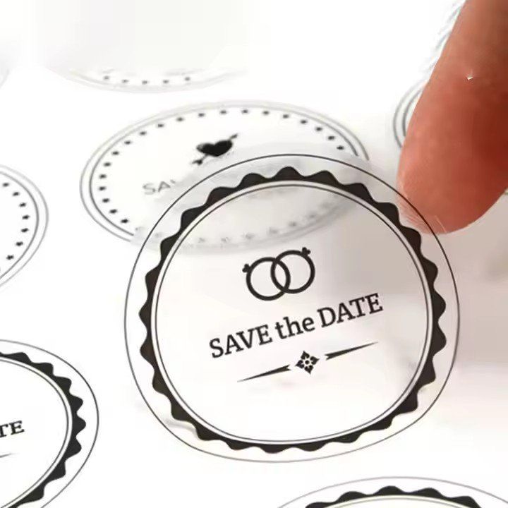
- Core Aesthetic Logic: From “Visual Comfort” to “Emotional Resonance”
Before designing a doll box sealing label, it’s essential to understand the underlying logic of mass-market aesthetics — consumers’ first impression is whether the label looks visually pleasing, and their deeper response is whether it evokes emotional connection.
This can be divided into three key dimensions:
Visual Harmony — colors, graphics, and typography should feel balanced and natural.
Cognitive Clarity — information must be straightforward and easy to process.
Emotional Warmth — the design should align with the emotional attributes of dolls (such as cuteness, warmth, or nostalgia).
For doll products, the general public tends to favor aesthetics that feel warm, cute, and positive. Whether targeting children’s cartoon dolls, trendy collectibles for young adults, or artistic collector editions for adults, consumers expect a sense of joy and delight from the label.
Children look for familiar cartoon imagery and bright colors.
Young people value trendiness and self-expression.
Adults prefer refined, sentimental, and elegant visuals.
Therefore, the design should balance universal aesthetic appeal (harmonious color palette and clean layout) with product-specific style tuning, avoiding overly niche or cluttered visuals. Ideally, the design should capture consumer liking within three seconds.
- Color Design: Using “Emotional Tones” to Match Public Visual Preferences
Color is the most emotionally charged and instantly noticeable element in label design. People’s color preferences are often tied to emotional associations — bright colors evoke joy, soft hues convey warmth, and deep tones suggest sophistication.
When designing doll box labels, follow the principle of “clear main tone + coordinated accent tone,” based on the product’s target audience and brand identity.
(1) Main Color: Align with Product Attributes and Emotional Tone
For children’s dolls: Use high-saturation, high-brightness colors like red, yellow, blue, and pink-purple. These easily attract attention and express playfulness and cheer.
Example: Pink or yellow as main tones for plush toys (for cuteness and warmth), with white line accents for friendliness; blue or green for plastic dolls to evoke freshness and fun.
For trendy dolls (young adults): Blend trend colors and muted tones such as Morandi pink, Klein blue, caramel brown, or fog blue. These balance individuality with sophistication.
Example: Use black with silver or gold highlights for a “cool, premium” look, or light gray and beige with low-saturation accents for a minimalist, artistic vibe.
For collectible dolls (adults): Opt for low-saturation, deep hues like dark brown, navy, forest green, or off-white to express elegance and depth.
Example: Deep brown with gold stamping for a vintage, luxurious tone, or off-white with light gray text for understated refinement.
(2) Accent Colors: Balance the Palette and Add Depth
Accent colors fill emotional gaps and prevent monotony. Follow either analogous harmony or complementary contrast principles:
Analogous harmony: Pair pink with light purple or light orange (warm hues) or blue with mint green or gray (cool hues) for unity.
Complementary contrast: Add small touches of purple with yellow, or green with red, in corners, icons, or text highlights to increase visual impact.
Accent colors should never exceed 30% of the total color area, to maintain focus and visual stability.
- Graphic Design: Use “Concrete Symbols” to Convey Value and Spark Emotion
Graphics form the visual centerpiece of label design and play a crucial role in helping consumers understand the product. The public tends to favor figurative, relatable imagery over abstract designs — visuals that feel familiar and emotionally connected.
Thus, doll box label graphics should avoid excessive abstraction or irrelevance. Instead, focus on figurative symbols that reflect the doll’s appearance, story, or emotional appeal.
(1) Core Graphics: Center on the Doll’s Identity
The main image should highlight the doll’s front view or signature features, allowing consumers to immediately recognize and connect the label to the product, reducing cognitive effort.
