

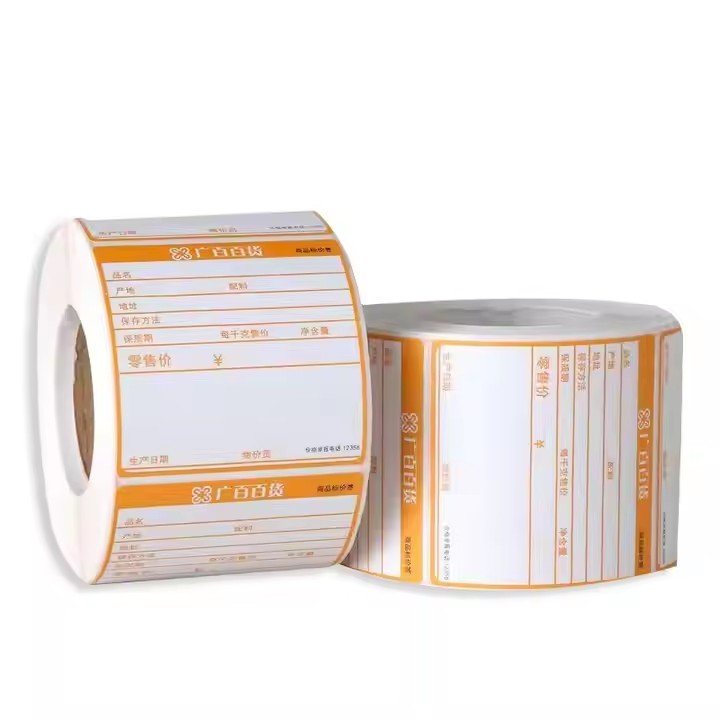
professional in one-stop Packaging Labels solutions
e-mail:hxmdlz@hxmpackage.com
Shenzhen Huaxinmei Printing Co., Ltd.
Features
- Design
- why choose us
- Our Advantage
- How to use
- Our Services
FAQ
- Support
- certification
- payment
- customization
- Privacy Policy

The first priority in designing fish oil icons for young consumers is to define a clear core positioning: “reduce the medical look, emphasize lifestyle relevance, ensure strong recognition and high adaptability.”
Unlike middle-aged and elderly consumers, who tend to value authority and seriousness in health supplements, younger consumers prefer visual expressions that feel relaxed, fashionable, and integrated into daily life. At the same time, the design must quickly communicate the core message—fish oil = deep sea, health, purity—and avoid blurring the product identity by overemphasizing aesthetics.
The essence of icon design lies in the precise selection and rational combination of elements. The design should revolve around both fish oil attributes and youthful expression, forming a “core elements + supporting elements” system that is recognizable without feeling cluttered.
(1) Core Elements: Locking in the Product’s Core Identity
Core elements should directly reference the essence of fish oil, enabling instant product recognition while being reinterpreted in a youthful way:
1. Deep-sea imagery
Move away from traditional, realistic large-fish illustrations. Instead, use minimalist line-drawn fish silhouettes—such as abstract salmon or cod forms—with smooth, rounded lines and no sharp angles.
Wave or ripple motifs can be used as supporting visuals, replacing realistic water imagery with gradients or geometric wave patterns to convey a sense of pure, deep-sea origin. For example, continuous minimalist wave lines can wrap around the bottle or serve as a background element, subtly reinforcing the marine attribute of fish oil.
(2) Supporting Elements: Enhancing Youthfulness and Lifestyle Context
Supporting elements enrich visual layers and connect with everyday life, preventing the core imagery from appearing too monotonous:
1. Geometric shapes
Soft geometric elements—such as circles, arcs, and fine lines—work well alongside core visuals. Examples include circular frames enclosing fish and capsule icons, or thin-line grid backgrounds that add a modern feel. Sharp-edged squares or triangles should be avoided to reduce visual tension.
2. Lifestyle symbols
Incorporate simplified symbols related to how young people consume fish oil—such as work, fitness, or home settings. Minimalist icons like a laptop, dumbbell, or water glass outline can make the design feel more relatable and emotionally engaging.
For instance, pairing a capsule icon with a simple water-glass line subtly communicates the convenience of “taking with meals.”
Based on mainstream youth aesthetics, fish oil icon design can focus on three major styles. Each corresponds to different visual languages and brand positioning needs.
(1) Minimalist Trendy Style: For Fashion-Forward Consumers
Style essence: “Less is more.” Use clean lines and high-contrast colors to create a bold, trendy look.
Color palettes typically revolve around black, white, and gray, accented with small areas of high-saturation colors such as bright blue. Examples include black line art with vivid blue highlights, or white backgrounds with dark gray outlines.
Element combinations often feature “core imagery + minimalist geometry,” such as abstract fish paired with bold circular outlines, or capsules juxtaposed with simple symbols like “Ω”.
(2) Fresh Natural Style: For Health-Oriented Lifestyle Groups
Style essence: Convey purity and health through soft, natural visuals.
Colors favor low-saturation natural tones such as light blue, pale green, off-white, and light gray.
Designs emphasize deep-sea imagery and natural textures—for example, minimalist wave patterns paired with rounded capsules, or fish line art blended into light blue gradient backgrounds.
Youth-oriented designs can easily fall into the traps of being overly decorative or lacking clarity. Careful attention to detail ensures both aesthetics and usability.
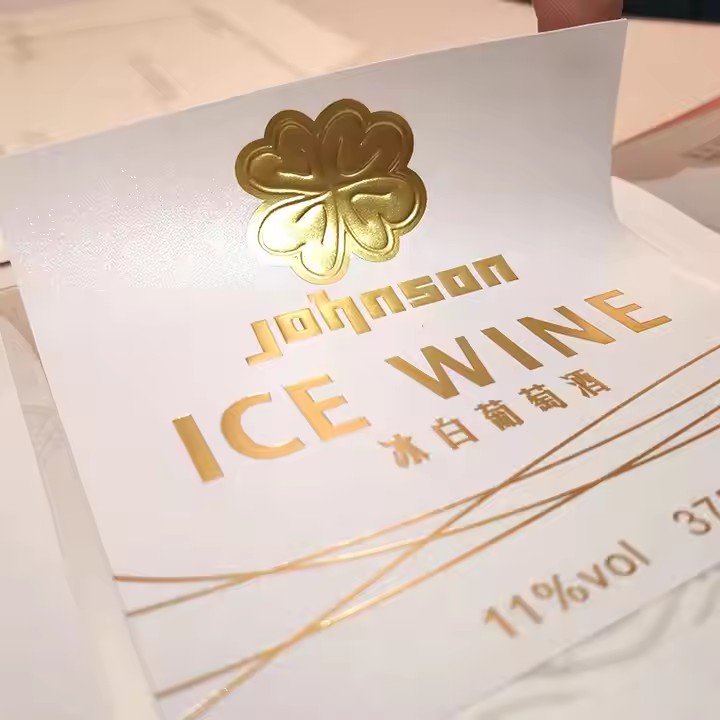
(1) Color Control: Avoid Aging Tones While Maintaining Clarity
Avoid traditional supplement colors like gold, dark red, or deep brown, which can feel outdated. Instead, prioritize low-saturation youthful tones or high-contrast trendy palettes.
Ensure legibility: light backgrounds should use dark lines, and dark backgrounds should use light lines, so small-scale icons (such as bottle labels) remain clear. Limit each design to no more than three colors to prevent visual clutter.
(2) Line Control: Smooth, Simple, and Production-Friendly
Lines should be smooth and rounded—neither too thin nor overly complex—to avoid printing blur or breakage during production.
Core elements can use slightly thicker lines, while supporting elements use finer lines to create visual hierarchy.
For bottle graphics, consider curved-surface adaptability: avoid line distortion at bends by using symmetrical (top-bottom or left-right) layouts.
Different application scenarios place different demands on icon structure, size, and detail. Designs should be adjusted accordingly to ensure real-world usability.
1. Bottle label applications
Icons should be concise and compact, with clearly emphasized core elements and no overly complex backgrounds. Regular shapes such as circles or squares are ideal for label sizing.
Light-toned color schemes paired with clear line work help reduce glare on bottle surfaces and ensure easy recognition after application.
professional in one-stop Packaging Labels solutions
e-mail:hxmdlz@hxmpackage.com
Shenzhen Huaxinmei Printing Co., Ltd.
Fill in the form below to book a 30 min no-obligation consulting session.
I will reply within 24 hours.