
I. Core Design Principle: Make the Pearl Texture the Visual Focus
Designing pearl stickers requires emphasizing strengths and avoiding excess.
The natural luster and 3D raised texture of pearl beads are their key visual highlights — the pattern should therefore enhance rather than overshadow this feature.
Three core principles help maximize the beauty of this material:
- Prioritize White Space — Avoid “Full-Surface Crowding”
Pearl beads already have strong visual presence, so full-coverage layouts can appear cluttered and unfocused.
Keep at least 40% of blank space to create contrast between “pearl elements” and “empty areas,” highlighting the material’s elegance.
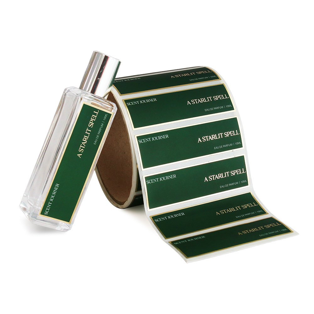
Example: For planner stickers, arrange only 3–5 pearls of varying sizes in one corner, outlined with delicate lines or a minimalist border — decorative yet not overpowering.
For gift packaging stickers, pearls can form arcs or dotted outlines around the brand logo, serving as accents rather than covering the entire surface.
- Simplify Lines to Match the 3D Texture
Because pearls are raised, overly intricate lines (e.g., vines, dense geometric shapes) can look fragmented.
Use bold lines, minimal contours, or even replace line segments with pearls themselves.
Example: For a heart design, instead of drawing a solid outline, arrange pearls in a heart shape with size gradation, finishing the edges with 1–2 slightly larger pearls — preserving the form while highlighting the texture.
For borders, use pearls instead of floral motifs: place four pearls at the corners, link them with thin dotted lines, adapting easily to different sticker sizes.
- Use Restrained Colors — Let the Pearl’s Natural Shine Speak
Pearls have soft iridescent tones (white, ivory, light pink). Pairing them with highly saturated colors (like bright red or vivid yellow) creates harsh contrast and weakens their gentle glow.
Stick to low-saturation, tonal harmony.
Base colors: white, ivory, or light gray backgrounds, keeping pearls in their natural shade (or lightly tinted with pastel pink or blue) — timeless, elegant, and versatile.
Accent colors: use subtle fine lines in light gold or silver between pearls, or apply a soft gradient effect (white to pale pink). Avoid large areas of bright colors to preserve the refined texture.
II. Four Main Design Styles for Different Application Scenarios
Pearl sticker styles should match their intended use. Different settings require varying levels of detail and delicacy.
Below are four mainstream design directions suitable for planners, decoration, and gift packaging.
- Minimalist “Ins” Style – For Planners and Phone Cases
This style values simplicity and sophistication, ideal for small surfaces such as journal pages, phone cases, or notebook covers.
Design elements: single large pearls (8–12 mm), small pearl clusters (3–5 mm), and thin lines (0.5–1 mm).
Typical patterns:
Single Pearl + Fine Circle: one pearl centered in a thin ring (0.5 mm line, light gold or silver), placed in the corner of a phone case or near a planner title — subtle yet elegant.
Pearl Dotted Line: 3–4 small pearls linked with pale gray dotted lines — works as dividers in journals or as accents around photos.
Irregular Scatter: 5–6 pearls of varying sizes arranged loosely and asymmetrically — perfect for notebook covers or gift box sides, creating a natural, effortless feel.
- Vintage Elegant Style – For Gift Packaging and Apparel Decoration
Vintage designs emphasize classic refinement, integrating European motifs and retro symbols.
Suitable for gift boxes, envelopes, clothing trims (collars, cuffs), or vintage-themed journal layouts.
Design elements: pearl strings, baroque scrollwork, ribbon shapes, serif typography.

Typical patterns:
Pearl Bow: pearls arranged along a bow outline, with two slightly larger ones at the knot center and thin beige or champagne lines defining folds — ideal for the top of gift boxes, replacing fabric ribbons.
Pearl Lace Trim: pearls forming semi-circular arcs with minimal scroll accents — elegant for envelope seals or vintage photo borders.
Pearl Letters: simple words like LOVE or JOY formed from pearls, with larger pearls at letter corners for emphasis — great for box sides or holiday greeting cards.
- Cute “Kawaii” Style – For Children’s Stationery and Collage Journals
This “soft and healing” style features rounded shapes and adorable motifs, perfect for children’s notebooks, stationery stickers, or cute-style bullet journals.
Design elements: cartoon animal outlines (bunny, bear), circles, hearts, and stars.
Typical patterns:
Pearl Animals: pearls forming a bunny’s face (round head + long ears), with pink pearls at ear tips and tiny black printed dots (non-pearl) as eyes — adorable yet refined, ideal for kids’ notebook covers.
