
The external label design of e-cigarettes should be based on thorough market research before determining appropriate design approaches and concepts.
- Color Application: Creating Visual Impact and Emotional Resonance
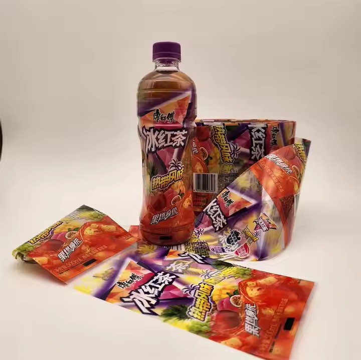
Color is the most impactful element in label design, capable of quickly grabbing consumer attention and conveying specific emotions and brand personality. The primary color should align with the e-cigarette flavor and target audience. For example, fruit-flavored e-cigarettes can use bright, vibrant colors like orange, pink, or green. Orange represents orange flavor, conveying energy and sweetness; pink indicates strawberry flavor, evoking a sweet and romantic feel; green corresponds to mint flavor, creating a fresh and cool experience. These colors not only intuitively hint at the flavor but also create strong shelf contrast, drawing consumer attention.
For trendy youth-focused products, bold color clashes—like purple with yellow, or blue with orange—can be used to present a fashionable and unique brand identity. For a more mature or professional demographic, stable and elegant tones like dark gray, navy blue, or gold are more suitable, reflecting a high-end and premium feel.
Color choices should also take into account cultural differences and psychological implications. In different cultural contexts, the same color can carry different meanings. For example, red symbolizes celebration and luck in Chinese culture, but in some Western countries, it may signal danger or warning. Therefore, for global market expansion, it is important to understand cultural nuances and use color appropriately to avoid misunderstandings.

- Graphic Elements: Shaping a Distinct Brand Identity and Product Recognition
Graphics are crucial for conveying information and building brand identity. Unique and creative visuals help e-cigarette labels stand out and leave a lasting impression. You can design signature graphic symbols based on the flavor, features, or brand philosophy. For instance, fruit-themed e-cigarettes can use stylized, minimal illustrations of fruits to make the flavor easily recognizable at a glance.
For brands that emphasize technology and futurism, abstract geometric shapes, lines, or tech elements like circuit board patterns or beams of light can be used to convey innovation and advanced technology. Embedding the brand logo into the graphic design can also strengthen brand recognition. Unique graphics not only enhance product identifiability but also help establish a memorable brand image.
Additionally, graphics can create a sense of scene or storytelling. For example, depicting users enjoying e-cigarettes during leisure time or social gatherings can evoke emotional resonance and spark buying interest. Through clever use of graphic elements, the product’s characteristics and brand values can be visually communicated to consumers, enhancing the label’s appeal and persuasiveness.
- Typography: Clear Information Delivery with Aesthetic Appeal
Typography is an essential part of e-cigarette label design, directly affecting how well information is conveyed and the overall visual aesthetics. First and foremost, the text must be clear and accurate, including product name, flavor, ingredients, usage instructions, and warnings. The product name and flavor should be in larger font sizes to ensure they are easy to spot.
Font selection should reflect the brand style and product positioning. For trendy, fashionable e-cigarettes, creative and stylish fonts can be used; for high-quality and professional brands, simple and clean sans-serif fonts are more appropriate. Adjusting font weight, color, and spacing helps create hierarchy and rhythm. For example, using bold fonts for the product name and lighter fonts for descriptive text makes the information both attractive and easy to read.

Typography should also maintain visual harmony and order. Techniques such as alignment and grouping can make the layout more structured and readable. Avoid cluttered or overcrowded arrangements that hinder the user’s reading experience. Well-designed typography not only conveys information effectively but also contributes to a refined and high-quality label design.
- Materials and Finishing: Enhancing Texture and Tactile Appeal
Beyond visual design, the material and finishing techniques of the label also play a key role in attracting consumers. Choosing the right materials enhances product texture and offers a distinct tactile experience. For instance, using textured specialty papers like linen or vellum can increase the sense of luxury; transparent adhesive materials can give a modern and clean visual effect.
For finishing, techniques like foil stamping (gold/silver), spot UV, and embossing can be used to add dimensionality and depth. Foil stamping makes text or graphics more prominent, giving the product a premium look; spot UV highlights important information to catch the eye; embossing provides tactile feedback that enhances the user experience and product appeal.
By smartly integrating various materials and techniques, e-cigarette labels can leave a strong impression both visually and physically, boosting the product’s perceived value and market competitiveness.
