
I. Core Logic Behind Wine Label Graphic Design
Brand Recognition Comes First:
The graphics should convey the brand’s core identity—such as region, craftsmanship, or philosophy—while avoiding excessive decorative elements that cause visual clutter. For example, Penfolds’ pyramid icon is simple, memorable, and has become a signature symbol of the brand.
Adapt to Consumer Scenarios and Target Audiences:
For entry-level wines targeting younger consumers, the graphics can be livelier and more minimalistic. Premium collectible wines should emphasize texture and cultural depth. For products targeting Asian markets, elements of Eastern art—such as landscapes or calligraphy—can enhance cultural resonance.
Compliance Requirements:
Graphics must comply with the labeling regulations of the target market (e.g., Australia requires region of origin, grape variety, alcohol content; the EU requires geographical indication). Graphics must not cover mandatory information or mislead consumers (e.g., using imagery of a false origin).
Match Materials and Printing Techniques:
Graphic design should align with label materials (e.g., coated paper, matte paper, foil paper) and printing techniques (e.g., hot stamping, UV embossing, embossing). For example, metallic effects pair well with hot-stamping, while watercolor-style graphics look best on matte paper, enhancing visual depth.
II. Classic Types of Wine Label Graphics and Key Design Points
- Regional Landscape: Conveying the Essence of Terroir
Region is a key quality indicator for wine. Landscape graphics visually recreate the terroir, helping consumers experience the “taste of the land,” and are widely used by global wine brands.

Core elements:
Vineyards (rows of vines, harvest scenes), geographical landscapes (e.g., Barossa Valley’s red-soil hills, Bordeaux’s rivers and châteaux, Tuscany’s hill towns), and climate cues (sunshine, morning fog, starry skies).
Design styles:
Realistic: High-resolution photography or detailed illustrations for brands emphasizing terroir purity. Example: Jacob’s Creek vineyard imagery conveys natural purity.
Expressive/Minimalist: Simple lines or watercolor strokes suggesting the landscape’s outline, ideal for boutique high-end wineries (e.g., minimalist vineyard line drawings on some Burgundy labels).
Color strategy:
Use earthy tones (brown, ochre, olive green) combined with region-specific colors (e.g., Barossa’s red soil, Bordeaux’s river blue). Avoid highly saturated colors to maintain a natural, refined aesthetic.
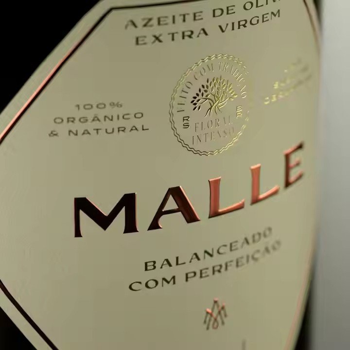
- Brand Symbolism: Enhancing Visual Memory
Using the logo, emblem, or family crest as the main graphic element emphasizes brand heritage and values—ideal for wineries with strong brand history.
Core elements:
Family crests (e.g., Château Lafite’s five-arrow emblem), stylized brand lettering (e.g., Wolf Blass), or iconic symbols (e.g., Penfolds’ pyramid, Mouton’s ram’s head).
Design styles:
Vintage emblem style: Symmetrical composition with ornate elements (scrolls, shields, crowns), often combined with gold or silver foil to convey heritage and luxury—ideal for collectible wines.
Modern minimalist style: Simplified logos, geometric shapes, monochrome blocks—ideal for younger audiences. Example: “19 Crimes” uses prisoner silhouettes tied to its story-driven brand identity.
Ideal usage:
Flagship products or series that require consistent brand identity, strengthening quick consumer recognition. For example, Yellow Tail’s iconic kangaroo graphic is playful, simple, and instantly identifiable for entry-level wines.
- Grape Variety & Winemaking Craft: Highlighting Core Selling Points
These graphics showcase grape characteristics or winemaking processes, supporting transparency for consumers who value ingredients and craftsmanship.
Core elements:
Grape clusters (Cabernet Sauvignon’s full berries, Pinot Noir’s small round berries), grape leaves, oak barrels, cellar scenes, winemaking tools (presses, corks).

Design styles:
Realistic illustration: Detailed textures of grapes or oak barrels, enhancing authenticity—ideal for mid-tier wines to help consumers understand quality.
Abstract & simplified: Geometric shapes or line art representing grapes or barrels, paired with simple color palettes—common among modern New-World wineries.
Detail techniques:
Hidden information can be embedded, such as the number of grape leaves indicating the vintage year or barrel texture density hinting at aging duration, enhancing interaction and storytelling.
- Cultural, Artistic, and Story-Driven Graphics: Enhancing Brand Premium and Emotional Connection
These designs incorporate cultural symbols, artistic elements, or storytelling to elevate emotional value—ideal for high-end wines or products catering to culture-oriented consumers (especially in Asian markets).
Core elements:
Cultural symbols: Aboriginal patterns (Australia), Gothic architecture (France), Flamenco dancers (Spain), Chinese ink-wash landscapes and calligraphy.
Artworks: Sections of famous paintings like Van Gogh’s Sunflowers or Monet’s Water Lilies, or commissioned artist collaborations that create unique, collectible labels.
Story scenes: Visualized narratives such as the founder’s journey or historical events (e.g., wartime winemaking scenes), enriching brand emotional appeal.
