
- Define Your Brand and Target Audience
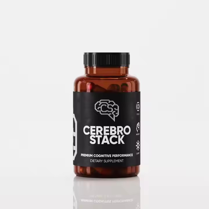
Brand style matters: The label should match the brand’s image. A luxury lip gloss brand can use metallic colors like gold and silver, with fine lines, embossing, or foil stamping to show elegance and class. A trendy, youth-focused brand can use bright colors like neon or pastel tones, along with fun graphics like doodles or pop art to look modern and energetic.
Know your audience: Understand what your target customers like. Young women may prefer cute icons like unicorns, flowers, or zodiac signs. Professional women may like simple, elegant patterns like geometric shapes or clean lines. Also, consider cultural differences in different countries to avoid misunderstandings.
- Use Smart Color and Visual Design
Color psychology: Colors create emotions. Red suggests passion and is great for bold, sexy lip gloss. Pink feels sweet and soft, perfect for youthful products. Purple gives a sense of luxury and mystery, ideal for premium items. Use color psychology to catch attention and increase appeal.
Color combinations: Good color matching makes a label stand out. Try contrast colors (e.g., red & green, yellow & purple) for bold impact, or similar tones (e.g., blue & purple, yellow & orange) for a soft, calm look. Gradient colors are also trendy and add depth and modern style.
- Creative Graphics and Patterns
Brand elements: Include key brand features like your logo or signature design elements. You can creatively reshape or combine them to become the central visual part of your label.
Trendy visuals: Follow design trends and add popular touches like hand-drawn flowers, animals, or current styles like retro or cyberpunk. You can also create special seasonal or holiday editions for a unique and collectible look.
- Fonts and Layout Design
Choose the right fonts: Fonts should match your brand style. Serif fonts feel classic and fancy—great for high-end brands. Sans-serif fonts look modern and clean—good for minimalist designs. Handwritten fonts feel personal and artistic—ideal for highlighting uniqueness or a handmade touch.
Smart layout: A good layout makes labels easier to read and more attractive. Use symmetrical layouts for balance, or asymmetrical layouts for a dynamic look. Make sure the spacing between text and graphics is just right—not too crowded or too empty.
- Material and Finishing for a Quality Feel
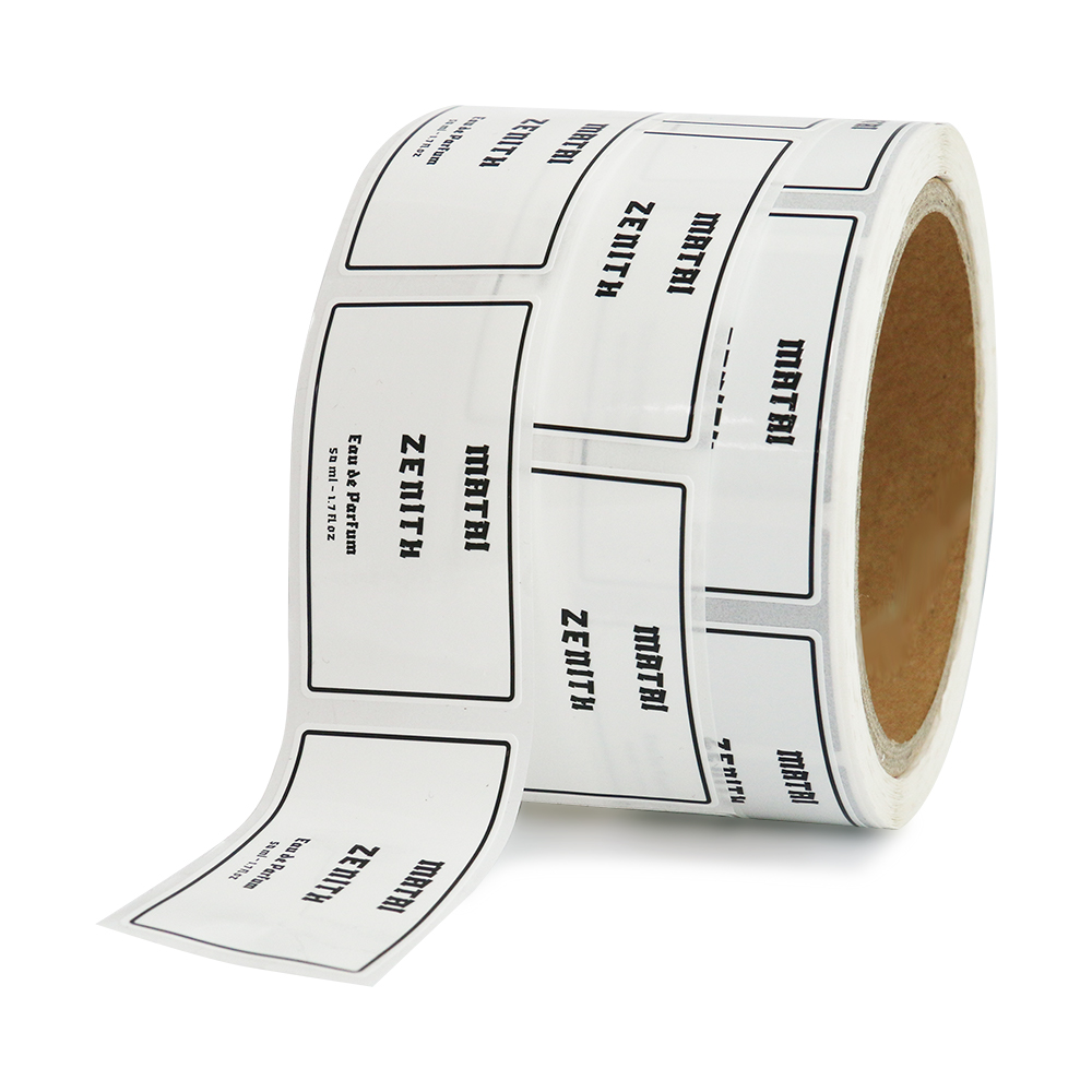
Choose materials wisely: The material affects how your label feels and looks. Paper is common—options include coated paper, kraft paper, or special textured paper. Plastic, metal, or fabric labels are also options. For example, PET plastic is waterproof and durable; metal adds a luxury touch.
Use premium finishing: Add shine with gold/silver foil, texture with embossing/debossing, or highlights with UV printing. Techniques like die-cutting or cut-outs can make special shapes that draw attention.
- Pay Attention to Details and Harmony
Leave white space: Don’t overload your label. Use blank space to make the design cleaner and more elegant. This also helps guide the viewer’s eyes to the most important parts.
Edge design: The shape of the label matters. Square corners feel sharp and clean; round corners feel soft and cute; irregular shapes make your label stand out.

Overall harmony: Make sure all design elements—color, font, images, materials—work well together. They should support each other and create a balanced look. Do multiple test prints to make sure the final design looks as expected.