
- Follow Color Trends to Create Visual Impact
The design of cosmetic stickers is crucial—only attractive designs can capture consumers’ attention. Color is the most direct visual language, quickly conveying the product’s character and brand tone. Designers should pay attention to global color trend agencies like Pantone and incorporate their Color of the Year into sticker designs. For example, Pantone 17-3938 “Very Peri,” a periwinkle blue released in 2022, was quickly adopted by many cosmetic brands. Its unique shade between blue and violet brought a fresh and energetic vibe, appealing to young consumers who value individuality.
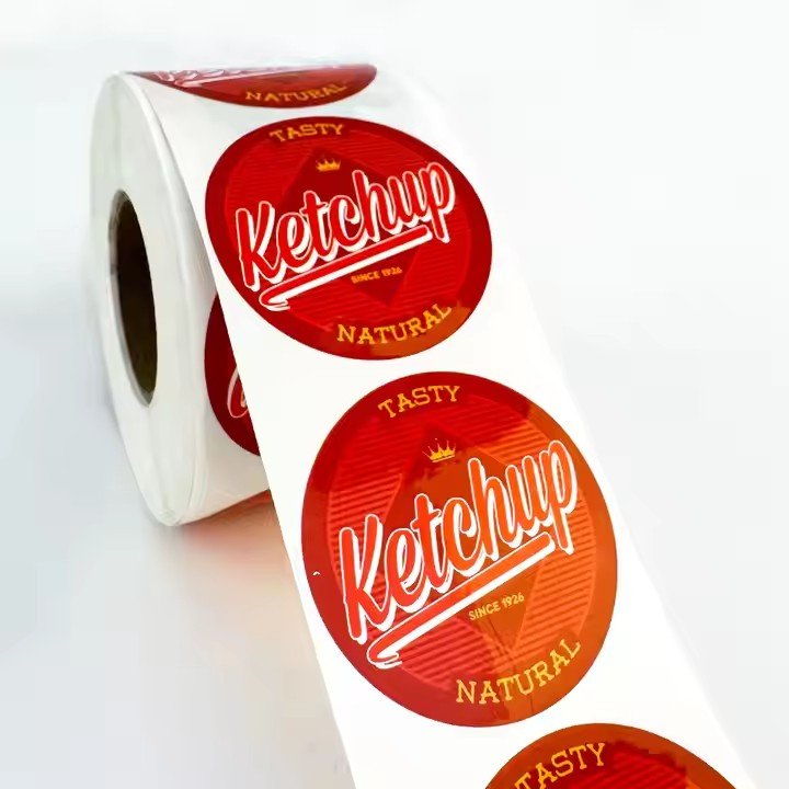
Beyond trend colors, strategic color matching can create distinctive moods. Complementary colors (e.g., red and green, yellow and purple) generate strong visual contrast and are effective for highlighting product benefits or promotions. Analogous colors (e.g., light pink and lavender) give a soft, elegant feel, suitable for premium skincare lines. Gradient colors—where one hue transitions smoothly into another—are also popular, offering a flowing, dreamy look that works well for conveying hydration or high-tech qualities.
- Use Innovative Graphic Elements to Show Creativity
Graphics are the heart of sticker design. Unique and original visuals help a product stand out on crowded shelves. Inspiration can come from nature, geometry, or abstract art. Natural motifs like flowers, plants, or marine life suggest purity and organic qualities—for instance, delicate rose petal patterns enhance a brand’s elegance and romance. Geometric shapes such as circles, squares, and triangles can be deconstructed and rearranged to form rhythmic and modern compositions, commonly used in makeup sticker designs. Abstract art, with its expressive lines and color blocks, adds an artistic and edgy feel, appealing to consumers who seek individuality.
Additionally, IP (Intellectual Property) characters enhance style and memorability. Brands can design exclusive mascots based on their identity and target audience. For example, a skincare brand might feature a cute cartoon fairy across its stickers to increase playfulness and consumer connection—especially popular among younger users—and strengthen brand recognition.
- Use High-Quality Materials and Craftsmanship to Elevate Texture
Material and print techniques greatly influence a sticker’s texture and tactile experience. Beyond standard paper, try innovative materials:
Transparent PVC creates a subtle “see-through” effect, integrating the sticker with the product’s packaging for a refined look.
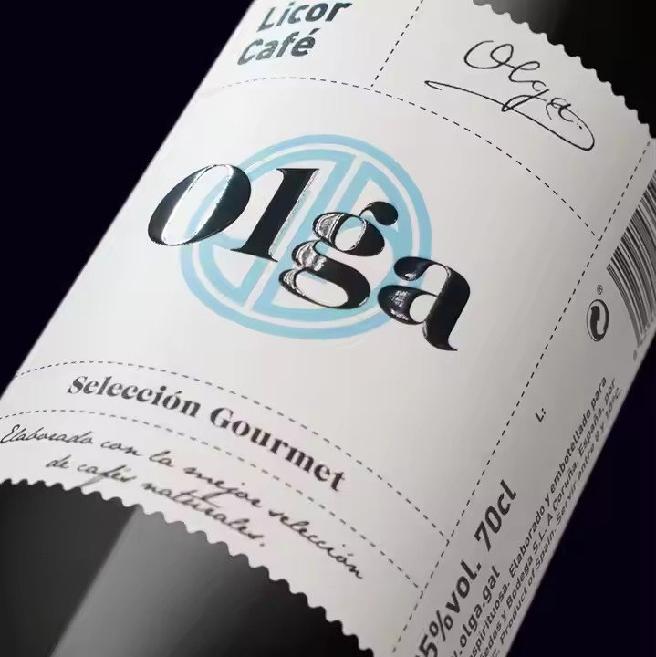
Metallic foil materials (gold or silver) convey luxury and sophistication, ideal for high-end cosmetics.
Frosted finishes offer a muted, understated elegance that communicates product quality and professionalism.
In terms of techniques:
Hot stamping (foil stamping) in gold or silver makes text or graphics stand out with a premium finish.
UV printing adds a raised texture to specific areas, enhancing visual and tactile experience—often used to highlight product names or key features.
Die-cutting breaks the flat sticker format with cut-outs that reveal the product or packaging beneath, adding depth and uniqueness.
- Infuse Cultural Elements to Add Depth
Incorporating cultural motifs into sticker design gives products more meaning and uniqueness. Traditional culture offers endless inspiration. For example, modern interpretations of Chinese patterns—such as cloud motifs, dragon scales, or blue-and-white porcelain—can be applied to stickers to reflect Eastern aesthetics and align with the rising “Guochao” (Chinese chic) trend. Ethnic elements like minority costume patterns or embroidery add exotic charm and a sense of mystery.
Modern subcultures also offer creative potential. Anime and ACG (animation, comic, game) styles resonate with young audiences—sticker designs featuring anime characters or two-dimensional art appeal strongly to this group. Street culture elements like graffiti and hip-hop art reflect individuality and urban trends, meeting the tastes of fashion-forward young consumers.
- Optimize Layout for a Clean, Appealing Look
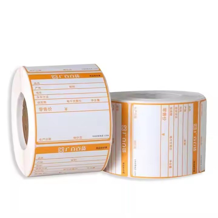
Well-structured layout is key to clear communication and visual balance in cosmetic sticker design. Stick to a clean, minimalist approach—avoid overcrowding the space with too much information. Highlight essential elements like the product name, brand logo, and key benefits. Use a clear hierarchy: vary font size, weight, and color to distinguish between different types of information. For instance, the product name might appear in a bold, large font; the brand logo should be consistently placed and easily identifiable; product claims can be written in smaller, legible text for clarity.