
I. Authority Certifications: The Visual Anchor of Compliance and Premium Positioning
Authoritative certifications are the most direct form of quality endorsement in wine design. The core principle is “highlight the essentials, present them correctly, and reinforce them visually,” ensuring consumers immediately recognize the wine’s legitimacy and premium credentials. Wine certifications generally fall into two categories: mandatory regulatory certifications and voluntary premium certifications, and the label design should differentiate their visual treatment based on their importance and function.
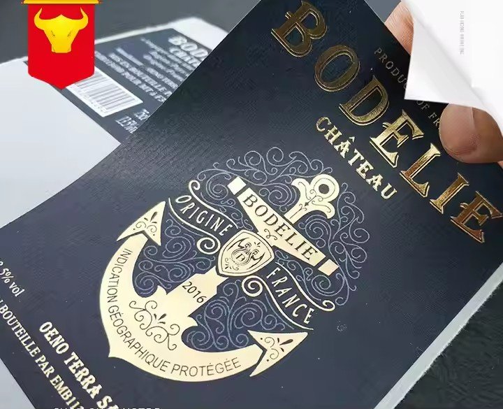
For mandatory certifications (such as Canada’s VQA, France’s AOC, Italy’s DOCG, or the EU’s PDO/PGI), the design must follow the principle of “recognizability first.” These certifications are the baseline for market entry and the primary cues consumers rely on to identify authenticity. Certification symbols—such as the VQA shield logo or the DOCG gold seal—should be placed in high-visibility areas (e.g., the upper label section or beside the brand name). Their colors should contrast with but harmonize with the main visual theme—such as red, gold, or black—ensuring instant visibility on the shelf. The size and proportion of these symbols must follow official regulations and cannot be distorted or recolored. For example, DOCG wines require an official anti-counterfeit strip on the bottleneck, while the front label must clearly display “DOCG” in bold serif typefaces to reinforce authority.
Additionally, mandatory certification–related information—such as origin, varietal composition requirements, and vintage—must be clearly stated. For instance, VQA-certified Icewine must prominently display the word “Icewine” and the corresponding DVA region. This information should be visually linked to the certification symbol, creating a dual-layered trust structure: “Certification Icon + Regulatory Information.”

For voluntary premium certifications (e.g., organic, biodynamic, fair trade, or international wine awards), design should emphasize rarity and expertise. These certifications reflect quality beyond baseline standards, and a “small yet refined” presentation works best so they do not compete with mandatory certifications for visual dominance. For example, an organic certification leaf icon can sit at the lower right corner, using green tones and matte finishes to express natural and healthy positioning. Award seals (such as “Gold Medal”) can be presented in selective gold foil, conveying prestige without disrupting the label’s overall aesthetics.
Authenticity is critical—false or misleading certification claims can severely damage brand credibility. To strengthen trust, a discreet verification QR code may be added, enabling consumers to validate certifications digitally and form a closed loop of “visual endorsement + digital verification.”
II. Origin and Winemaking Endorsement: Making Terroir and Expertise Visually Tangible
Wine quality is rooted in terroir and craftsmanship. The label must transform these intangible values into perceivable visual cues through precise information hierarchy and metaphorical expression, communicating rarity and expertise.
Origin endorsement centers on graded indication and symbolic representation. Regional classification systems (e.g., France’s regional/village/Premier Cru/Grand Cru, or Canada’s DVA/sub-appellations) directly reflect the rarity of terroir. Labels should highlight the regional level as a core piece of information—for example, “Bourgogne Grand Cru” may be rendered in a slender but elegant serif typeface placed near the top, accentuated with soft gold lines to evoke premium positioning. Sub-regional information such as “Gevrey-Chambertin” should be placed adjacent to the main region, creating a clear “Region → Sub-region” hierarchy.
Symbolic representations can further enhance terroir identity. Burgundy Grand Cru labels may incorporate subtle limestone textures; Bordeaux labels may feature abstract river lines referencing the Garonne and Dordogne; Niagara Peninsula labels may include minimalist waterfall linear motifs. These elements should remain abstract—expressed as textures, gradients, or fine lines—to preserve a premium, understated aesthetic while embedding terroir identity.
Craftsmanship endorsement focuses on highlighting key winemaking steps to convey expertise and precision. Essential elements include harvesting methods (e.g., hand-picked, berry-by-berry selection), fermentation techniques (e.g., wild fermentation), aging methods (oak barrel, stainless steel), and aging duration. Long descriptions should be avoided; instead, pair keywords + symbols—for example, a minimalist hand-picking icon for manual harvesting or a stylized barrel icon for aging.
For premium wines, highlight cues such as “Single Vineyard,” “Low Yield,” or “Limited Edition.” Labels can display limited numbers such as “328/500” in gold foil to strengthen rarity perception. Craftsmanship cues should align with product positioning: organic wines should emphasize “no pesticides, no chemical fertilizers” alongside organic symbols, while biodynamic wines may include astronomical symbols to express their natural, calendar-based philosophy.
III. Brand Heritage and Reputation Endorsement: Emotional Connection Rooted in History
A winery’s heritage, reputation, and long-standing craftsmanship form an essential part of its quality endorsement. The design goal is to “convey warmth, showcase legacy, and reinforce trust”—evoking emotional resonance and transforming brand history into perceived product value.
