
Luxury Cigar Label Design for High-End Tobacco Brands
A premium cigar label is more than decoration; it is the first signal of craftsmanship, taste, and value. Strong luxury cigar label design combines refined visuals, durable materials, precise printing, and thoughtful compliance so the band feels as considered as the cigar itself. For high-end tobacco brands, the goal is not simply to look expensive, but to create a label that feels memorable, trustworthy, and aligned with the smoking experience.
Table of Contents
What makes a cigar label feel luxurious?
A cigar label feels luxurious when every design choice supports a clear brand position: heritage, exclusivity, craftsmanship, modern restraint, or bold prestige. The best labels do not rely on ornament alone. They use hierarchy, texture, color, typography, and finishing details to tell the buyer what kind of cigar they are holding before the cellophane is opened.
Luxury often begins with restraint. A crowded label can look costly to produce but still feel unfocused. A refined band gives the eye a path: brand mark first, line or collection name second, supporting details last. This hierarchy matters because cigar labels are small, curved, and viewed quickly in humidors, retail displays, gift boxes, and online product photos.
Color also carries expectation. Deep black, cream, burgundy, forest green, navy, metallic gold, copper, and silver can all suggest premium quality when used with purpose. The right palette depends on the brand story. A heritage cigar may call for warm parchment tones and engraved illustration, while a modern boutique release may feel stronger with matte black, clean type, and one precise metallic accent.
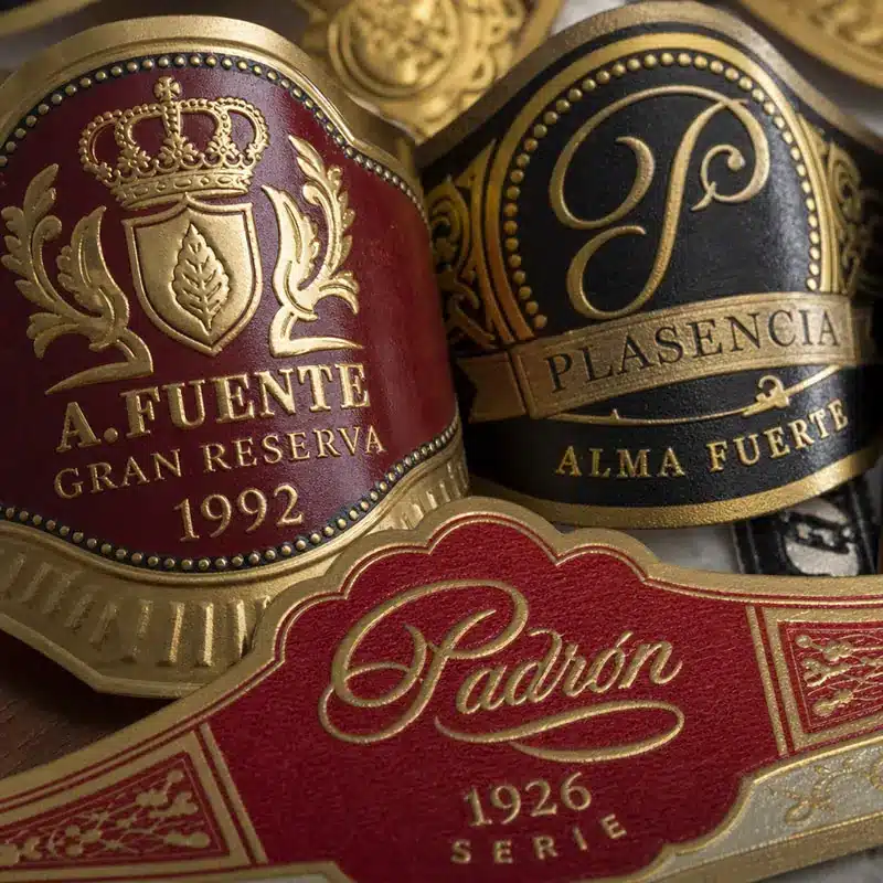
Core visual elements that shape premium perception
A high-end cigar label needs to be beautiful, but it also needs to work at a glance. The design must wrap cleanly around the cigar, remain readable at a small size, and still feel distinctive when placed beside competing brands. That balance is where premium design becomes strategic.
Typography is one of the most important choices. Serif fonts, engraved letterforms, elegant scripts, and custom lettering can evoke tradition and ceremony. Clean sans serif type can communicate confidence, modernity, and precision. What matters most is not the category of font, but whether the typography is legible, consistent, and appropriate for the cigar’s market position.
Illustration and iconography add depth when they are meaningful. Crests, shields, tobacco leaves, initials, portraits, architectural details, regional symbols, or abstract marks can become recognizable brand assets. However, every visual element should earn its space. If the art does not reinforce origin, flavor profile, brand heritage, or exclusivity, it may simply create clutter.
Strong luxury cigar label design usually includes:
- A clear focal point: Often a logo, monogram, crest, or collection mark that anchors the band.
- Readable hierarchy: Primary text should be visible quickly, even on a small curved surface.
- Intentional contrast: Dark-on-light, light-on-dark, metallic-on-matte, or textured-on-smooth combinations help details stand out.
- Balanced ornament: Borders, filigree, seals, and patterns should frame the design rather than compete with it.
- Brand consistency: The label should connect naturally with boxes, outer packaging, website imagery, and promotional materials.
Which materials and finishes best communicate high-end quality?
Materials and finishes communicate luxury because they affect how the label feels in the hand. A beautifully designed band can lose impact if the paper wrinkles easily, the adhesive fails, or the ink looks flat against the chosen stock. Premium cigar labeling depends on the physical experience as much as the artwork.
Textured specialty papers are a common choice for high-end brands because they add tactile interest before any finishing is applied. Linen, laid, vellum, soft-touch, and other refined surfaces can make the band feel more substantial. Coated papers can also work well, especially when the brand needs crisp color, sharp detail, or a polished presentation.
Finishing techniques are where a label often starts to feel collectible. Foil stamping in gold, silver, copper, bronze, or holographic accents can highlight a crest, border, signature, or limited-edition detail. Embossing raises selected areas, while debossing presses them into the surface. Spot UV can add gloss to a specific element, creating contrast against a matte background.
For luxury labels, the most effective finishes are rarely applied everywhere. A small foil highlight can feel more sophisticated than a fully metallic design. A subtle embossed seal can feel more exclusive than heavy ornament across the entire band. The best results come from using finishing techniques to guide attention, not overwhelm it.
When choosing materials, consider practical performance as well:
- Handling: The label should resist scuffing and wrinkling during packing, shipping, retail handling, and use.
- Storage: Colors and finishes should remain stable in normal cigar storage environments.
- Adhesion: The adhesive should hold securely without damaging the cigar or creating a messy removal experience.
- Print clarity: Fine borders, small text, and detailed artwork require a material that supports crisp reproduction.
- Brand feel: The texture and sheen should match the cigar’s price point, packaging, and intended buyer.
Printing choices influence cost, flexibility, and exclusivity
Printing method affects more than appearance. It influences minimum order sizes, customization options, turnaround, consistency, and the types of finishes available. For established brands producing large runs, traditional printing methods may offer excellent consistency and access to premium embellishments. For boutique brands, private labels, corporate gifts, weddings, and limited editions, digital printing can offer flexibility without requiring a massive run.
Digital printing is useful when a brand needs shorter quantities, variable artwork, seasonal releases, personalized text, or test-market packaging. It can support sharp color and fast iteration, which is valuable when a newer cigar brand is still refining its visual identity. The tradeoff is that certain specialty effects may require additional processes or may not match the depth of traditional foil and embossing combinations.
Offset and specialty print production can be ideal for larger, more established label systems. These approaches can support refined color control, premium papers, metallic inks, foil stamping, embossing, die-cutting, and layered finishes. They may require more planning and higher setup investment, but they can create a deeply polished result when the brand is ready for scale.
Die-cutting also deserves attention. A unique label silhouette can help a cigar stand out immediately, especially in a crowded display. Curved edges, crest shapes, extended side panels, or layered bands can make the label feel more custom. Still, shape should serve the design. If a die-cut makes application harder or compromises readability, it may hurt the overall effect.

How can smaller brands create a premium label without overspending?
Smaller brands can create a premium label by focusing budget on the few details buyers notice first: strong branding, quality paper, clean typography, and one or two high-impact finishes. A label does not need every luxury technique to feel elevated. It needs a clear concept and disciplined execution.
Start with the brand position before choosing embellishments. Is the cigar classic and celebratory, dark and full-bodied, minimalist and boutique, or rare and collectible? That answer should shape the palette, type style, materials, and amount of ornament. Without that foundation, expensive finishes may make the label look decorative rather than distinctive.
A practical premium-label checklist for smaller brands includes:
- Define the buyer: Know whether the label must appeal to collectors, gift buyers, lounge customers, event guests, or everyday premium smokers.
- Choose one signature element: This could be a crest, monogram, foil border, embossed seal, or custom illustration.
- Limit the palette: Two or three main colors plus one metallic accent often feels more refined than a busy range.
- Prioritize legibility: Small type, low contrast, and ornate scripts can become hard to read once wrapped around the cigar.
- Use finishes selectively: Apply foil, embossing, or spot gloss to focal points instead of covering the entire band.
- Request physical samples: Screens cannot fully show texture, reflectivity, adhesive behavior, or the feel of the finished band.
- Plan for future releases: A flexible label system makes it easier to add new lines, sizes, strengths, or limited editions later.
Private label projects benefit from the same discipline. A wedding, executive gift, lounge anniversary, or corporate cigar release can feel premium without pretending to be a legacy tobacco house. Personalized text, tasteful iconography, and a limited color palette often create a more elegant impression than overbuilt decoration.
Compliance belongs inside the design process
Cigar labels and packaging may need to accommodate required warnings, disclosures, or market-specific labeling rules. These requirements should never be treated as an afterthought. If compliance information is forced into the design late, it can disrupt the layout, reduce readability, and weaken the premium impression.
The better approach is to reserve space early. Designers can create a system where required information is legible, properly placed, and visually separated from the main brand artwork. That might mean using secondary panels, box labeling, outer packaging, or a cleaner back-band structure depending on the product format and applicable rules.
Because requirements can vary by market and change over time, brands should verify current obligations with appropriate regulatory or legal guidance before printing. From a design perspective, the key is integration. A premium label should look intentional from every angle, including the parts that carry mandatory information.
Sustainability can still feel luxurious
Eco-conscious choices do not have to make a cigar label feel plain or inexpensive. Recycled-content papers, responsibly sourced stocks, water-based coatings, and more restrained embellishment can support a premium identity when selected carefully. In fact, a quieter material story may strengthen brands that want to communicate craft, authenticity, and modern responsibility.
The challenge is balance. Heavy foil coverage, complex laminates, and layered materials may create visual drama, but they can also complicate sustainability goals. Brands interested in a lower-impact presentation should ask suppliers about paper sourcing, coating options, recyclability, adhesive behavior, and finish alternatives.
Sustainable luxury often works best through texture, simplicity, and restraint. A warm uncoated stock with an embossed mark can feel refined without excessive shine. A single metallic detail on a responsibly chosen paper can deliver a premium cue while keeping the design focused. The result feels deliberate rather than compromised.
Common mistakes that weaken a premium cigar label
Many cigar labels fall short not because they lack decoration, but because they lack focus. Luxury is not the same as complexity. When too many elements compete for attention, the buyer may struggle to understand the brand, the cigar line, or the intended level of quality.
Avoid these common problems:
- Overcrowded layouts: Too many borders, icons, textures, and type styles can make the label feel noisy.
- Poor contrast: Metallic details, dark backgrounds, and small text must be tested for real-world readability.
- Generic luxury cues: Gold foil and crests only work when they connect to a distinctive brand idea.
- Weak production planning: A design that looks good digitally may fail if the paper, adhesive, or finishing method is wrong.
- Ignoring the full package: The band, box, bundle label, website, and sales materials should feel like one brand system.
A useful test is to place the label beside several competitors and view it from a few feet away. Does it stand out? Is the name readable? Does it feel premium for the right reasons? Then examine it up close. The details should reward attention without depending on tiny elements to carry the whole identity.
A premium label starts with a clear brand story
The most successful high-end cigar labels are not just attractive; they are coherent. They make the cigar easier to understand, easier to remember, and easier to desire. Every choice, from the paper texture to the foil placement, should support the same promise.
For brands developing or refreshing a label, the smartest starting point is strategy: who the cigar is for, what experience it represents, and how it should sit in the market. From there, design becomes more focused and production decisions become easier. With the right balance of visual identity, material quality, print technique, and compliance planning, luxury cigar label design can turn a small band of paper into a powerful expression of prestige.