How to Design Wine Labels That Appeal to the Middle-Class Aesthetic?

For China’s new middle class, purchasing decisions have moved far beyond simple “functional needs” toward the pursuit of quality symbolism and emotional resonance. The wine label—being the first visual touchpoint between the product and the consumer—is not merely decorative; it is a visual embodiment of middle-class values.A label that aligns with middle-class aesthetics must find

Read More »

Why Are Clear Labels the Future of Modern Packaging?

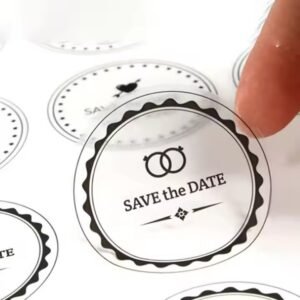
What Makes Transparent Labels So Popular? In today’s competitive retail world, brands are shifting toward minimalist, clean, and premium packaging aesthetics. Clear labels—also known as transparent stickers or no-label-look labels— allow brands to showcase the natural beauty of their products while maintaining brand identity and compliance. According to MarketsandMarkets (2024), the global label printing market

Read More »

How to Choose the Right Material for Wire Labels?

The material of wire labels must meet four key requirements, forming the foundation for proper selection: Durability: Must withstand physical wear, chemical corrosion, and temperature/humidity fluctuations in its working environment while remaining legible over time. Compatibility: Material hardness and flexibility should match the wire diameter and installation space, ensuring that the label does not affect

Read More »

How to Design Perfume Packaging That Looks More Attractive?

Fresh floral fragrances suit smooth, organic forms such as droplet-shaped or petal-shaped bottles, with flowing lines that echo a natural, light feel. Woody or oriental scents work well with angular geometric bottles in a matte finish to express depth and sophistication. Niche or artisan perfumes can experiment with irregular or asymmetrical forms — trapezoidal, spiral,

Read More »

How to Design Wine Labels That Fit Australian Aesthetics?

Australia’s unique landforms and ecology are irreplaceable visual signatures. In design, landscapes should be stylized and abstracted, not rendered in full realism (which can look cheap). The goal is to express a sense of grandeur and purity. Symbolizing Wine Regions:For different wine regions such as Barossa Valley, Hunter Valley, and Margaret River, extract and simplify

Read More »

What Are the Design Concepts for Australian Health Supplement Packaging Graphics?

Australia’s distinctive natural scenery serves as an irreplaceable visual symbol. By extracting iconic landscape elements and rendering them in minimalist or abstract illustration styles, designs can highlight product origin while maintaining a refined, premium tone. Simplified Landmark Imagery:Transform landmarks such as Uluru, the Great Barrier Reef, and the Blue Mountains into linear illustrations.For example: On

Read More »

Why Choose Foil Stamped Red Envelopes from a Trusted Manufacturer?

Why Premium Red Envelopes Matter More Than Ever Red envelopes—traditionally used for celebrations, gifting, festivals, and branding—have evolved into an international symbol of prosperity and cultural heritage. Today, foil stamped red envelopes are no longer limited to Lunar New Year; they are widely used in corporate gifting, luxury brands, wedding packaging, and marketing campaigns. According

Read More »

What Type of Paper Is Suitable for Australian Health Supplement Stickers?

I. Core Selection Principles: Compliance First, Practical AdaptationWhen choosing paper for Australian health supplement stickers, the primary prerequisite is meeting TGA regulatory requirements. On this basis, practicality and brand positioning should be balanced—three core principles are indispensable:Compliance Principle: TGA requires health supplement stickers to have “permanently clear information, resistance to peeling, and wipe resistance”. The

Read More »

How to Design Medical Labels for Greater Safety?

I. Information Presentation: Maximize Clarity and Eliminate Ambiguity The core purpose of a medical label is to convey critical information. Its design must prioritize legibility and accuracy to minimize human error. Clear Information Hierarchy Organize content by risk priority: place the highest-risk information (e.g., drug contraindications, sample type) in the most prominent location—typically the top

Read More »

Book Your Free Session Now

Fill in the form below to book a 30 min no-obligation consulting session.

I will reply within 24 hours.